The Space Around the Subject
In architectural photography, we tend to speak of what a frame contains. We discuss the staircase, the window, the way a corridor turns toward light. Yet the quality of an image often depends just as much on what surrounds those elements. The empty areas of a photograph, the stretches of wall, floor, sky, and shadow that hold nothing in particular, are not accidents to be minimized. They are compositional decisions, and they carry meaning.
This is the principle of negative space: the intentional use of unoccupied areas to shape how the eye moves and how a subject is understood. In interior photography and exterior work alike, negative space is one of the quietest tools available, and one of the most powerful. It is also frequently misunderstood as emptiness, when in truth it is a form of emphasis.
Why Emptiness Reads as Intention
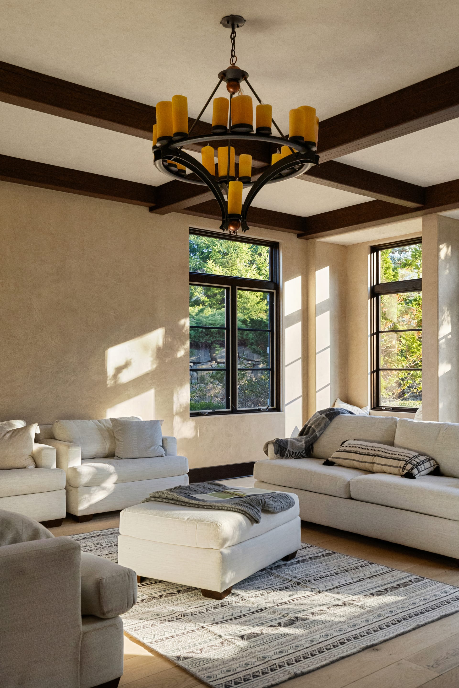
A room photographed edge to edge, with every surface filled and every corner accounted for, tends to feel busy. The eye has nowhere to rest. Introduce a generous span of blank wall above a considered piece of furniture, and something shifts. The furniture gains presence. The wall becomes a frame. The image begins to feel composed rather than merely captured.
This is because the human eye reads deliberate emptiness as confidence. When a photographer leaves space, the viewer senses a choice was made, that the subject was considered worthy of room. The absence draws attention to the presence.
Negative space is not the absence of a subject; it is the room we give a subject to be seen.
For design professionals, this matters enormously. Architecture is often about proportion, restraint, and the relationship between form and void. A photograph that honors negative space speaks the same language as good design. It communicates that the work was built with intention, and that intention deserves an unhurried gaze.
Where Negative Space Lives
Negative space appears in more places than a beginner might expect. Recognizing it is the first step toward using it well.
- The expanse of ceiling above a dining table, which gives a room its sense of height
- A stretch of unadorned wall that lets a single artwork command the frame
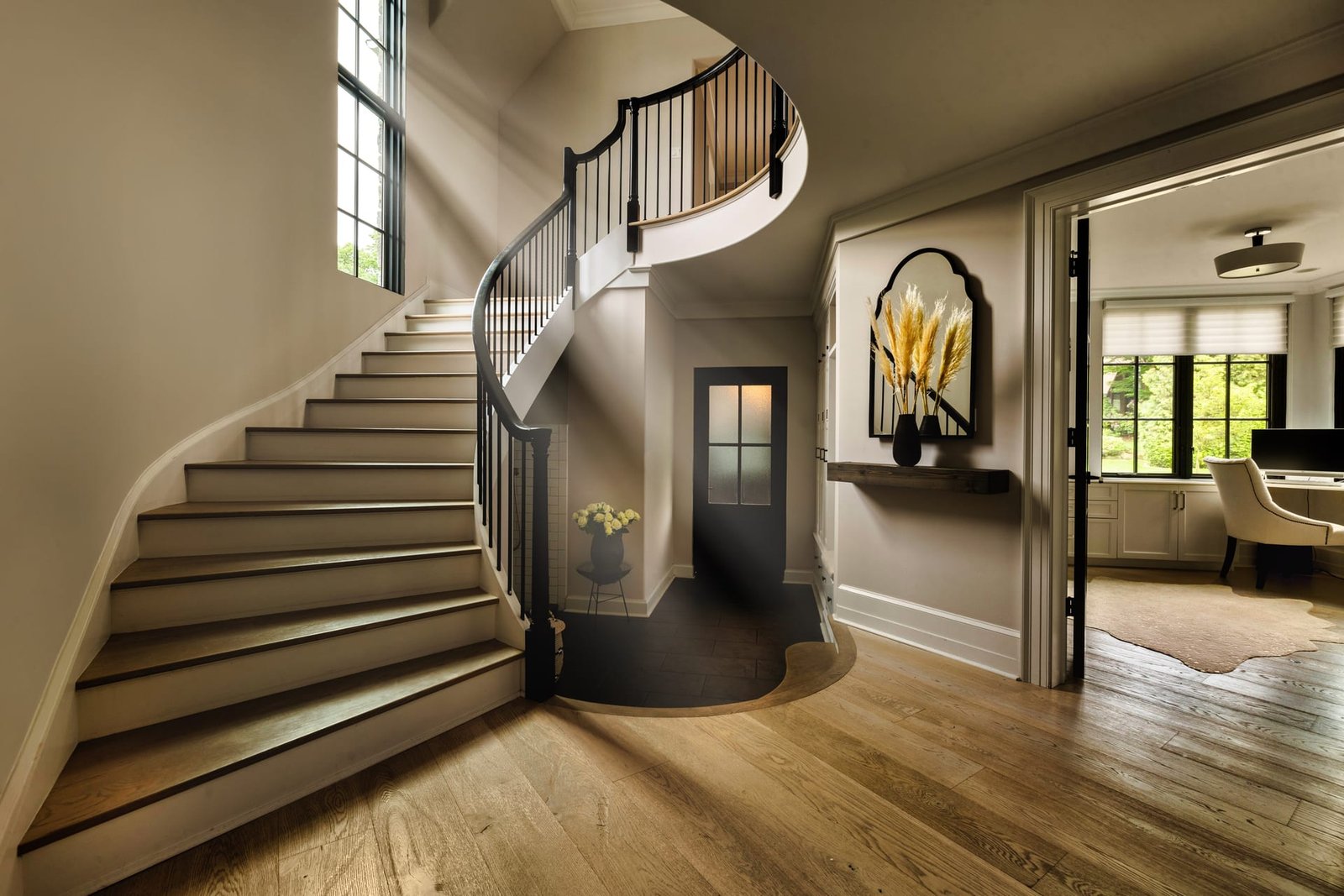
- Open floor in the foreground of an interior, guiding the eye inward
- Sky above a building at twilight, establishing scale and setting
- Shadow that pools in a corner, framing a shaft of daylight
Each of these is doing work. None is filler. When a photographer chooses to include them at a particular size and position, the image gains rhythm.
Composition as a Balance of Presence and Absence
Photographers often speak of the rule of thirds or of leading lines. Negative space belongs in the same conversation, though it operates differently. Rather than telling the eye where to go, it tells the eye where not to go, which amounts to the same thing from the opposite direction.
Consider a minimalist interior. If the frame is packed with detail, the minimalism is contradicted by the photograph. The image argues against the design. But if the composition allows for calm, uninterrupted areas, the photograph becomes an extension of the design philosophy. The medium agrees with the message.
This alignment is why interior photography for pared back, considered spaces so often relies on restraint. The photograph must embody the same discipline as the room. A cluttered frame of a serene space is a kind of mistranslation.
The Risk of Too Much
Negative space can be overused. A frame that is ninety percent empty and ten percent subject risks feeling like an exercise rather than an image. The subject can appear lost, and the viewer may struggle to understand what the photograph is about. Balance is the operative word. The goal is not maximum emptiness but the right amount for the space at hand.
A tight, intimate reading room might call for a fuller frame that conveys warmth and enclosure. A grand atrium might invite vast open areas that let the eye register its true dimensions. The subject dictates the ratio, not a formula.
The right amount of emptiness is never fixed; it is decided by the character of the space itself.
Negative Space and the Way We Use Images
There is a practical dimension to this beyond aesthetics. Images that contain thoughtful negative space are more versatile in the ways design professionals actually use them. A photograph with open wall or sky offers room for text, for a headline, for a logo. Editors, marketers, and web designers value these frames because they can be adapted without crowding.
A hotelier building a website often needs a hero image that can carry a booking prompt across its surface. An architect assembling a monograph may want photographs that give captions and titles somewhere to sit. When negative space is planned during the shoot, these needs are met without awkward cropping later. The image serves both the eye and the page.
- Web banners and hero sections that require space for overlaid text
- Print layouts where images bleed alongside copy
- Social formats that crop to different ratios without losing the subject
- Award submissions where clarity and composure are judged
Seeing Empty Space Before the Shutter
The most useful shift for anyone commissioning architectural photography is to begin noticing negative space in your own environments. Stand in a finished project and observe where the eye rests. Notice the walls that hold nothing, the pools of shadow, the open reaches of floor. These are not gaps to be corrected. They are the breathing room that gives the built work its dignity.
When you understand this, conversations with your photographer become richer. You can point to the calm areas you want preserved rather than assuming every square inch must be justified. You can trust that a wide, quiet frame is doing something, even when it appears to show less.
The finest architectural images rarely shout. They allow the work to be seen on its own terms, surrounded by the space it needs. That restraint is not a lack of effort. It is the discipline of knowing what to leave alone, which is among the hardest and most valuable skills a photographer can bring to your project.
If you are ready to see your architecture and interiors photographed with this kind of intention, I would welcome the chance to talk with you at Matthew Lekker Photography.