Every photograph of a building is, in some sense, a collaboration with the people who designed it. Long before a camera enters a room, an architect has already resolved questions of proportion, sightline, and balance. The most persuasive interior photography does not fight these decisions; it listens to them. When a photographer understands the logic embedded in a plan and elevation, the resulting images feel inevitable rather than staged, and the design reads exactly as its author intended.
This is why the finest architectural photography borrows its grammar from architecture itself. The principles that govern how a space is composed in three dimensions translate, with remarkable precision, into how it should be composed within a frame. For architects, interior designers, builders, and hoteliers, recognising this shared vocabulary makes it easier to brief a photographer and to judge whether a final image honours the work.
Axis and Symmetry: Letting the Building Lead
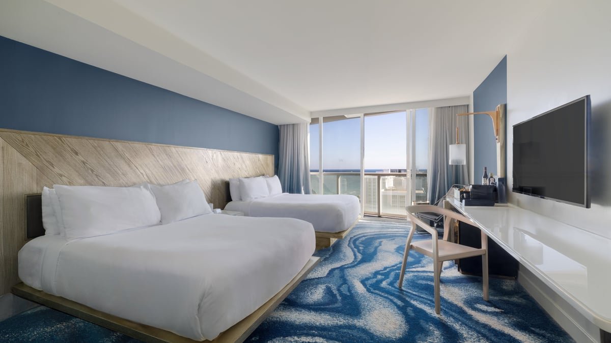
Architects rarely place a doorway, a corridor, or a courtyard by accident. Axis organises movement and attention, drawing the eye and the body from one point to the next. A photographer who identifies the primary axis of a room and aligns the camera to it produces images with an immediate sense of order. The vanishing point falls where the design intends, and the viewer is invited to move through the space as they would in person.
Symmetry is the most emphatic expression of axis. A perfectly centred composition, with elements balanced left and right, conveys formality, calm, and intention. It suits grand hotel lobbies, considered residential entryways, and any interior where the architecture already announces its own equilibrium.
When a photographer honours the axis a building was designed around, the image stops describing the room and begins to embody it.
Yet symmetry is a tool, not a rule. Deliberate asymmetry can be equally powerful, using visual weight rather than mirror-image balance to hold a frame together. The discipline lies in choosing consciously, so that every composition responds to how the space was actually conceived.
Proportion and the Discipline of the Frame
Proportion has governed building for millennia, from classical orders to the modern grid. Architects work with ratios because certain relationships between height and width feel resolved to the human eye. Photographers inherit this concern the moment they decide where the edges of the frame will fall.
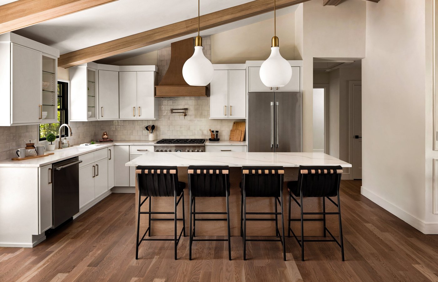
Cropping is a proportional act. A wide horizontal frame emphasises breadth and horizon, suiting expansive open-plan interiors and landscape-oriented facades. A vertical frame accentuates height, ideal for stairwells, double-height voids, and slender urban buildings. The photographer’s task is to match the proportion of the frame to the proportion of the subject, so the image reinforces rather than contradicts the architecture’s intended character.
Reading the Grid
Many contemporary interiors are built on an underlying modular grid, visible in ceiling coffers, floor tiles, joinery, and glazing. This grid is a gift to the photographer. Aligning the camera so that horizontals stay level and verticals remain true keeps the grid intact, and a coherent grid signals precision and craftsmanship. Converging verticals, by contrast, introduce a distortion that the human eye rarely tolerates in built space, which is why careful architectural photography relies on perspective control to keep walls parallel and upright.
Rhythm, Repetition, and the Pause
Architecture creates rhythm through repetition: a colonnade of columns, a run of windows, a sequence of arches. These repeating elements establish a visual beat that guides the eye across a facade or down a corridor. Photographers can amplify this rhythm by positioning the camera so the repetition recedes into the distance, each element slightly smaller than the last, producing depth and momentum.
Rhythm becomes most expressive when it is interrupted. A single contrasting element within a repeating pattern—a differently coloured door in a row of identical ones, a piece of sculpture at the end of a colonnade—acts as a focal point. Interior designers use this principle constantly when they place a statement chair or a distinctive light fitting within an otherwise measured scheme. The photographer’s job is to find the vantage point where the rhythm and its interruption are both legible.
- Repeating structural elements to establish visual tempo
- A single point of contrast to anchor attention
- Negative space that lets the rhythm breathe
Framing Within the Frame
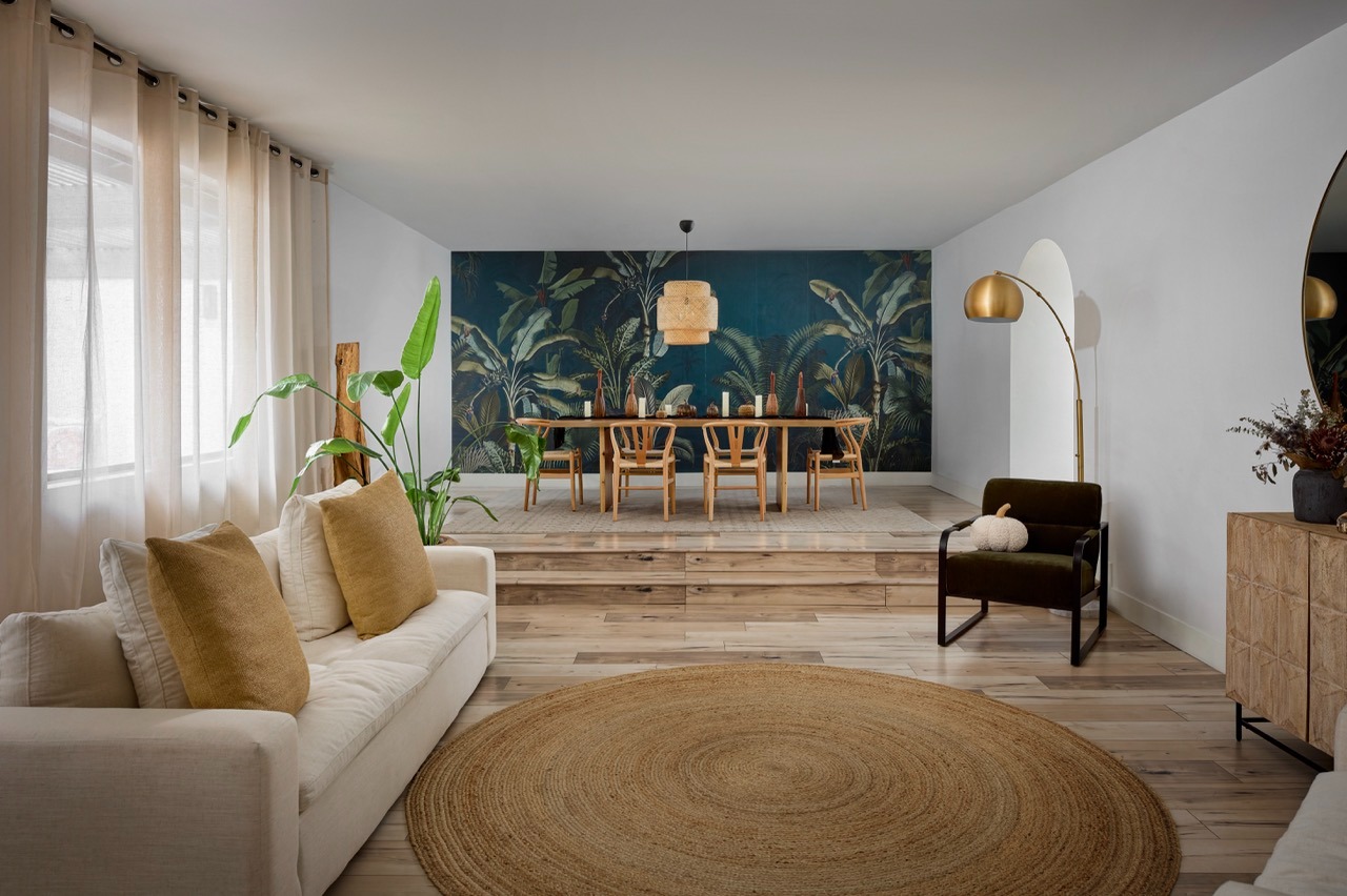
Buildings are full of apertures: doorways, windows, arches, and openings that frame views from one space into another. This is a compositional principle architects use to choreograph how occupants experience a sequence of rooms. Photographers borrow it directly by shooting through a doorway or beneath a beam, using the architecture’s own openings to frame the subject beyond.
This layering creates depth and narrative. A foreground threshold, a middle-ground room, and a distant window establish three planes that the eye reads as a journey. For hoteliers and realtors, images built this way communicate flow and generosity of space far more convincingly than a single flat view ever could.
Light as a Structural Element
Architects design with light as deliberately as they design with brick or glass. Clerestory windows, skylights, and carefully placed openings shape how a space feels at different hours. A photographer who studies how daylight moves through an interior can schedule the shot for the moment the design comes alive, when a shaft of light rakes across a textured wall or a soft glow fills a courtyard.
Light is not something added to architecture in the edit; it is a material the building was designed to hold.
Directional light reveals form. It defines the depth of a reveal, the texture of stone, the crispness of a shadow line. Flat, even illumination flattens these qualities and erases the very details the architect laboured over. Understanding light as structure rather than decoration is what separates a record of a room from a portrait of it.
Scale and the Human Presence
Scale is difficult to convey in a photograph without a reference. Architects establish human scale through door heights, step risers, and handrails, all sized to the body. Photographers preserve this by keeping such elements in frame, or by introducing a subtle human presence that lets the viewer gauge the true dimensions of a space. A room can appear vast or intimate depending entirely on these cues, so scale must be handled with the same care an architect brings to it.
Composition as a Continuation of Design
The through-line in all of these principles is that photography, at its best, continues the work of design rather than merely documenting it. Axis, proportion, rhythm, framing, light, and scale are not photographic inventions; they are architectural ones, translated into two dimensions. When a photographer treats composition as an extension of the original design intent, the image becomes a faithful and elevated ambassador for the work, whether for a portfolio, a publication, or a listing.
For the professionals who make and inhabit these spaces, the reward is images that feel timeless and intentional, images that read as the space itself rather than a version of it filtered through unfamiliar rules.
If you would like your architecture or interiors captured with this same attention to their underlying design, we would be glad to hear from you at Matthew Lekker Photography.