
Why Texture Carries a Space
A photograph cannot be touched, yet the best architectural photography makes a viewer feel as though they could run a hand across the grain of an oak table or feel the chalky cool of a lime-plastered wall. Texture is the quiet conductor of this sensation. It is the quality that translates material into feeling, and it is often the difference between an image that merely records a room and one that convinces a viewer the room is real, considered, and worth occupying.
For design professionals, texture is rarely incidental. The decision to specify brushed brass over polished, hand-troweled plaster over flat paint, or a loose linen over a tight weave is a decision about how a space will be experienced. When those choices are flattened in a photograph, the work loses the very distinctions that justified it. Rendering texture well is therefore not a stylistic flourish. It is fidelity to the intent behind the material.
Texture is the quality that translates material into feeling, and it is often the difference between a room recorded and a room believed.
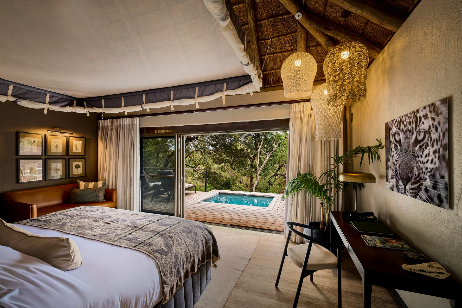
How Light Reveals Surface
Texture is not a property of a material so much as a property of light meeting that material at an angle. A wall of rough plaster photographed under flat, frontal light will read as smooth and characterless. The same wall photographed with light raking across it from the side will reveal every ridge, pore, and gentle undulation. The material has not changed. The relationship between the light and the surface has.
This is the first principle of photographing texture: direction matters more than quantity. Soft, diffuse light flatters complexions and calms a scene, but it suppresses surface detail. Directional light, skimming across a plane at a shallow angle, exaggerates relief and brings the hand of the maker into view.
Raking Light and the Grazing Angle
When we want to emphasize the tactility of a surface, we look for light that grazes it. Low morning or late-afternoon sun entering through a window will travel almost parallel to an adjacent wall, catching every imperfection. Stone, timber, textile, and troweled finishes all come alive under this treatment. The grazing angle is why a brick facade can look inert at midday and sculptural at dusk.
In interior photography, the same effect can be found and shaped. A table set near a window reveals the grain of its top when light moves across rather than straight down onto it. Positioning the camera to see the shadowed side of a texture, rather than the fully lit side, often reads as more three-dimensional, because the eye reads the interplay of highlight and shadow as depth.
Matching Technique to Material
Different materials ask for different handling. Part of the craft is recognizing what a surface needs before deciding how to light and frame it.
- Natural stone and concrete: These reward raking light that reveals aggregate, veining, and the subtle variation of a poured or honed finish. Flat light turns marble into plastic.
- Wood: Grain direction interacts with light direction. Light traveling along the grain emphasizes length and flow; light crossing it emphasizes figure and depth.
- Textiles: Weave and pile depend on contrast within the shadows. A boucle or a heavy wool needs enough directional light to separate the loops, but not so much that it blows out and loses the softness that defines it.
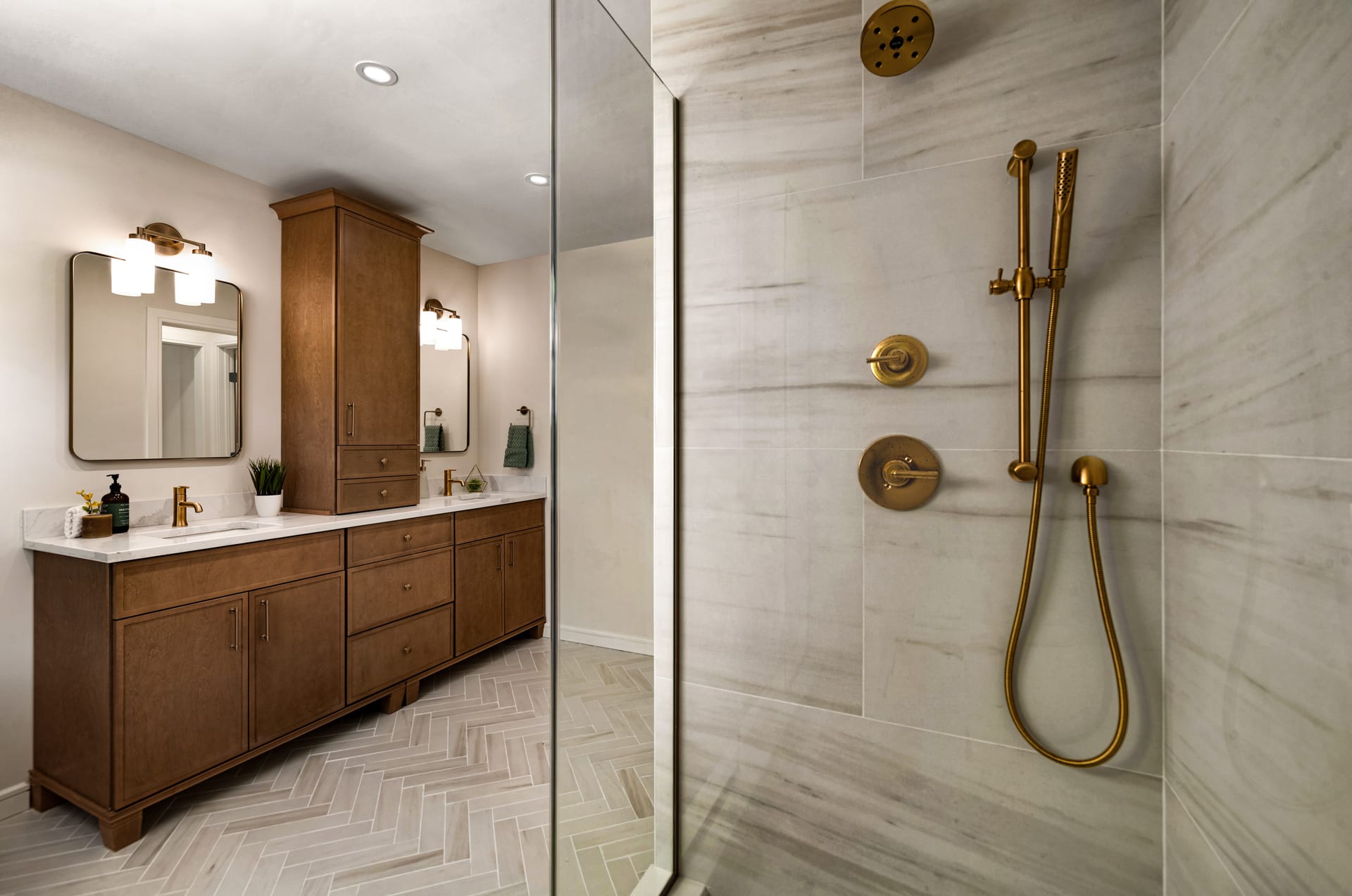
- Metals: Here the question is reflection rather than relief. Brushed and satin finishes scatter light into a soft sheen; polished metals mirror their surroundings. Controlling what a metal reflects is controlling how it reads.
- Glass and glazed tile: The surface quality lives in the specular highlights. The placement of those highlights, and the gradation across them, tells the eye whether a glaze is glossy or matte.
The Role of Focus and Distance
Texture also depends on how closely the camera looks. A wide establishing frame renders a plaster wall as a tone; a tighter composition renders it as a surface. This is one reason a considered set of images moves between scales, offering the broad geometry of a room and then stepping in to let a single material speak.
Sharpness matters here more than almost anywhere else. The fine articulation of a weave, a saw-cut, or a honed edge demands precise focus and enough depth of field to hold the plane crisp from near to far. A slightly soft frame flattens texture more quickly than most other subjects, because the eye has learned to associate fine detail with closeness and reality.
A wide frame renders a plaster wall as a tone; a closer one renders it as a surface the eye can almost feel.
Contrast Within the Shadow
Much of texture lives in the darker values of an image. If the shadows are crushed to pure black, the small transitions that describe a rough or woven surface disappear. In post-production, protecting shadow detail and resisting the urge to deepen contrast too aggressively keeps those micro-variations legible. A gentle hand preserves the quiet gradations that let a surface breathe.
Texture as Narrative in a Project
For architects, builders, and interior designers, a body of work is a story about material decisions. When texture is rendered faithfully across a set of images, the viewer understands the project as a coherent set of choices rather than a collection of pretty rooms. The warmth of reclaimed timber beside the cool restraint of poured concrete; the softness of a plaster wall against the precision of a steel window frame. These juxtapositions are the argument of the design, and photography either carries that argument or loses it.
For hoteliers in particular, texture is closely tied to the promise of comfort. A guest reading a photograph is deciding whether a space looks restful, luxurious, or merely functional. The visible softness of bed linen, the depth of a rug, the tactile grain of a timber headboard all communicate hospitality before a word of copy is read.
A Short Field Discipline
When approaching a surface worth photographing, a few questions guide the work:
- Where is the light coming from, and can it be made to graze rather than flatten?
- Does the frame need to step closer to let the material register as texture?
- Are the shadows holding enough detail to describe the surface?
- What adjacent material will heighten this one by contrast?
These questions are simple, but they move an image from documentation toward something closer to sensation. Texture is patient work. It rewards the photographer who waits for the right angle of light and the design professional who understands that the feel of a material is part of what their photographs are meant to convey.
If you would like your materials and surfaces rendered with this kind of care, we would welcome a conversation at Matthew Lekker Photography.
Add us as a preferred source on Google
Add as preferred source