Why Scale Is Never Automatic
A photograph flattens three dimensions into two. In that translation, one of the first things to go is scale. A room that feels generous when you walk through it can collapse into something cramped on screen, and a modest footprint can be made to read as expansive. Neither is a lie, exactly. Both are choices. For architects, interior designers, and builders, the question is not whether a photograph distorts size but whether it distorts it in the service of truth.
In architectural photography, scale is a constructed quality. It does not arrive on its own. The camera has no instinct for how large a space feels to a body moving through it, so the person behind the lens has to supply that information deliberately, using the tools of composition, reference, and perspective. Understanding how this works lets you brief a photographer with intention rather than hoping the images simply feel right.
A photograph does not record size; it argues for it, and the argument is only as good as the evidence left in the frame.
The Elements That Build Scale
Size in an image is relative. We read a space by comparing its parts to things we already understand. Remove those points of comparison and the eye has nothing to measure against. Keep them, and the room settles into its true proportions.
Known Objects as Reference
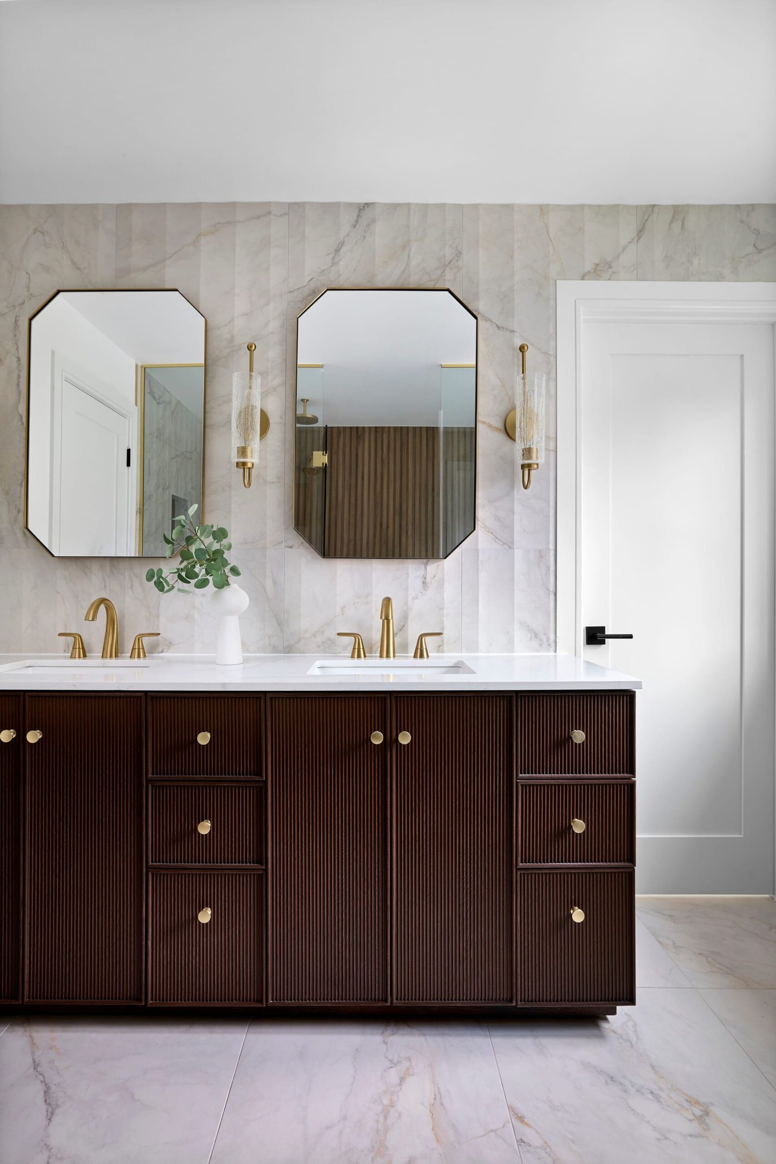
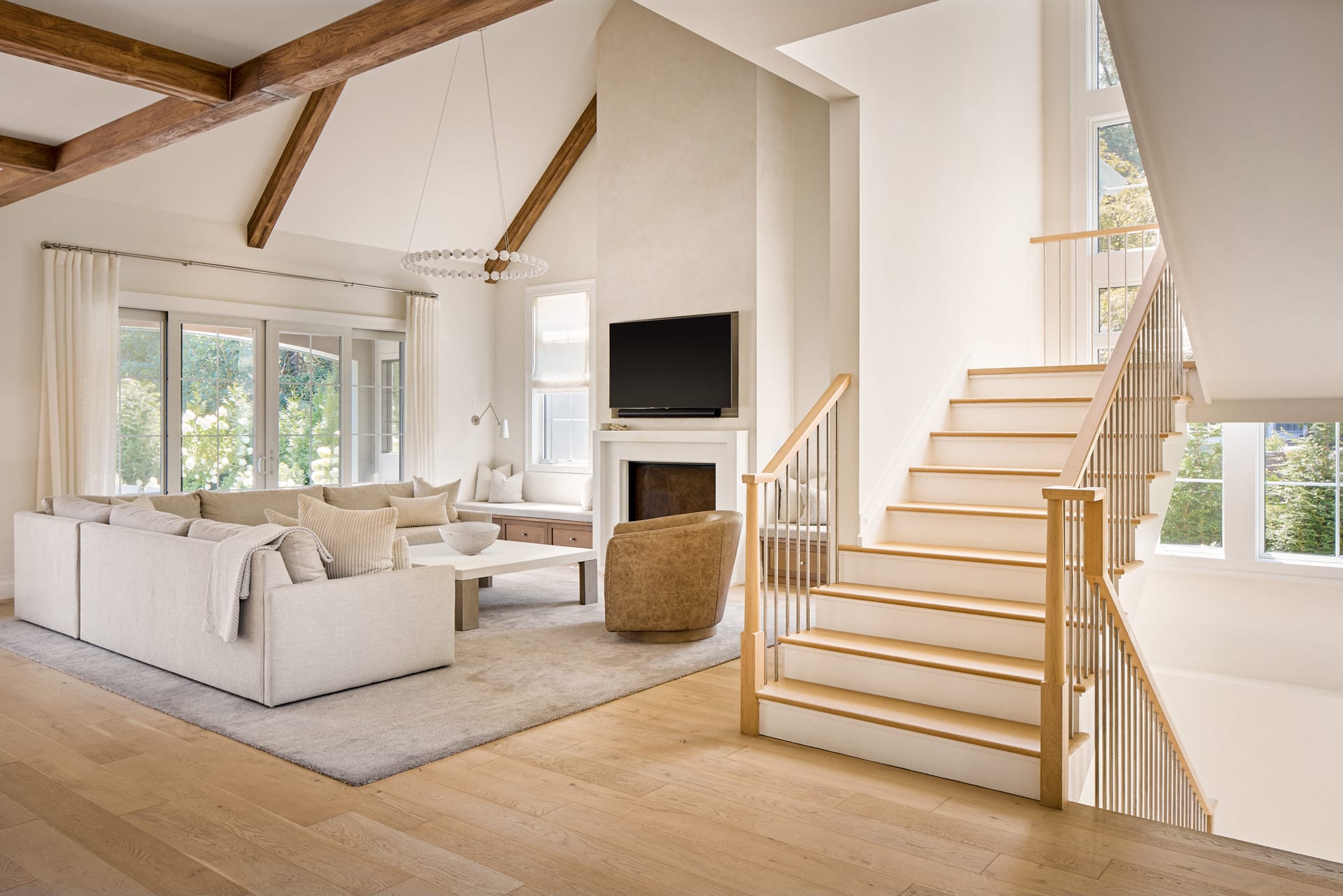
The most reliable way to communicate scale is to include something the viewer already knows the size of. A dining chair, a door, a light switch, a stair tread, a stack of books. These objects carry fixed dimensions in the viewer’s memory, and the mind uses them instantly to gauge everything around them. A soaring ceiling means little without a chair beneath it to prove the height. The chair does the work; the ceiling simply benefits.
This is why entirely empty rooms, stripped of furniture during a renovation or a sale, so often photograph poorly. Without reference objects, the viewer cannot tell a compact bedroom from a large one. For realtors photographing vacant properties, this is the central difficulty, and it is one reason thoughtful staging pays for itself in the final images.
Layering Foreground, Middle, and Depth
Depth and size are closely linked. When a photograph has a clear foreground, a middle ground, and a far plane, the eye travels through those layers and reads distance as it goes. That journey translates directly into a sense of spaciousness. A flat, single-plane composition, by contrast, gives the eye nowhere to travel and the room feels shallow.
In interior photography, this often means positioning the camera so that a piece of furniture or an architectural element sits close to the lens, with the main space opening up beyond it. The near element anchors the scale, and the recession behind it does the rest.
The Horizon and the Human Eye Line
Camera height shapes how a body relates to a space. Shoot from standing eye level and the room reads as it would to a person walking in. Drop the camera lower and ceilings lift, verticals stretch, and the space gains grandeur. Raise it and the room can feel diminished, surveyed from above rather than inhabited. None of these is wrong, but each tells a different story about how large the space is meant to feel.
How Scale Gets Distorted
Distortion is not always a failure. Sometimes it is a deliberate emphasis. The problem arises when it goes unnoticed, when a lens choice or a vantage point quietly misrepresents a space in a way that the client has not chosen.
- Wide lenses exaggerate depth. A very wide focal length pushes near objects forward and far objects back, stretching the apparent distance between them. A small room can be made to look much larger than it is. This is the most common source of mismatch between the photograph and the lived experience.
- Tight lenses compress. A longer focal length flattens the relationship between planes, making a deep room feel stacked and shallow. Used well, this creates a composed, considered image. Used carelessly, it can rob a space of its generosity.
- Converging verticals. Tilting the camera up or down causes vertical lines to lean, which the eye reads as instability and often as a loss of true proportion. Keeping verticals parallel preserves the honest scale of the architecture.
The most honest image is rarely the widest one; it is the one that makes a stranger feel the room the way you do.
Scale as an Editorial Decision
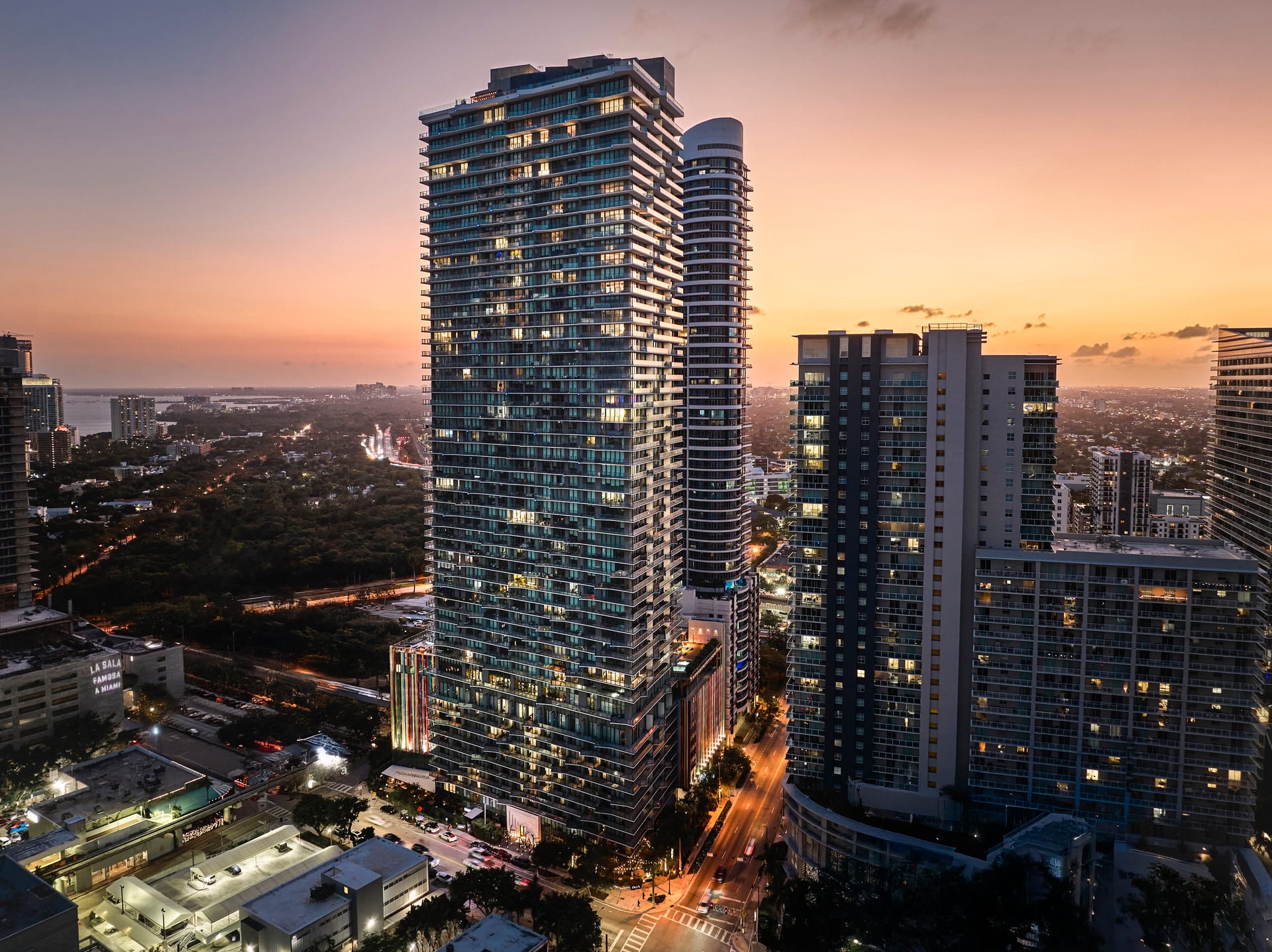
For hoteliers and hospitality brands, scale carries an emotional charge. A lobby photographed to emphasize volume communicates arrival and generosity. A guest room photographed to feel intimate and enveloping communicates comfort and retreat. The same furniture, the same light, and yet two different promises to the guest. Deciding which to make is a branding question before it is a technical one, and it deserves to be discussed before the shoot rather than discovered afterward.
Designers face a parallel decision. A project might include a deliberately compact reading nook alongside a double-height living space. If every image is composed to feel as large as possible, the contrast that makes the design intelligent is lost. The small room needs to read as small on purpose, so that its coziness becomes a virtue rather than a liability. Honest scale, varied across a set of images, lets the full range of a project speak.
Matching the Image to the Experience
The test of scale in architectural photography is simple to state and hard to meet: would a person who has stood in the space recognize it in the photograph. Not merely identify the room, but feel its size correctly. When a client walks a visitor through a finished project and the visitor says the photographs did not prepare them for how it feels, the images have failed at scale, even if they were beautiful.
Getting this right is a collaboration. The photographer brings the technical understanding of lens, height, and composition. The designer or architect brings the knowledge of which spaces are meant to feel expansive and which are meant to hold you close. A short conversation before the camera comes out usually settles more than any amount of correction afterward.
A Short Checklist for Honest Scale
- Include at least one object of known size in each primary frame.
- Build depth with distinct foreground, middle, and far planes.
- Choose camera height to match the feeling you want the room to carry.
- Keep verticals true unless a lean is a deliberate choice.
- Decide, space by space, whether the goal is generosity or intimacy.
Scale rewards attention precisely because it so rarely announces itself. When it is handled well, no one notices; the room simply feels like itself. When it is handled poorly, the viewer senses something is off long before they can name it. The difference between the two is intention, applied quietly, frame after frame.
If you are preparing a project for the camera and want its proportions represented with care, we would welcome the conversation at Matthew Lekker Photography.
Add us as a preferred source on Google
Add as preferred source