Why Color Is the Quiet Foundation
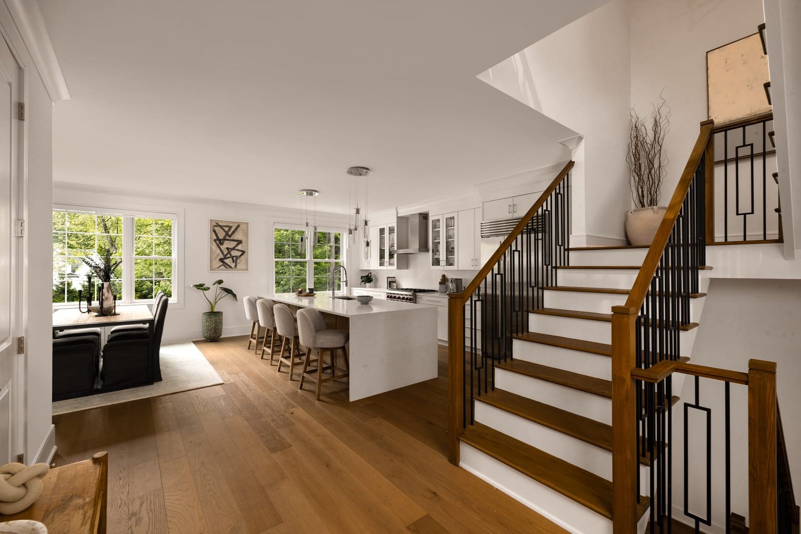
Of all the decisions that shape a photograph, color is the one most often noticed only when it goes wrong. A room can be perfectly composed, cleanly lit, and precisely framed, yet feel subtly untrustworthy if the whites drift blue or the timber reads too orange. In architectural photography and interior photography alike, color is not decoration. It is documentation. The tones in an image are a record of real decisions made by designers, architects, and builders, and those decisions deserve to be rendered honestly.
For design professionals, this matters more than it might first appear. A paint selection chosen over weeks of sampling, a stone slab picked for its particular warmth, a bespoke upholstery dyed to an exact specification, all of these can be undone by a careless white balance. The photograph becomes a portrait of the wrong room.
Color is not decoration in a photograph; it is the record of decisions made long before the camera arrived.
Understanding Color Temperature in a Space
Every light source carries a temperature, measured in Kelvin, that shifts the character of the colors it falls upon. Daylight is cool and blue-leaning. Incandescent and many warm LED fixtures lean amber. Overcast skies push toward a flat neutrality, while a clear sky filling a north-facing room can introduce a surprising coolness that the eye quietly corrects but the sensor does not.
The human eye is a remarkable instrument of adaptation. Walk from a tungsten-lit lobby into daylight and you barely register the shift, because your perception continuously recalibrates. A camera has no such grace. It captures exactly what is present, which means a space lit by several sources at once becomes a negotiation between competing temperatures.
The Problem of Mixed Light
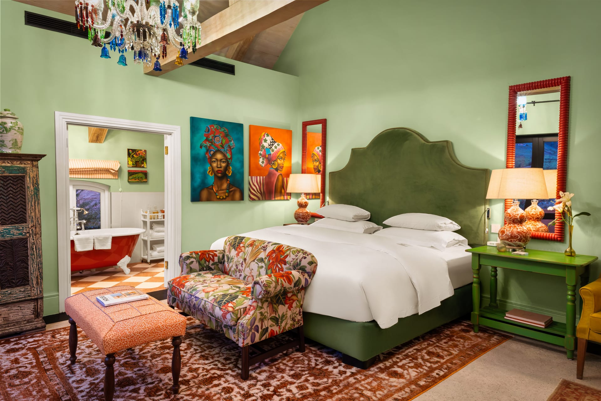
Mixed lighting is the most common color challenge in interior photography. Consider a typical scene: cool daylight entering through a window, warm recessed downlights overhead, and perhaps a lamp with an even warmer bulb in the corner. Each pool of light carries its own temperature. Set the white balance for the window and the lamplight glows orange. Set it for the lamp and the window turns icy.
There is no single correct answer, only a considered one. The resolution depends on the intent of the image and the mood the space is meant to convey. The goal is rarely to eliminate every variation, which would make a room feel sterile, but to guide these differences into a harmony that feels true to the experience of standing there.
Rendering Tone Honestly
Faithful color begins at capture, not in post-production. Shooting in raw preserves the full range of information and allows white balance to be set deliberately rather than guessed. A gray card or color reference placed in the scene provides a known neutral anchor, giving a reliable starting point from which every other tone can be judged.
From there, the work is interpretive. A photograph is not a measurement; it is a translation. The aim is to render the space as a thoughtful observer would remember it, which means honoring the following:
- The true hue of the walls, so a warm white does not drift cool or a greige does not collapse into gray.
- The character of the timber, stone, and metal, each of which carries subtle color that defines its quality.
- The mood of the light, whether the warmth of evening or the clarity of morning, kept intact rather than neutralized into blandness.
- The consistency across a set, so that a room does not change complexion from one frame to the next.
When to Correct and When to Preserve
Not every color shift is a flaw. The amber glow of a pendant light over a dining table is part of the atmosphere a designer intended. Flattening it into neutral white would strip the room of its warmth and misrepresent the space as surely as any color cast. The discipline lies in distinguishing an error from a mood.
A useful question to hold in mind: does this color serve the truth of the space, or does it distract from it? A green cast bouncing off a lawn onto a white ceiling is a distraction. The soft warmth pooling beneath a lamp is a truth. Correcting the first while protecting the second is the essence of considered color work.
A photograph is not a measurement but a translation, rendering a space as a thoughtful observer would remember it.
Color and Material Fidelity
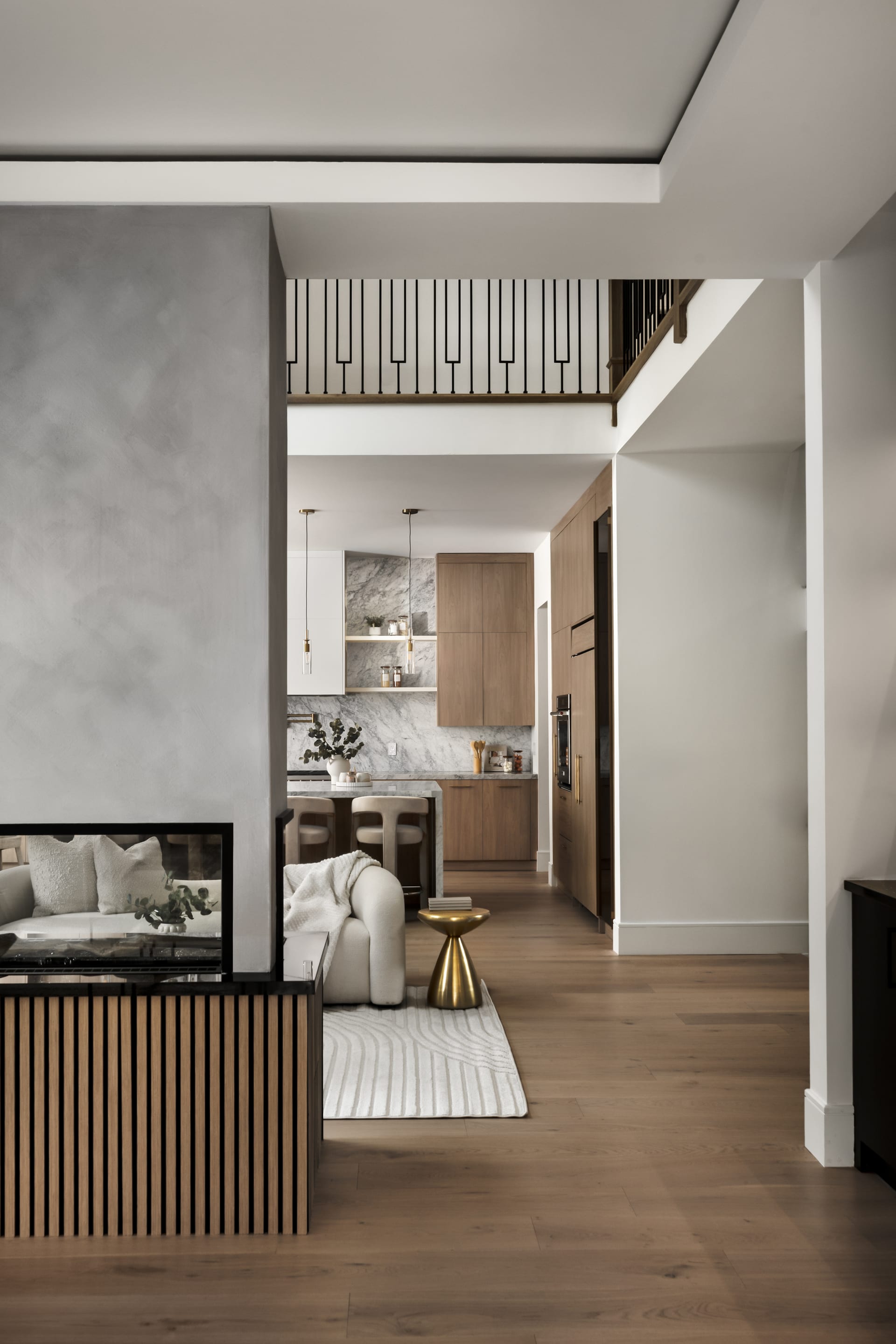
For builders and architects, material fidelity is often the point of the photograph. A natural stone countertop, a brushed brass fixture, a hand-finished plaster wall, these are tactile decisions that must survive the journey from site to screen. Accurate color is what allows a viewer to read the richness of a material rather than a distorted approximation of it.
This becomes especially important when images will live in multiple contexts. A photograph viewed on a calibrated studio monitor may be judged later on a phone, printed in a magazine, or projected in a client presentation. Starting from honest, well-calibrated color gives the image the best chance of holding its integrity across all of these surfaces.
The Role of Consistency Across a Project
A single building or interior scheme is usually photographed as a body of work, not an isolated image. When these photographs appear together, in a portfolio, a brochure, or a hotel’s marketing, inconsistent color becomes immediately visible. One room appears warm and inviting, the next cool and clinical, and the sense of a coherent design vision fractures.
Maintaining consistent tone across an entire shoot is quiet, patient work, but it is what allows a project to read as the unified whole its designers conceived. For hoteliers in particular, where every image contributes to a single atmosphere a guest is being invited to anticipate, this consistency is not a luxury. It is the difference between a believable promise and a disjointed one.
A Discipline of Restraint
Perhaps the hardest part of working with color is knowing when to stop. Modern tools make it easy to push saturation, warm a scene into golden excess, or cool it into fashionable moodiness. Each of these can be seductive, and each can betray the space. The most trustworthy architectural and interior photography tends toward restraint, letting the room speak in its own voice rather than imposing a borrowed one.
True color is not the most dramatic choice. It is the most honest one, and over time honesty is what earns a photograph its credibility with the people who know the space best.
If you would like your next project rendered with color that honors every material and decision, I would welcome a conversation with Matthew Lekker Photography.
Add us as a preferred source on Google
Add as preferred source