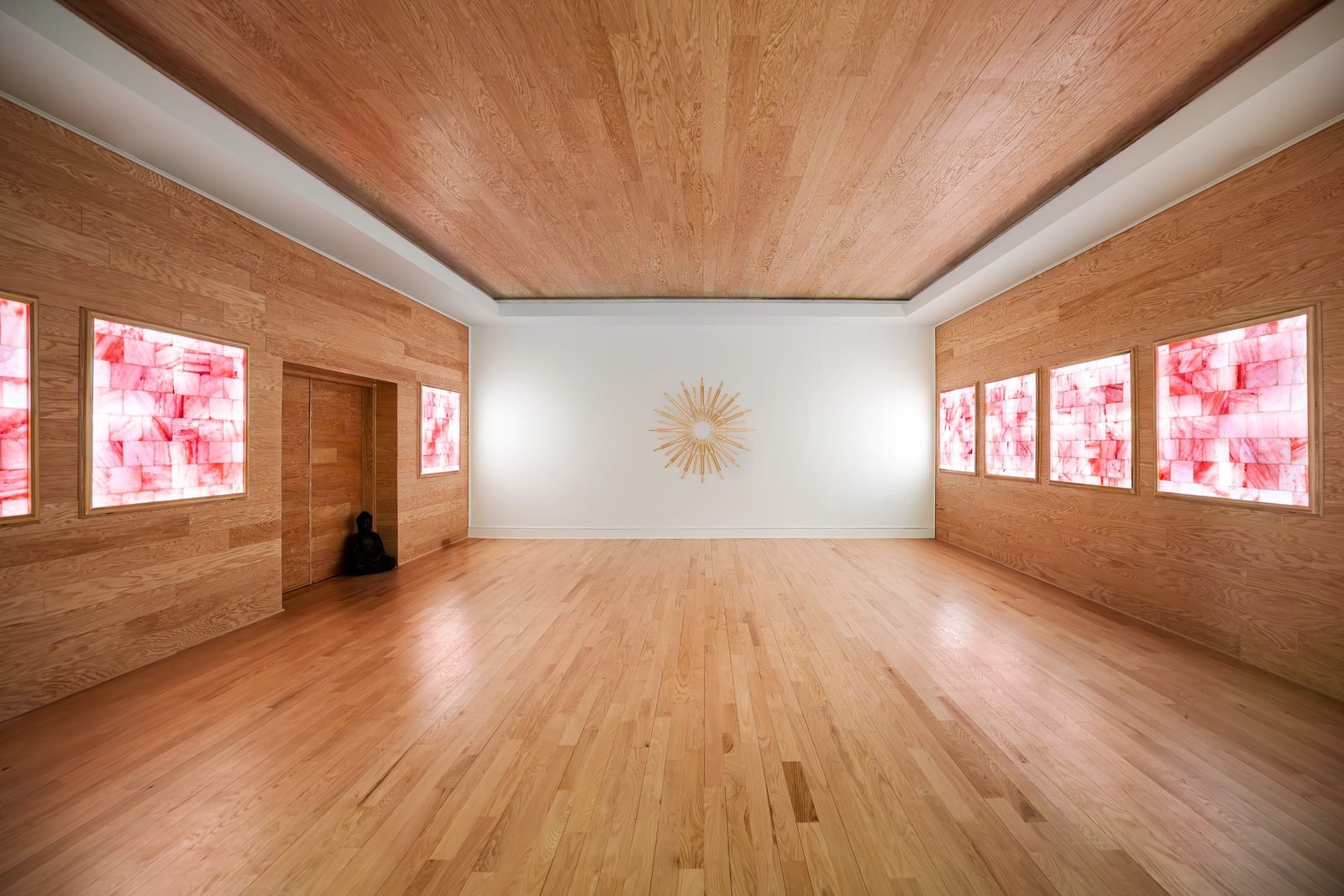
The Quiet Language of Color
Color is the first thing the eye reads in a room and the last thing a photograph should get wrong. Long before a viewer registers proportion or composition, they respond to warmth or coolness, to whether a space feels inviting or clinical. In architectural photography and interior photography alike, the accuracy of color is not a technical footnote. It is the difference between an image that honors a designer’s decisions and one that quietly undermines them.
Every material in a room carries its own tone. Oak leans golden, walnut leans brown-red, marble carries veins of grey and cream. Paint colors are chosen after hours of deliberation, sampled against north and south light, adjusted by a shade to sit correctly beside the flooring. When a photograph shifts that tone, even slightly, the work of specification is lost. A designer who selected a warm greige sees it rendered as flat beige. A hotelier who invested in a specific brass finish watches it turn yellow on screen.
Color is the first thing the eye reads in a room and the last thing a photograph should get wrong.
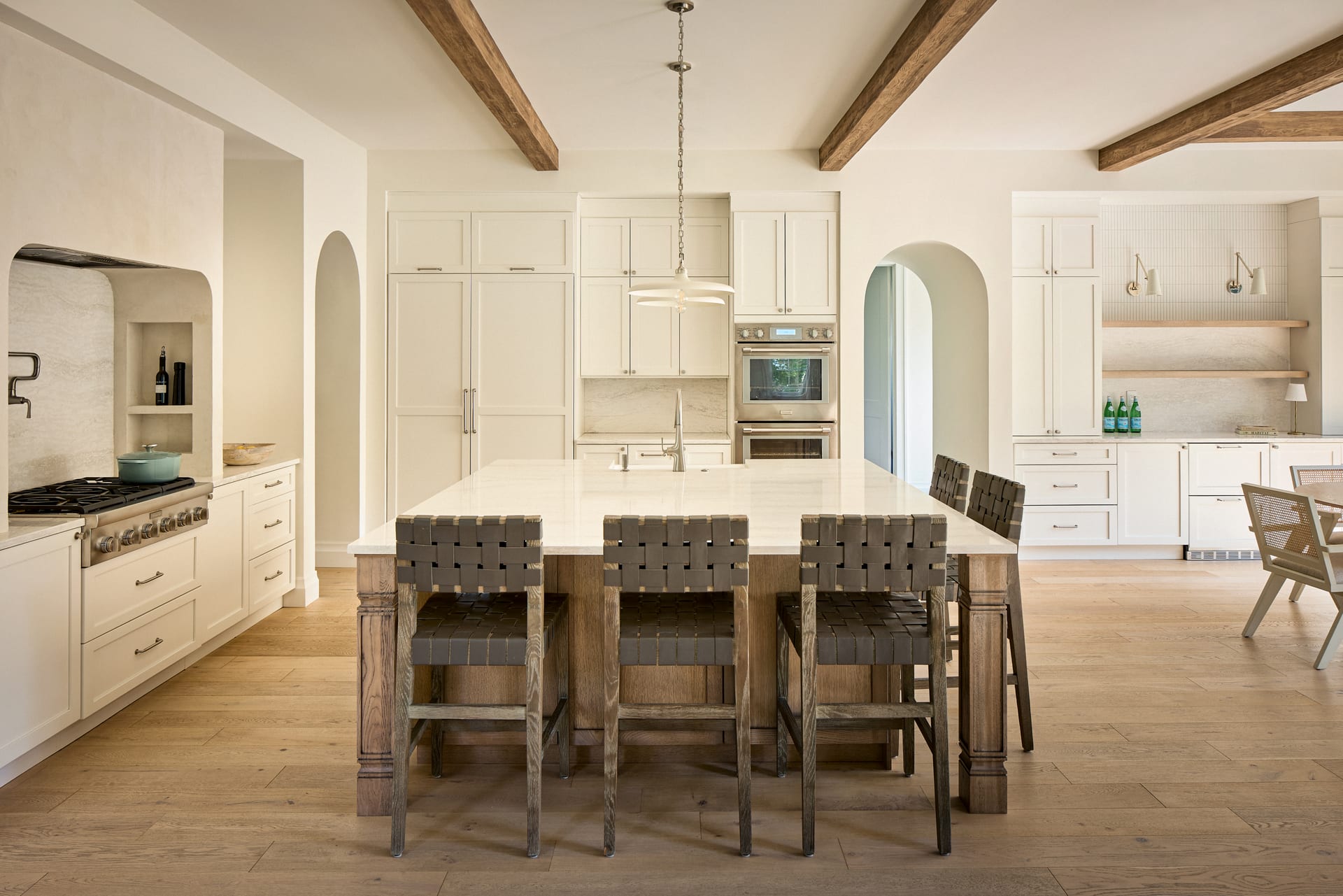
Where Color Casts Come From
A color cast is an unwanted tint that spreads across an image, pulling every surface toward a single hue. It rarely announces itself. More often it settles in quietly, so that a room looks a little too cool, a little too green, without an obvious cause. Understanding the sources is the first step to controlling them.
Mixed Light Temperatures
The most common culprit is light of differing temperatures sharing one frame. Daylight through a window reads cool and blue. A warm incandescent lamp reads amber. Recessed LED downlights may sit somewhere between, or drift green depending on their quality. When these sources meet on a single wall, the camera cannot balance them all at once. One will be corrected and the others will fall out of true.
Reflected Surfaces
Color also travels. A bold red rug throws warmth onto the underside of a coffee table. A green lawn outside a floor-to-ceiling window casts a subtle tint across a pale interior floor. A timber deck bounces gold onto white ceilings. These reflections are natural, and often beautiful, but they can accumulate until a neutral space no longer reads as neutral.
The Sky Itself
On an overcast day, light arrives cool and even. Under a clear blue sky, north-facing rooms take on a distinctly blue character. At the edges of the day, everything warms. The exterior conditions are always present inside the frame, whether or not the window appears in it.
Why It Matters for Design Professionals
For an architect or interior designer, a photograph is a record of intent. It travels to award submissions, to portfolios, to the desks of prospective clients who will never stand in the room. If the color is wrong, the impression is wrong, and no amount of composition will repair it.
The stakes are especially high in a few situations:
- Material-led interiors. Spaces defined by natural stone, timber, plaster, or metal depend entirely on faithful tone. These materials are chosen for their character, and their character is their color.
- Paint and finish specification. When a designer wants a portfolio to reflect exact choices, a shifted hue misrepresents the actual work delivered.
- Hospitality photography. A boutique hotel sells atmosphere. Warmth that reads as sallow, or cool light that reads as clinical, can change a guest’s decision before they arrive.
- Real estate. Buyers make emotional judgments quickly, and unnatural color reads as a lack of care, whether or not they can name why.

Managing Color at the Source
The most reliable color work happens before the shutter, not after. A photograph built on clean light needs far less correction, and correction always costs something in fidelity.
Decide on a Dominant Temperature
Rather than fighting every source, it is often better to commit to one. Photographing during daylight and turning off warmer lamps produces a clean, consistent cool base. Alternatively, embracing a warm evening palette and letting lamps lead creates a deliberate mood. Trouble arrives when neither approach wins and the frame is left divided.
Correct Lamps Where Possible
In a considered interior shoot, mismatched bulbs can be swapped so that every fixture shares a temperature. This is quiet, unglamorous work, but it removes hours of correction later and keeps the space looking intentional rather than assembled.
Watch the Reflections
Noticing where color bounces allows for small adjustments: repositioning a strongly colored object, shifting an angle so a green window falls outside the frame, or timing a shot for when the exterior light is neutral. Awareness is most of the battle.
The most reliable color work happens before the shutter, not after.
The Role of Neutral Reference
Even a carefully lit space benefits from a known reference point. A neutral grey or white card placed briefly in the scene gives a fixed anchor for accurate color during editing. It takes seconds to capture and removes guesswork entirely. From that single reference, the rest of the frame can be brought into true, so that the white of a marble countertop reads as the white it actually is, and the warmth of timber reads as warmth rather than a cast.
This discipline matters most in spaces where the eye has no natural anchor. A room finished entirely in soft neutrals offers few clues about whether the tone is correct. A reference removes the doubt.
Editing With Restraint
Correction in post-production should aim for truth, not invention. The goal is not to make a space look different from how it feels in person, but to translate that felt experience onto a screen that will show it in a hundred different lighting conditions. This calls for a light hand.
Over-correction is its own failure. Pushing an image too far toward neutral can strip a room of the warmth that made it appealing. A space designed to feel golden at dusk should still feel golden in the photograph. The aim is fidelity to intent, which sometimes means preserving a warm cast rather than eliminating it.
- Correct globally first, using a neutral reference, before any local adjustment.
- Preserve the deliberate mood of the space rather than defaulting to clinical neutrality.
- Check images on more than one screen, since color shifts across displays.
- Compare against the true materials whenever possible, not against memory.
Color as a Form of Respect
Getting tone right is ultimately a way of respecting the work being photographed. A designer spends weeks resolving a palette. A builder sources a specific stone. A hotelier tunes the light in a lobby until it feels exactly right. Faithful color honors those decisions and lets them speak clearly to anyone who sees the final image.
Accurate tone rarely draws attention to itself. When color is handled well, a viewer simply believes the room. That quiet believability is the mark of considered interior photography, and it is worth the patience it demands.
If you would like your spaces rendered with color you can trust, Matthew Lekker Photography would welcome a conversation about your next project.
Add us as a preferred source on Google
Add as preferred source