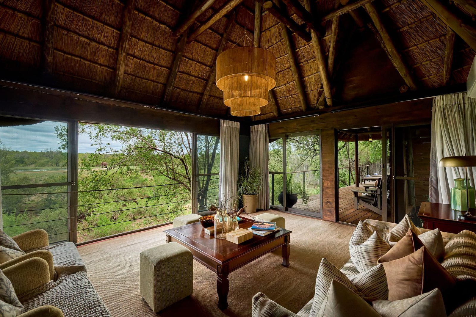
Why Color and Material Deserve Deliberate Attention
Every considered space is, at its core, a conversation between color and material. The warmth of oiled walnut, the cool authority of honed concrete, the way a muted plaster wall shifts through the day. These decisions carry the intent of the designer and the identity of the space. Yet they are also the elements most easily lost in translation between the room and the photograph. Architectural photography and interior photography succeed or fail on whether these tones and textures arrive intact.
For design professionals, this matters more than it might first appear. A client rarely stands in the finished room before deciding to hire you. They meet your work through images. If the palette you labored over reads flat, the timber looks orange, or the stone loses its depth, the photograph quietly misrepresents your craft. Understanding how color and material behave under a lens is not a technical footnote. It is a form of stewardship over your own design.
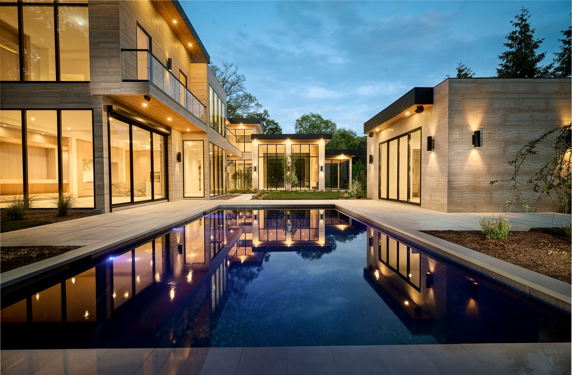
How the Camera Sees Color Differently
The human eye adapts constantly. Walk from a warm interior into daylight and your perception recalibrates within seconds, holding onto a sense of what white truly looks like. A camera has no such intuition. It records the light that is present, which means a room lit by warm lamps, cool north light, and a screen glowing in the corner produces three competing color signatures at once.
This is why white balance is one of the most consequential decisions in interior photography. A single space might contain daylight streaming through a window, tungsten downlights, and the reflected green of a garden beyond the glass. Left unmanaged, these mixed sources muddy the palette and undermine the very restraint a designer worked to achieve.
A photograph that misreads a palette does not simply look wrong; it quietly rewrites the designer’s intention.
The Discipline of Color Accuracy
Accurate color begins on the shoot, not in editing. Where possible, competing light sources are balanced or controlled so that a single dominant temperature governs the frame. Warm and cool sources are rarely allowed to fight without reason. When a designer has chosen a specific paint or a particular species of stone, the goal is fidelity: the finished image should let that decision speak in its true voice.
This precision protects your specifications. A sage green that drifts toward mint, or a soft greige that turns pink, does more than look inaccurate. It suggests a choice you did not make. For architects and interior designers whose reputations rest on subtlety, that gap is worth closing.
Material as the Carrier of Atmosphere
If color sets the mood of a space, material gives it substance. The photograph’s task is to make surfaces legible: to let the viewer feel the tooth of a linen weave, the grain of sawn oak, the faint irregularity of handmade tile. This is where light and angle do their quiet work.
Texture only becomes visible when light rakes across it. Flat, frontal illumination erases the very qualities that make a material desirable. A gentle side light, by contrast, reveals the ridges of plaster, the depth of a bouclé, the subtle sheen of brushed brass. In architectural photography, the direction of light is often what separates a surface that looks like a sample from one that looks like a considered decision.
- Matte surfaces reward soft, directional light that lifts their texture without introducing distracting hot spots.
- Polished and reflective materials demand careful control of what they mirror, since a stone countertop or a lacquered cabinet will faithfully reproduce every reflection in the room.
- Natural materials such as timber and leather carry tonal variation that flat lighting can flatten into uniformity, erasing the character that justified their cost.
The Problem of Reflection
Reflective materials introduce a particular discipline. Glass, glossy tile, marble, metal, and mirror all record their surroundings. A beautifully specified surface can be undone by the reflection of a light stand, a cluttered opposite wall, or an unintended color cast bouncing in from elsewhere. Managing reflection is often invisible labor: repositioning, flagging light, and choosing angles so the material reads as itself rather than as a canvas for everything around it.
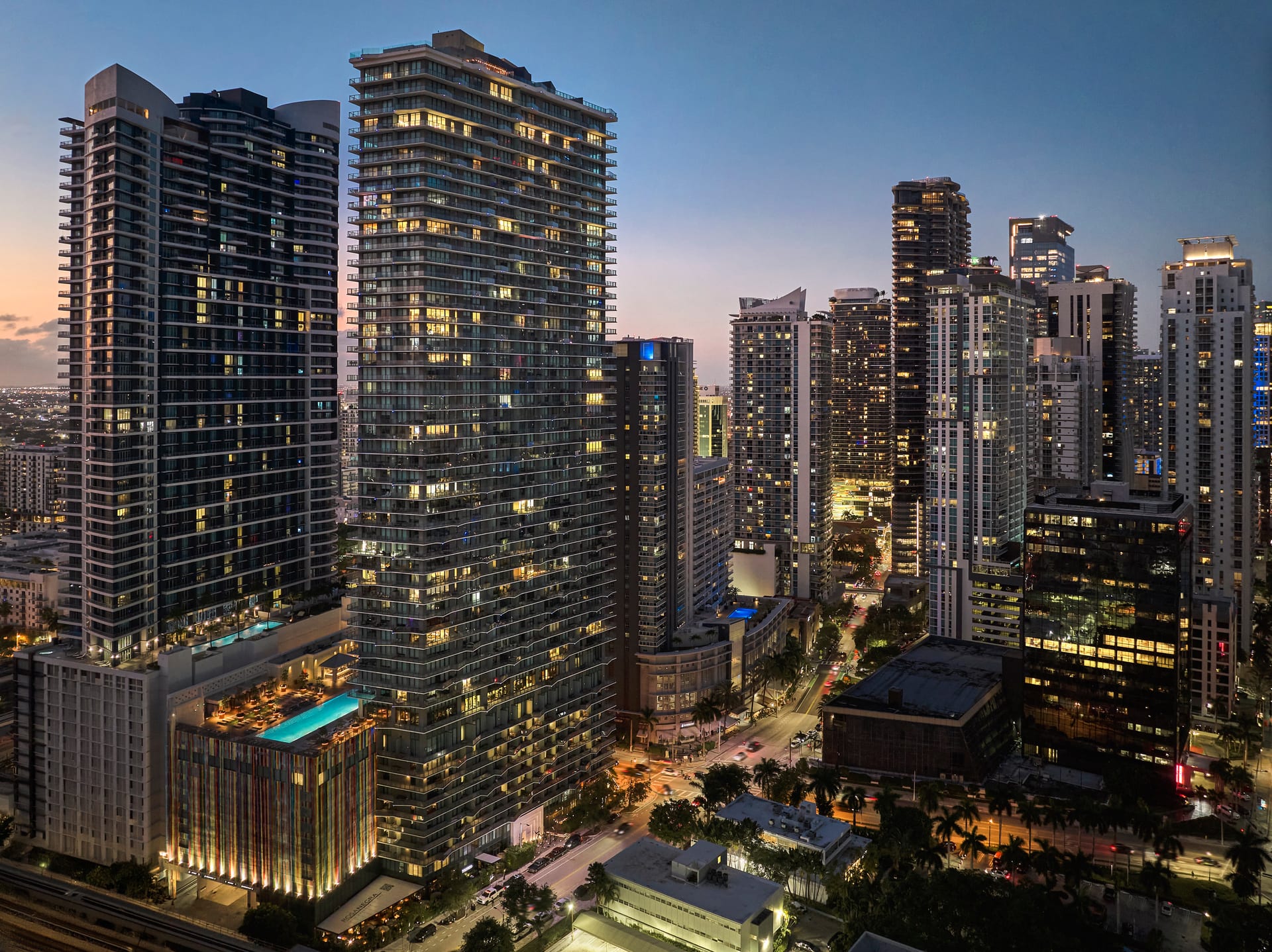
How Color and Material Work Together in the Frame
The strongest interior photography treats color and material as a single composition rather than two separate concerns. A restrained palette allows a rich material to become the focal point. A bold color asks that surrounding textures stay quiet. The photographer’s job is to read the designer’s hierarchy and honor it, ensuring the image emphasizes what the space itself emphasizes.
Consider a room built around a single warm timber island against pale plaster walls. If the walls photograph too cool, the timber loses its glow and the intended contrast collapses. If the walls run too warm, the distinction blurs and the composition flattens. Getting the relationship right is what makes the photograph feel like the room, not merely a record of its contents.
Fidelity to color and material is not about accuracy for its own sake, but about preserving the argument a space is making.
What This Means for Your Next Shoot
Design professionals can do a great deal to protect the integrity of color and material before the camera arrives. A short conversation about intent goes further than any correction afterward.
- Name your priorities. Identify the finishes and tones that define the project so they can be safeguarded through lighting and post-production.
- Share your specifications. Knowing the actual paint, stone, or timber gives a reference point for true color rather than guesswork.
- Flag the difficult surfaces. Highly reflective or subtly textured materials benefit from extra time and attention on the day.
- Discuss the mood. A palette can be rendered faithfully while still carrying warmth or restraint depending on the atmosphere the design intends.
The Long Value of Getting It Right
Color and material are the aspects of a project most likely to date a photograph, and most likely to distinguish it. A trend-chasing edit that oversaturates or crushes tones will feel tired within a season. An image that renders finishes honestly and lets materials breathe will remain useful for years, representing your work with the same integrity it had on completion day. For architects, builders, interior designers, and hoteliers building a lasting body of work, that durability is quietly valuable.
Photography, at its best, is an act of translation. The goal is never to embellish the palette or dramatize the materials beyond what the design offers, but to carry them faithfully from the room into the frame, so that anyone who sees the image understands exactly what was intended.
If you would like your next project photographed with this kind of care for color and material, we would welcome a conversation at Matthew Lekker Photography.