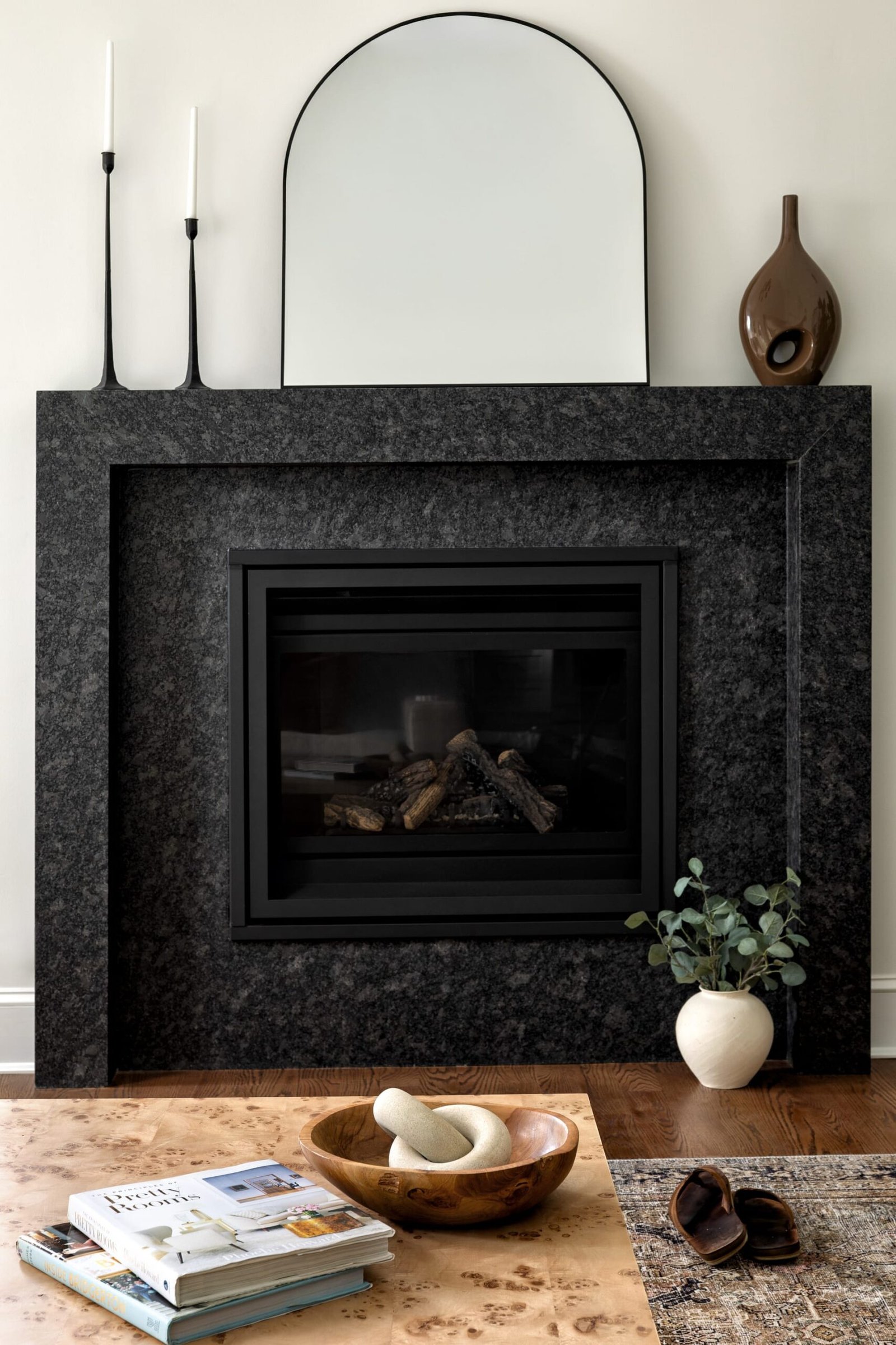
Every well-composed photograph is a negotiation between what is present and what is not. In architecture and interior work, we spend a great deal of attention on the objects, surfaces, and volumes we want to hold in frame. Yet the quiet areas between them, the passages of wall, floor, and air that carry no incident at all, do just as much work. These are the negative spaces, and learning to see them is one of the more refined skills in interior photography.
Negative space is not empty space in the casual sense. It is deliberate rest. It is the pause that lets the eye recover, the breathing room that gives a composition its poise. When a room feels crowded in a photograph even though it is beautifully appointed in person, the culprit is almost always a failure of negative space rather than a failure of the design itself.
Why Emptiness Reads as Quality
Design professionals understand this instinctively in physical space. A generous entryway, an uninterrupted expanse of plaster, a clear run of countertop all communicate care and confidence. The same principle governs the photograph. A frame that grants its subject room to exist tells the viewer that nothing here is accidental.
Negative space is not empty space in the casual sense; it is deliberate rest.
The reason is partly perceptual. The eye reads contrast, and contrast requires ground as much as figure. A single chair against a broad wash of wall becomes a considered gesture. The same chair pressed against a wall of competing objects becomes one more item in a list. When we photograph interiors, we are constantly deciding how much silence to give each element so that its meaning can land.
The Difference Between Empty and Bare
There is a distinction worth holding onto. Empty space is intentional and composed; bare space feels neglected. The gap between the two is subtle, and it usually comes down to edges and proportion. A field of negative space that terminates cleanly, framed by a strong architectural line or a considered edge, reads as luxury. The same field that trails off ambiguously reads as an oversight.
This is why a photograph of a minimal room is often harder to make than a photograph of a maximal one. With little to arrange, every relationship carries weight. The distance from the sofa to the window, the ratio of ceiling to floor in frame, the amount of tabletop left clear all become decisions that cannot hide behind abundance.
Composing With the Void
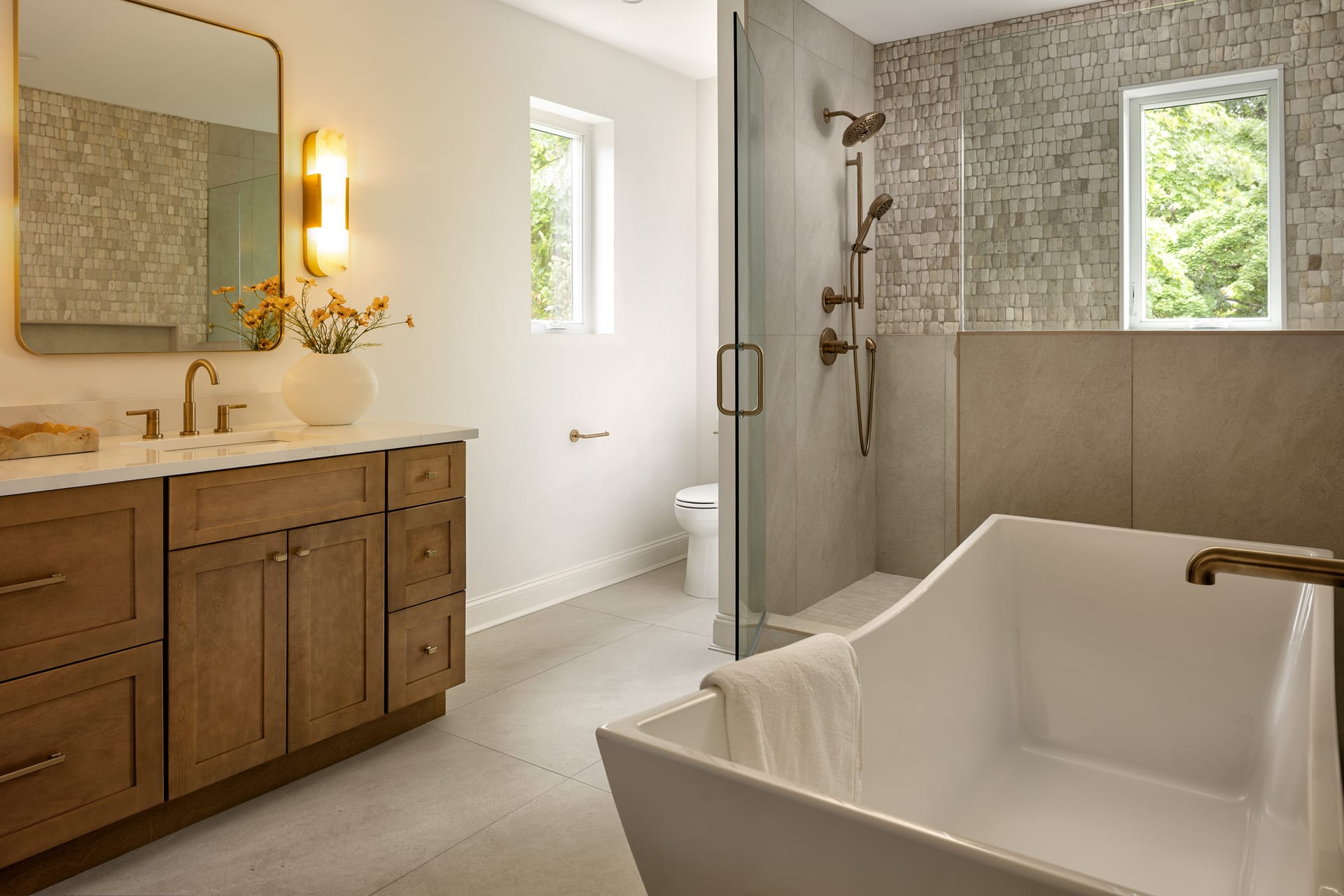
When I approach a room, I try to identify its natural areas of rest before I decide where to place the subject. These are the surfaces the architecture already offers as pause: an unbroken wall, a clear floor plane, an open corner, the sky beyond a window. Once I know where the room wants to breathe, I can compose so those pauses do their job rather than fighting them.
A few working principles guide this:
- Give the subject room to lead. Placing negative space in the direction a subject faces or moves lets the eye follow naturally, without congestion.
- Let one plane stay quiet. If the foreground is busy, allow the background its calm. A frame rarely tolerates activity everywhere at once.
- Watch the corners. The corners of the frame are where clutter accumulates unnoticed. Keeping them clear preserves the sense of ease.
- Respect the ceiling and floor. These broad, often featureless planes are natural reservoirs of rest. Cropping them too tightly removes the room’s air.
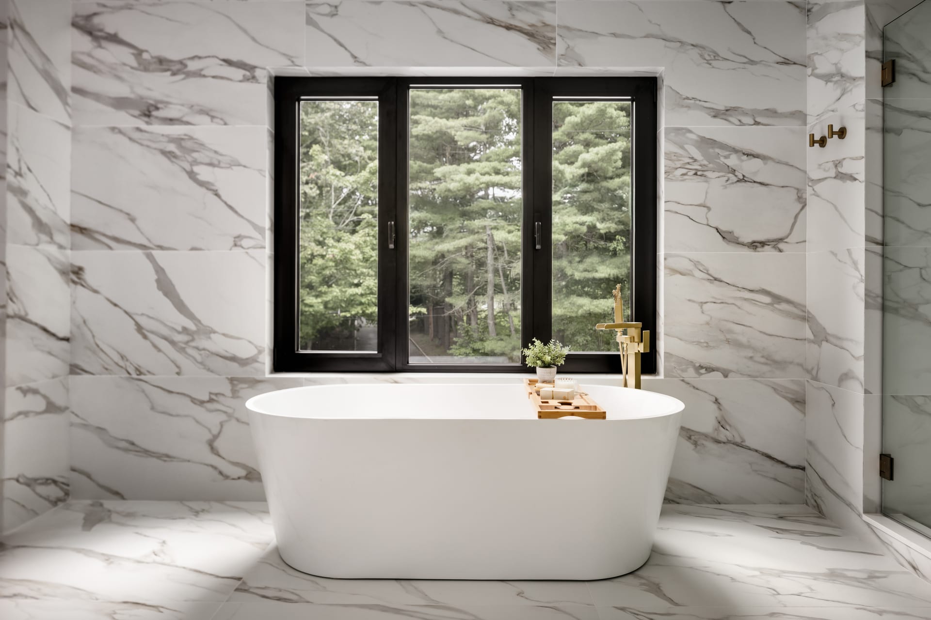
None of this asks for a spare, austere image. A layered, richly styled interior can carry as much negative space as a minimalist one. The task is to ensure that the richness has somewhere to resolve, that the eye is offered a place to set down before it moves on.
Negative Space in Architectural Exteriors
The principle extends beyond the interior. In architectural photography, sky is the most common and most underused form of negative space. A building set against a clean expanse of sky gains authority; the emptiness above it becomes a stage. Overcrowd the frame with surrounding structures, cables, and clutter, and the building loses its standing.
The same is true of foreground. A generous, uninterrupted approach, a courtyard, a plaza, a stretch of paving, lets a facade arrive with weight. Emptiness in front of a building is not wasted composition. It is the runway that gives the subject its sense of scale and arrival.
Emptiness in front of a building is not wasted composition; it is the runway that gives the subject its sense of scale.
The Practical Value for Design Professionals
For architects, interior designers, builders, and hoteliers, understanding negative space changes how you prepare a space for the camera and how you read the images that come back. A room styled to the edges, with every surface dressed, often photographs as busier than intended. Editing the styling, removing rather than adding, frequently produces a stronger frame.
When reviewing a set of images, it is worth asking a few questions of each one:
- Does the eye have somewhere to rest, or is it working the whole time?
- Does the negative space feel composed and intentional, or does it read as an accident?
- Is the subject given room to lead, or is it boxed in by competing detail?
- Does the frame breathe, or does it feel held at capacity?
These are not technical questions. They are questions about experience, about how the photograph makes a viewer feel. And that experience is precisely what a portfolio needs to convey: not merely that a space exists, but that it was made with care and knows how to hold a room together.
Restraint as a Signature
The most confident architectural and interior photography knows what to leave out. It resists the impulse to fill, to prove, to document every corner. Instead it trusts the viewer to complete the picture, offering enough and no more. That restraint is not emptiness. It is the mark of an image that understands its own subject.
For hospitality and residential work especially, this quality translates directly into perceived value. A guest, a buyer, or a client responds to the sense of spaciousness a photograph conveys, and that sense is authored as much by what surrounds the subject as by the subject itself.
If you are preparing a space and want images that let it breathe, I would welcome a conversation with Matthew Lekker Photography.
Add us as a preferred source on Google
Add as preferred source