The Surface Beneath the Space
A room is understood first through its shapes and light, but it is remembered through its surfaces. The cool weight of honed stone, the soft nap of bouclu00e9, the way oak deepens where hands have passed over it for years. These are the qualities a design professional labours over and a client pays to experience. Yet material is among the most difficult things to translate into a photograph, because a still image asks the eye to feel something it can only see.
Good architectural photography does not merely record that a wall is timber or that a floor is polished concrete. It conveys how those materials behave: their density, their temperature, the way they hold or release light. For architects, interior designers, and builders whose work lives in the specificity of a chosen finish, this is not a decorative concern. It is the difference between an image that documents a space and one that communicates its intent.
Why Texture Resists the Camera
The human eye reads texture through a combination of shadow, movement, and touch memory. We know linen is soft because we have felt it, and a small shift of the head reveals its weave from a dozen angles. A photograph has none of these advantages. It offers one fixed viewpoint, one moment of light, and no tactile history. Everything the surface needs to say must be said within that frame.
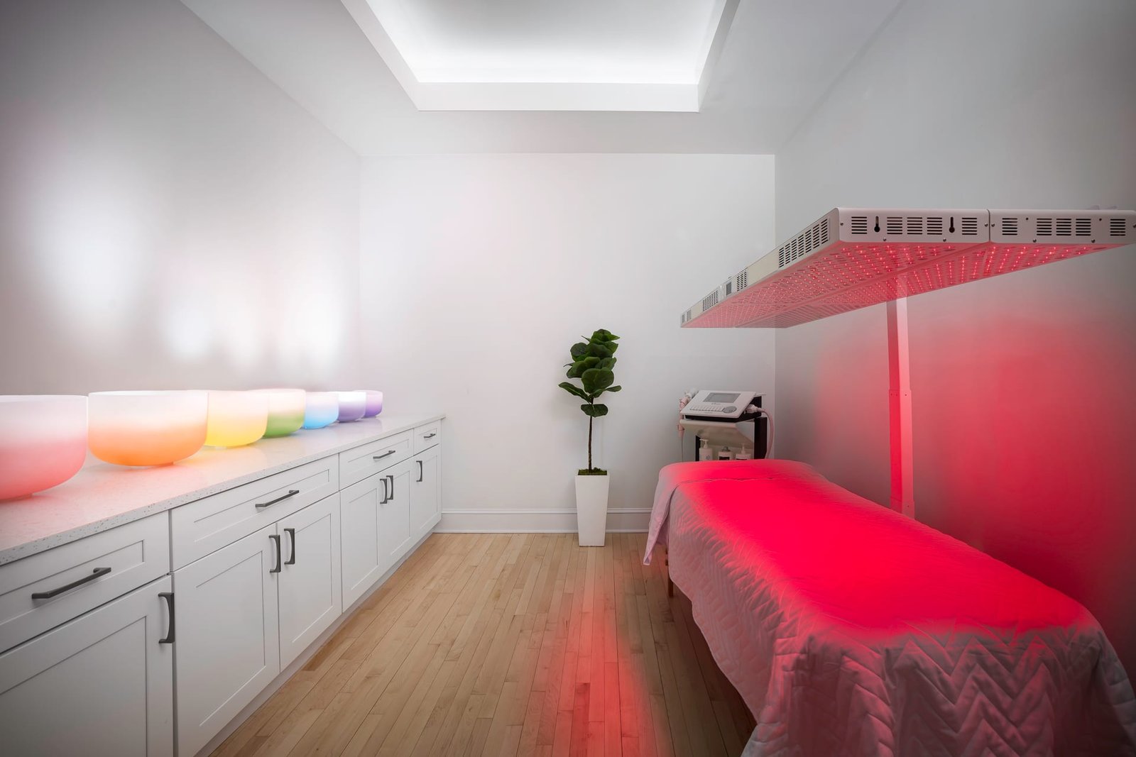
This is why flat, even lighting so often fails material. When light arrives from directly behind the camera, it erases the microscopic shadows that give a surface its grain. Plaster looks like paint. Travertine looks like laminate. The information is technically present, but the feeling has been washed away.
A surface without its shadows is a surface stripped of its truth.
The Role of Raking Light
The single most effective tool for revealing texture is directional, low-angled light, often called raking light. When light grazes a surface at a shallow angle, every irregularity casts a tiny shadow, and those shadows accumulate into a visible sense of relief. This is how the tooth of a hand-troweled wall becomes legible, or how the joints in a brick facade gain depth rather than reading as a flat pattern.
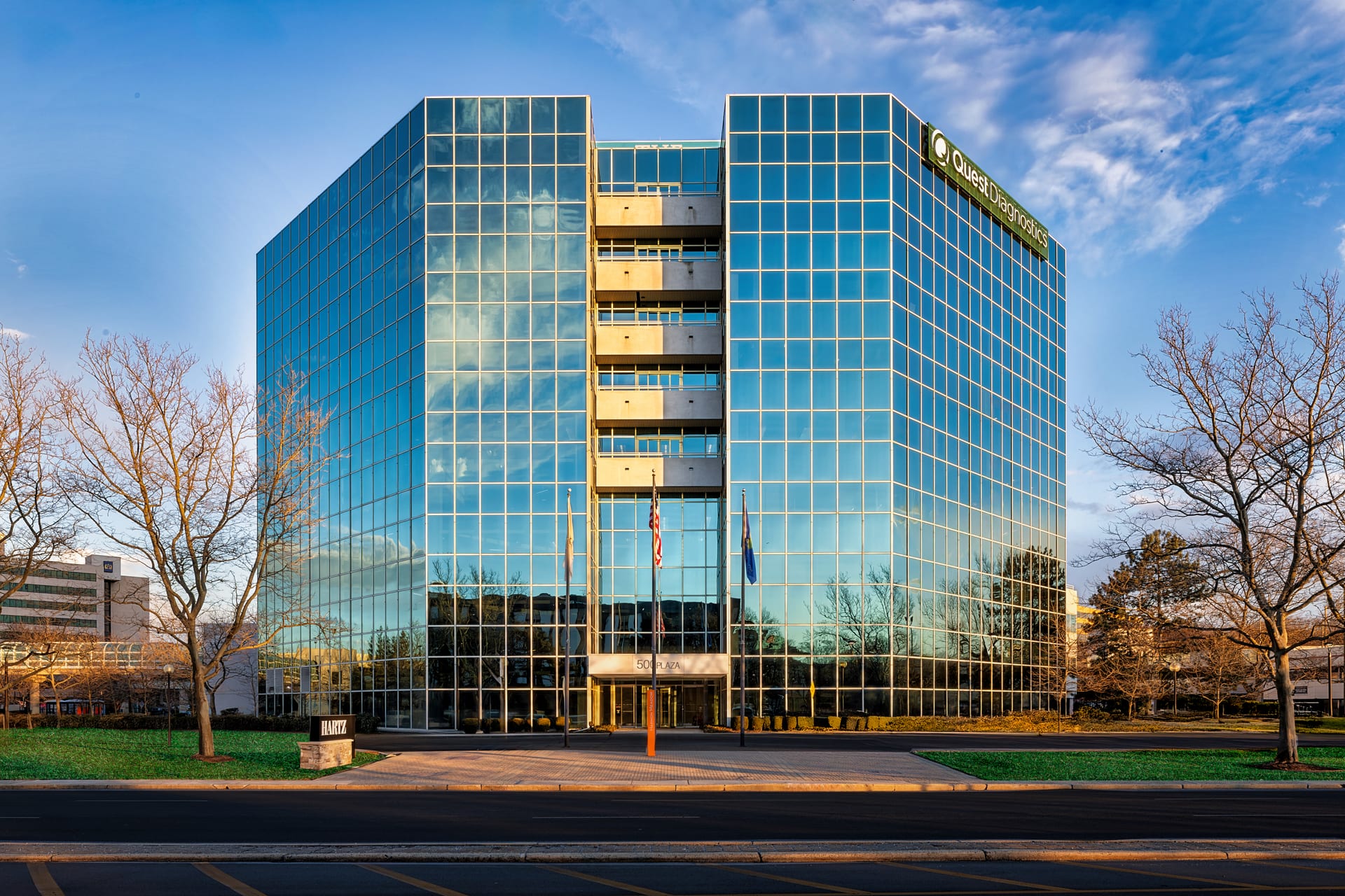
In interior photography this often means working with a window as a side light rather than a frontal one, positioning the camera so that daylight sweeps across the material instead of hitting it head on. In architecture, it can mean timing an exterior frame for the hour when the sun rakes along a textured cladding rather than flattening it at midday. The material dictates the light, not the other way around.
Reading Different Materials
Every surface has its own logic, and part of the craft lies in recognising what each one needs.
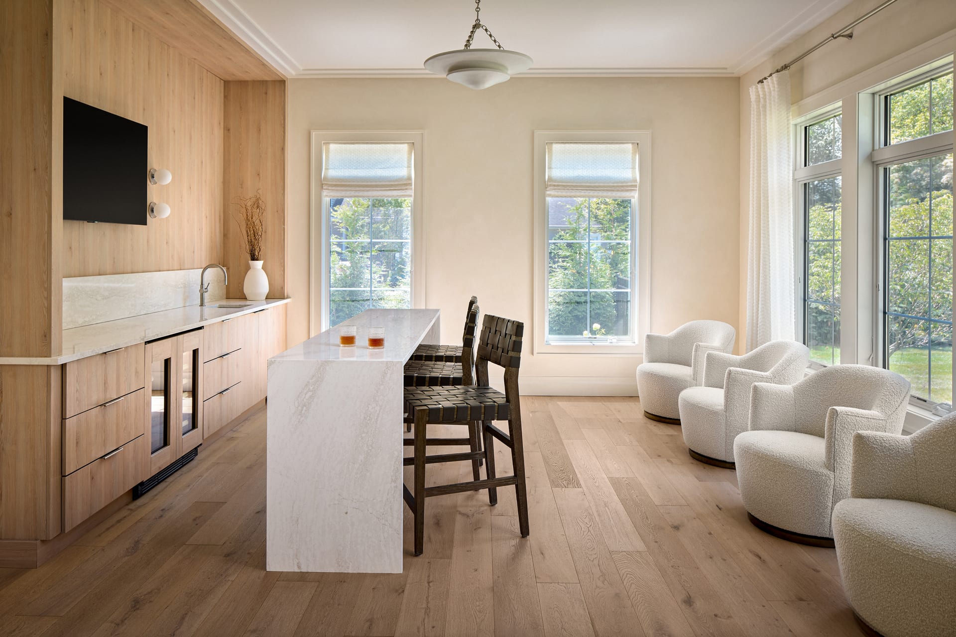
- Stone and concrete: These reward directional light that reveals their aggregate, veining, and subtle tonal shifts. A polished stone benefits from a controlled reflection that shows its depth, while a honed or matte finish needs raking light to avoid appearing lifeless.
- Timber: Grain is everything. Light should run along the direction of the grain to emphasise its rhythm, and reflections must be managed so that a lacquered finish reads as wood rather than a mirror.
- Textiles: Softness is communicated through gentle gradients of shadow. A cushion or throw shot in flat light looks like a printed image of fabric; the same object under soft, angled light reveals its pile and drape.
- Metal: The character of brass, steel, or blackened iron lives entirely in what it reflects. The photographer must consider not only the metal but the environment mirrored within it.
- Glass and glazed tile: These depend on the interplay of reflection and transparency, requiring a careful balance so the surface neither disappears nor dominates.
Contrast as Composition
Material rarely appears in isolation. The most compelling interior photography often works because it places contrasting surfaces in conversation: rough against smooth, warm against cool, matte against gloss. A concrete plinth beside a wool rug, a plaster wall meeting a brass fixture. These pairings are frequently the reason a design succeeds, and photographing them deliberately honours the decisions behind the space.
When composing, it helps to think in terms of material adjacency. Where do two finishes meet, and what happens at that seam? The junction is often where craftsmanship is most visible, and where the eye is most rewarded.
The Detail and the Whole
Texture works at two scales. There is the intimate close frame, where a single material fills the image and its qualities are studied in depth, and there is the wider view, where texture provides quiet richness beneath the architecture. Both matter. A body of work that shows only wide shots loses the tactile intimacy of a space, while a set of close details alone leaves the material untethered from its context.
Material is what turns a photograph of a room into a photograph of an experience.
For a hotelier, this balance is particularly valuable. A guest chooses a property on the promise of how it will feel, and feeling is largely a matter of surface: the crispness of bed linen, the warmth of a timber headboard, the coolness of a stone bath surround. Photography that captures these qualities sells an atmosphere rather than a floor plan.
Practical Preparation for Material
Much of what makes material photograph well begins before the camera is set up. Surfaces should be clean and considered, though not sterile. Dust reads clearly on dark or glossy finishes, and fingerprints on metal or glass become obvious once light strikes them. At the same time, the honest patina of a well-used material, the worn edge of a leather chair or the soft ageing of a timber floor, is worth preserving rather than concealing. The goal is truth, not perfection.
A few considerations that reward attention on the day:
- Wipe down reflective surfaces and glazing shortly before shooting.
- Note the direction of natural light and how it moves across key materials through the day.
- Identify the surfaces that define the project’s character, and ensure they receive dedicated frames.
- Allow the photographer time to work with light modifiers where a finish needs shaping rather than simply illuminating.
Fidelity to the Maker
Ultimately, photographing material well is an act of respect toward the people who selected and installed it. The specification of a finish is rarely accidental. It carries budget, intention, and often a great deal of persuasion. When architectural photography renders that material faithfully, it defends those decisions and communicates them to future clients, collaborators, and audiences who will never stand in the room.
This is why material fidelity should never be an afterthought in a brief. It is the layer that gives a photograph its credibility. A space can be beautifully composed and correctly lit, yet still fall flat if the surfaces feel synthetic or generic. Get the material right, and the image gains a quiet authority that no amount of styling can replace.
If you would like your surfaces and finishes photographed with the care they deserve, we would be glad to hear from you at Matthew Lekker Photography.