
The Question a Surface Asks
Every material in a space carries a promise. Brushed oak suggests warmth underhand. Honed limestone hints at coolness. A boucle sofa implies a certain give when you sit. In person, these promises are read instantly through touch, but a photograph has no fingers. It must convince the eye of something the hand will never verify. This is the quiet discipline behind rendering material truth, and it is one of the most undervalued skills in architectural photography and interior photography alike.
Design professionals invest enormous care in specifying finishes. The difference between a matte and a satin lacquer, between wire-brushed and smooth timber, between wool and synthetic, is often where the budget and the intent of a project live. When a photograph flattens those distinctions into a generic sheen, it erases the very decisions that made the work worth commissioning. The image may still look pleasant, but it no longer tells the truth about what was built.
Why Texture Reads Differently Than We Expect
Texture in a photograph is not created by the material itself. It is created by light meeting the material at an angle that reveals its structure. Flat, frontal light erases grain and weave. Raking light, arriving nearly parallel to a surface, exaggerates it. Somewhere between those extremes lies the honest rendering, the one that matches how a person standing in the room would perceive the finish.
A photograph has no fingers, yet it must convince the eye of something the hand will never verify.
This means texture is a lighting decision before it is a composition decision. A plaster wall that looks convincingly hand-troweled in one frame can look like painted drywall in another, taken minutes later, simply because the light shifted. The material did not change. The relationship between the light and the surface did.
Reading the Five Common Surfaces
Most interiors are built from a small vocabulary of materials, and each has its own behavior under the lens. Understanding how they respond helps everyone on a shoot anticipate what will and will not translate.
Timber and Grain
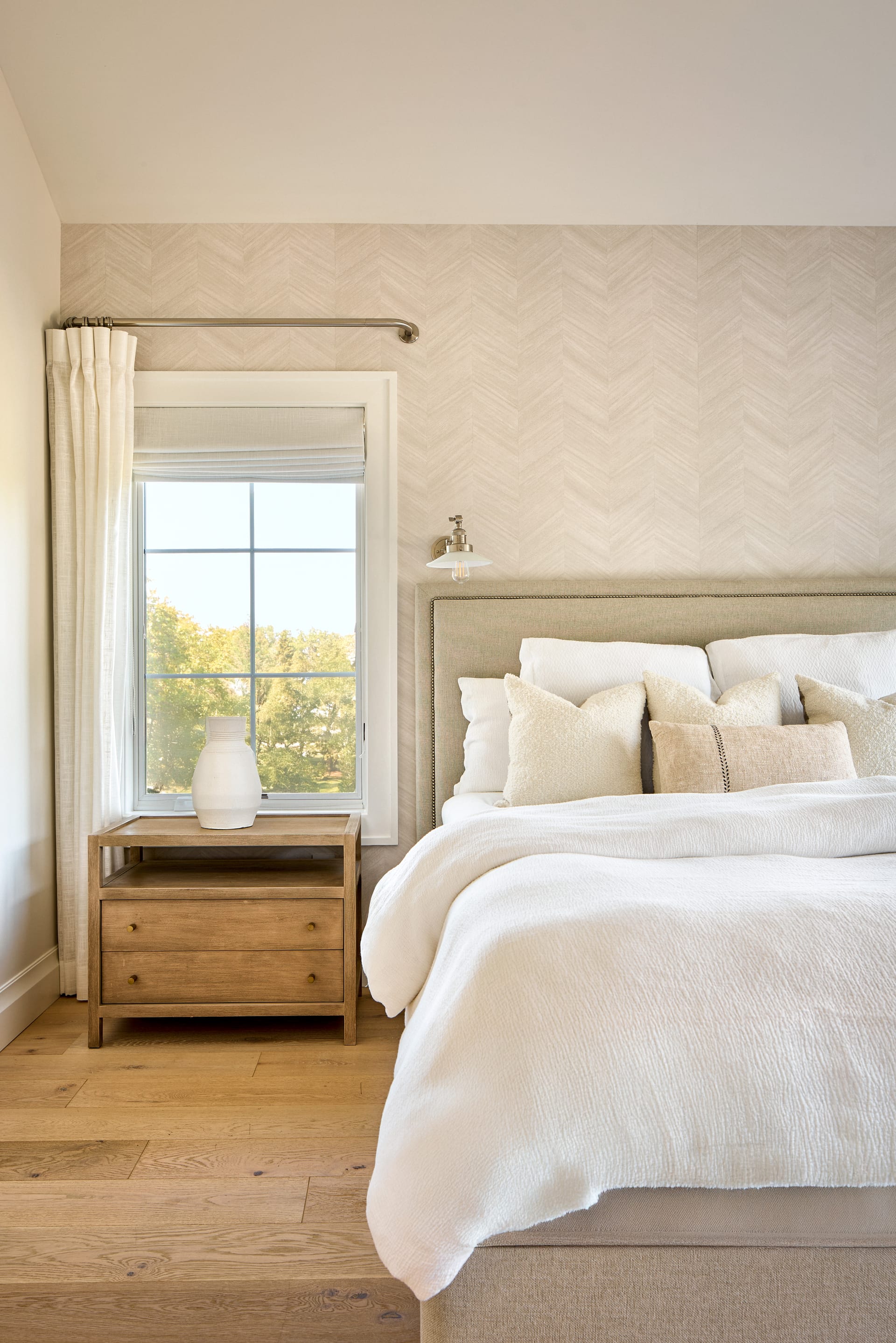
Wood wants side light. Its story is written in the grain, and grain only appears when light skims across it rather than striking it head-on. Overly bright, direct light bleaches the tone and collapses the figure of the wood into a pale, characterless plane. A slightly lower, angled key preserves the depth of the grain and the honesty of the stain.
Stone and Masonry
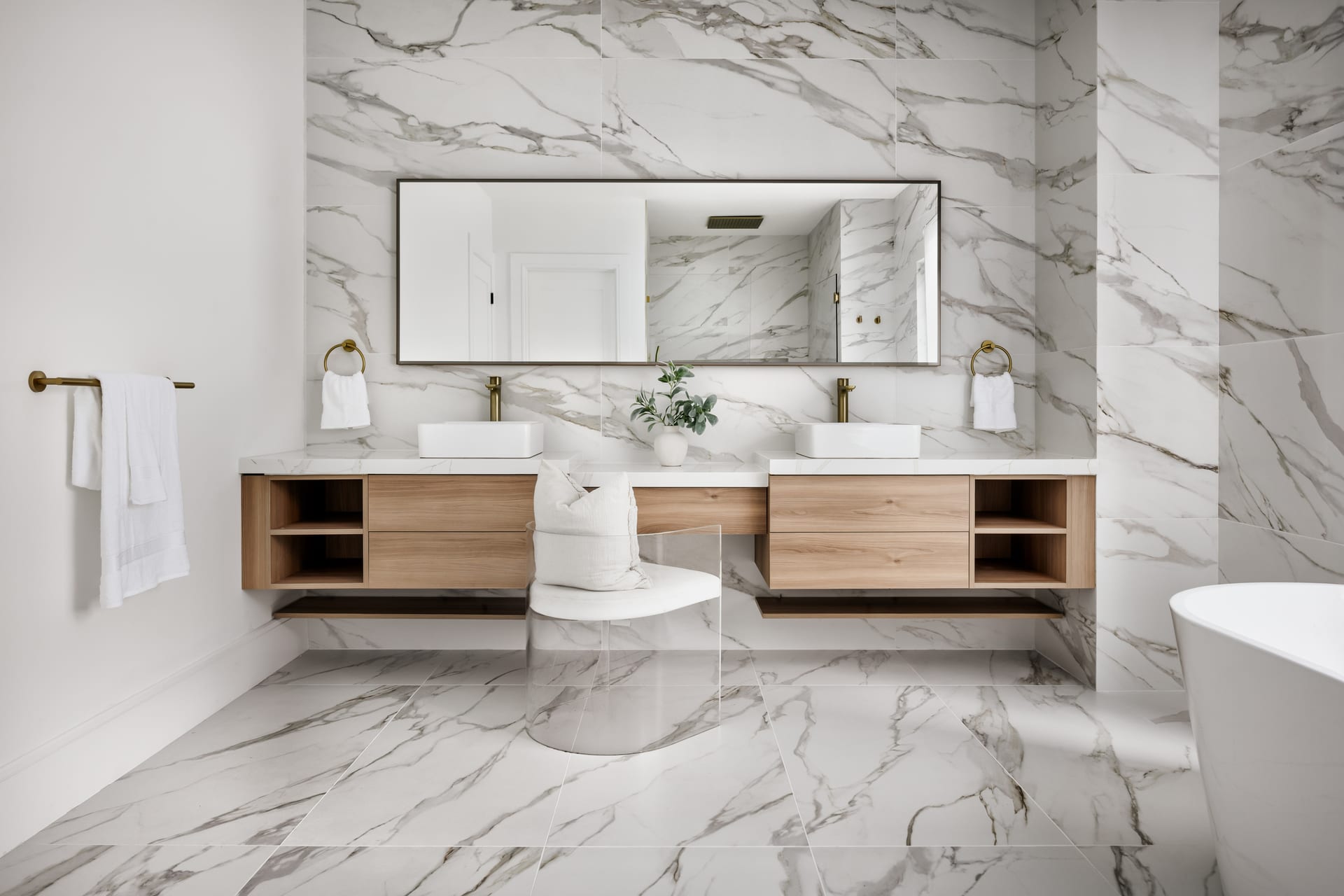
Stone lives in its variation. Veining in marble, the tonal drift across travertine, the irregular face of split stone, all of these depend on gradation. A surface lit too evenly loses the movement that makes stone feel geological rather than printed. The goal is to keep the natural falloff of light across the material so the eye reads mass and permanence.
Textile and Upholstery
Fabric is about softness and depth. A close weave can look flat and cheap when hit with hard light, and rich and tactile when lit with a broad, soft source that lets the pile cast tiny internal shadows. The nap of velvet, the loop of boucle, the slub of raw linen, each becomes legible only when the light is diffuse enough to respect the fiber.
Metal and Reflective Finishes
Metal does not have a texture so much as it borrows one. A polished surface shows the room around it, so its character comes from what it reflects. Controlling those reflections, keeping them clean and intentional rather than cluttered, is how brushed brass or blackened steel reads as considered rather than accidental.
Plaster and Painted Walls
The subtlest of all. A hand-applied finish differs from a flat coat by fractions of a millimeter of relief. That relief needs a directional light to exist in a photograph at all. Without it, months of artisanal work vanish into a uniform field of color.
The Detail Frame as Evidence
Wide shots establish a room, but material truth often lives in the closer frame. A tight composition of a stone junction, a joint in millwork, the meeting of two textiles, functions as evidence. It tells the viewer that the quality visible in the wide shot was real all the way down to the seam.
- Photograph junctions where two materials meet, as these reveal craftsmanship.
- Include a small tonal range in each detail so the surface has depth rather than a single flat value.
- Let some frames be almost abstract, reading as pure texture, to anchor the tactile story.
These frames rarely become the hero image, but they do the quiet work of building trust. A prospective client, another designer, or a hotel guest reading a portfolio absorbs them almost unconsciously, and comes away believing the space is as considered as it claims to be.
What Post-Production Can and Cannot Do
There is a temptation to treat texture as something recoverable in editing. Some of it is. Contrast and clarity adjustments can strengthen a grain that was captured but underemphasized. What editing cannot do is invent texture that the light never revealed in the first place. If a surface was lit flat, no amount of local contrast will restore the honest relief. The information simply was not recorded.
Texture is a lighting decision before it is a composition decision.
This is why the material conversation belongs on set, not at the desk. The most efficient path to a truthful image is to shape the light for the finish while standing in front of it, adjusting angle and diffusion until the surface behaves the way it does in life.
A Practical Note for the Design Team
When you brief a shoot, it helps to name the materials you most want to see honored. If the walls are a limewash you spent weeks perfecting, or the floor is a reclaimed timber with a story, say so. That single instruction changes how a frame is lit and often becomes the difference between a photograph that documents a room and one that conveys its quality.
Material truth is not about drama or effect. It is about fidelity, the sense that the image and the space agree with each other. For architects, builders, interior designers, and hoteliers, that agreement is the foundation of every credible portfolio, because it lets the work speak for itself without exaggeration.
If you would like your finishes and surfaces rendered with this kind of care, Matthew Lekker Photography would welcome a conversation about your next project.
Add us as a preferred source on Google
Add as preferred source