The Line as Foundation
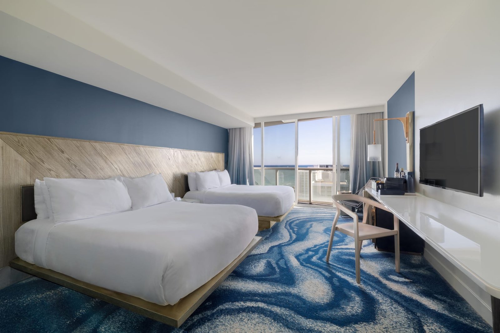
Every photograph of a building begins with a line. Before color, before light, before the arrangement of furniture within a room, there is the question of whether the walls stand upright and the floor runs true. In architectural photography, the line is not a stylistic flourish. It is the structure on which credibility rests. A doorway that leans, a column that tilts, a horizon that slips a degree off level — these small failures register in the viewer before they can name what is wrong.
For architects, interior designers, and builders, this matters more than in almost any other kind of image-making. The work being photographed is itself an act of precision. Walls are plumb by intention. Sightlines are planned. When a photograph honors those decisions, it speaks the same language as the design. When it does not, it introduces a discord that undermines the very thing it was meant to celebrate.
Why the Eye Insists on Straight
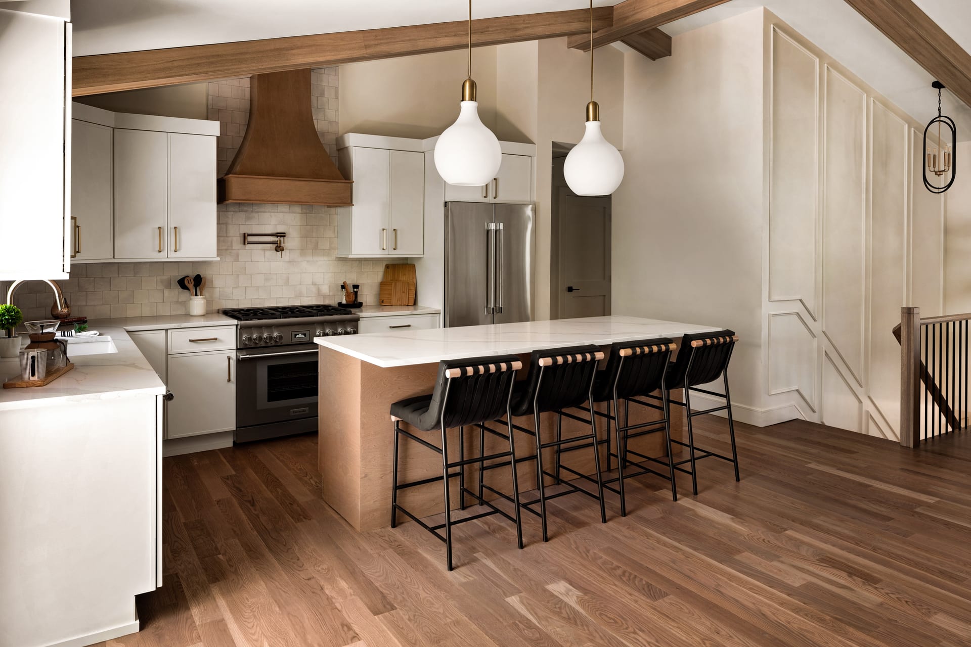
We carry an internal sense of gravity. We know, without measuring, what upright feels like. A vertical that converges or leans triggers a quiet unease, a suspicion that the space is unstable even when we cannot articulate why. This is the reason a slightly crooked frame can make an otherwise beautiful room feel subtly off.
A level frame is not something a viewer notices; it is something they feel the absence of.
The verticals — door frames, window mullions, the corners where two walls meet, the edges of cabinetry — act as the skeleton of the image. When they run parallel to the edges of the frame, the space reads as solid and intentional. The horizontals do similar work along the ground: countertops, shelf lines, the meeting of floor and wall. Together they form a grid that the eye can rest against.
The Problem of Converging Verticals
Point a camera slightly upward and the verticals begin to lean toward one another, as though the building were tapering into the sky. This is the most common distortion in interior and architectural work, and the most distracting. It happens whenever the sensor plane is tilted away from vertical, which is nearly unavoidable when photographing tall spaces or shooting from a low position.
The disciplined solution is to keep the camera level and correct the framing through lens choice, camera height, or perspective control. A tilt-shift lens allows the photographer to raise the field of view without tilting the camera, preserving true verticals. Where that is not possible, careful correction in post-production can recover much of the geometry — though it is always better to protect the line at the moment of capture than to rescue it afterward.
The Height Decision
Where the camera sits vertically has a direct effect on how lines behave. A camera placed too high looks down on a room, foreshortening the floor and pushing furniture into a heap. Too low, and the ceiling looms while table surfaces vanish. There is usually a height at which the verticals stay honest and the horizontals distribute the space evenly — often lower than instinct suggests, frequently around the level of a seated eye.
- For residential interiors, a lower camera tends to give furniture presence and keeps the ceiling from dominating.
- For grand hospitality spaces, a mid-height position balances the scale of the architecture against the human comforts within it.
- For exteriors, the goal is usually to keep the building’s verticals parallel, which means resisting the urge to tilt up at a tall facade.
Each choice is a negotiation between honoring the line and serving the story of the room. The line is rarely the only consideration, but it is the one that quietly governs the rest.
When to Break the Rule
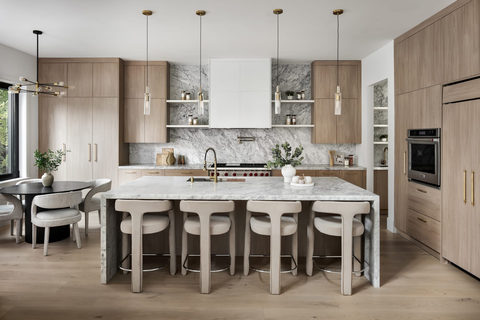
Discipline is not dogma. There are moments when a deliberate departure from perfect verticality serves the image. A dramatic upward view of a spiral staircase, a soaring atrium, or a cathedral ceiling may embrace convergence to communicate height and awe. The difference is intention. A leaning line that reads as an accident undermines trust; a leaning line that reads as a decision creates drama.
The rule earns its power precisely because we know when the photographer chose to set it aside.
The test is simple. If the departure looks like a mistake, correct it. If it looks like a considered gesture — bold, committed, unmistakably chosen — it can lift an image beyond the ordinary. Boutique hotels and architects presenting signature spaces often benefit from one or two of these expressive frames within a set that is otherwise scrupulously level.
Reading the Horizontals
Verticals receive most of the attention, but horizontals do subtle work of their own. A countertop that runs slightly downhill, a picture rail that drifts, a horizon glimpsed through a window that sits off level — each introduces a small tension. In interior photography, the meeting of floor and wall is a reliable reference. If that line runs true across the frame, much of the image will feel settled.
Water is unforgiving here. A pool, a bath, or a reflecting surface will always find true level, and any tilt in the frame becomes instantly visible against it. When photographing spaces that include water, the horizontal becomes non-negotiable.
The Line and the Client’s Confidence
For design professionals commissioning photography, the treatment of line is a useful signal of craft. A portfolio full of leaning walls and drifting horizons suggests haste. A body of work in which the lines are considered — held true where truth serves, bent only with clear purpose — suggests a photographer who understands that architecture is a discipline of precision and treats the image with equal care.
This is not about rigidity. It is about respect. The line is the point at which the photographer’s craft meets the designer’s intent. When both are working from the same regard for what is upright and true, the resulting images carry an authority that no amount of styling can fake.
A Practical Habit
The most reliable way to protect the line is to build a habit of checking it before anything else:
- Level the camera first, using a spirit level or the in-camera grid.
- Compose within a level frame rather than tilting to fit.
- Watch the corners of the frame, where distortion shows first.
- Reserve deliberate convergence for images where the drama justifies it.
These small disciplines take seconds and repay themselves in every frame. They are the quiet groundwork beneath a photograph that feels calm, considered, and true to the space it represents.
If you are preparing to photograph a project and want images that honor the precision of your work, we would welcome the conversation at Matthew Lekker Photography.
Add us as a preferred source on Google
Add as preferred source