The Question at the Border
Most conversations about architectural photography concern themselves with what appears at the center of an image: the sightline, the hero furniture, the play of light across a wall. Less often discussed, and arguably more decisive, is the edge. The border of a photograph is where a room stops and the viewer’s imagination begins. Every framing choice is quietly an act of authorship, because it determines not only what is seen but what is withheld.
For architects, interior designers, and hoteliers, this matters more than it might appear. A space is continuous. A photograph is finite. Somewhere along the perimeter of every frame, a wall gets cut, a doorway gets clipped, a piece of furniture surrenders half of itself to the crop. Where that edge lands changes how the room reads, how large it feels, and how complete it appears.
The border of a photograph is where a room stops and the viewer’s imagination begins.
What the Edge Communicates
An image tightly cropped to a vignette suggests intimacy and focus. A frame that gives generous room around its subject suggests calm, air, and confidence. Neither is correct in the abstract; each is correct for a particular intention. The problem arises when the edge falls by accident rather than by decision, leaving a sliver of a radiator, an orphaned chair leg, or a doorframe that neither belongs nor resolves.
In interior photography, the edge does three jobs at once. It defines the boundary of the composition, it establishes the relationship between the subject and its surroundings, and it signals whether the room continues beyond the frame or ends there. A skilled reading of the border lets a photograph feel like a deliberate window rather than a random slice.
The Clean Break Versus the Implied Continuation
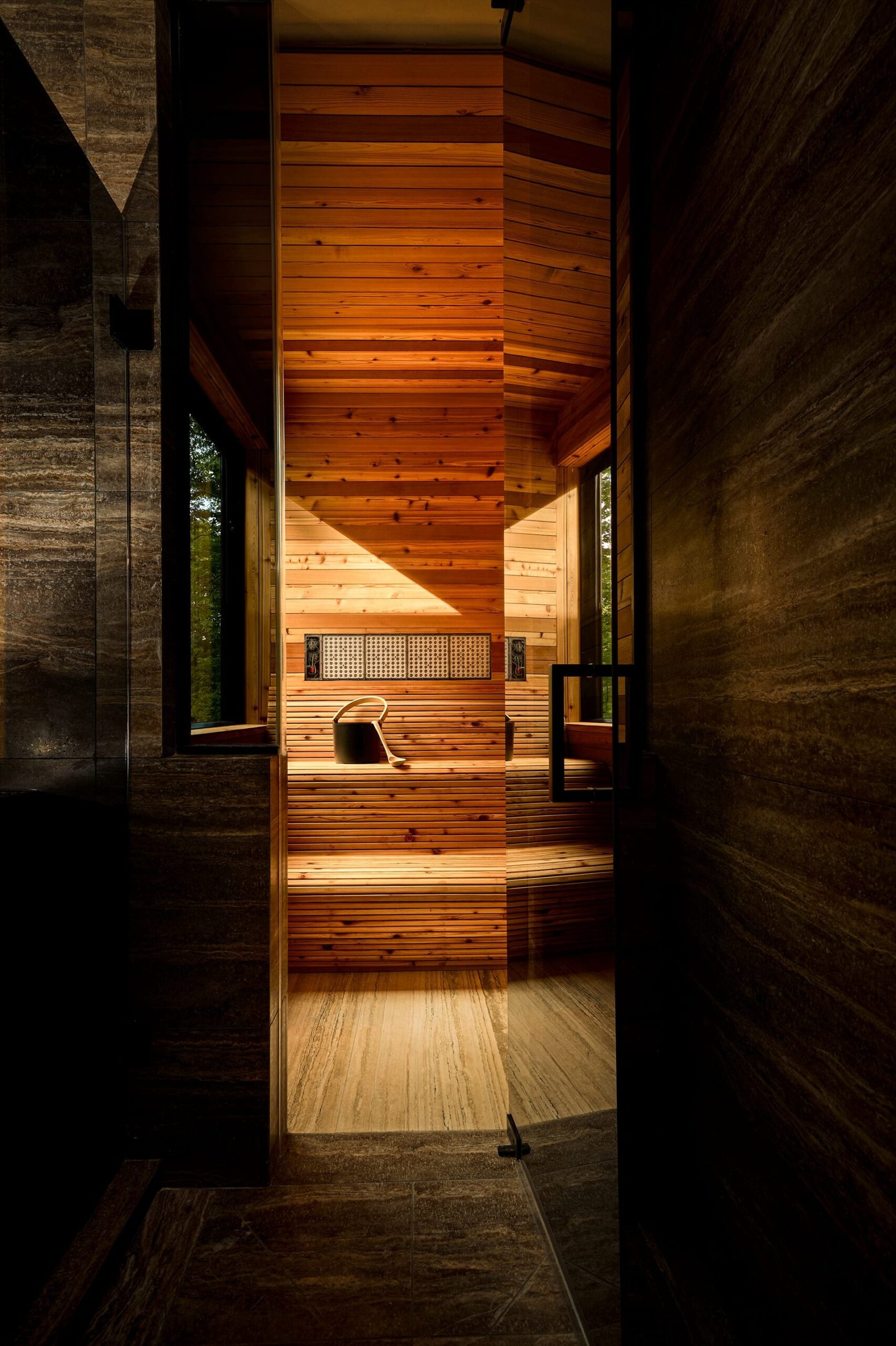
There are broadly two ways to treat an edge. The first is the clean break: the frame ends on architecture itself, a wall corner, a column, a return, so the composition feels sealed and self-contained. This suits hero shots and cover images, where a sense of completeness reassures the viewer that nothing is missing.
The second is the implied continuation: the frame deliberately cuts through an element, a table that runs off the edge, a corridor that disappears past the border, inviting the eye to imagine what lies beyond. This approach lends energy and depth, and it is particularly effective in sequences where one image is meant to lead into the next.
- Use the clean break when an image must stand alone, such as a portfolio lead or a listing’s primary photograph.
- Use the implied continuation when building a narrative, where suggestion of more space keeps the viewer moving forward.
- Avoid the accidental clip, where an element is severed with no compositional reason, drawing attention to the wrong thing.
The Edge and the Sense of Scale
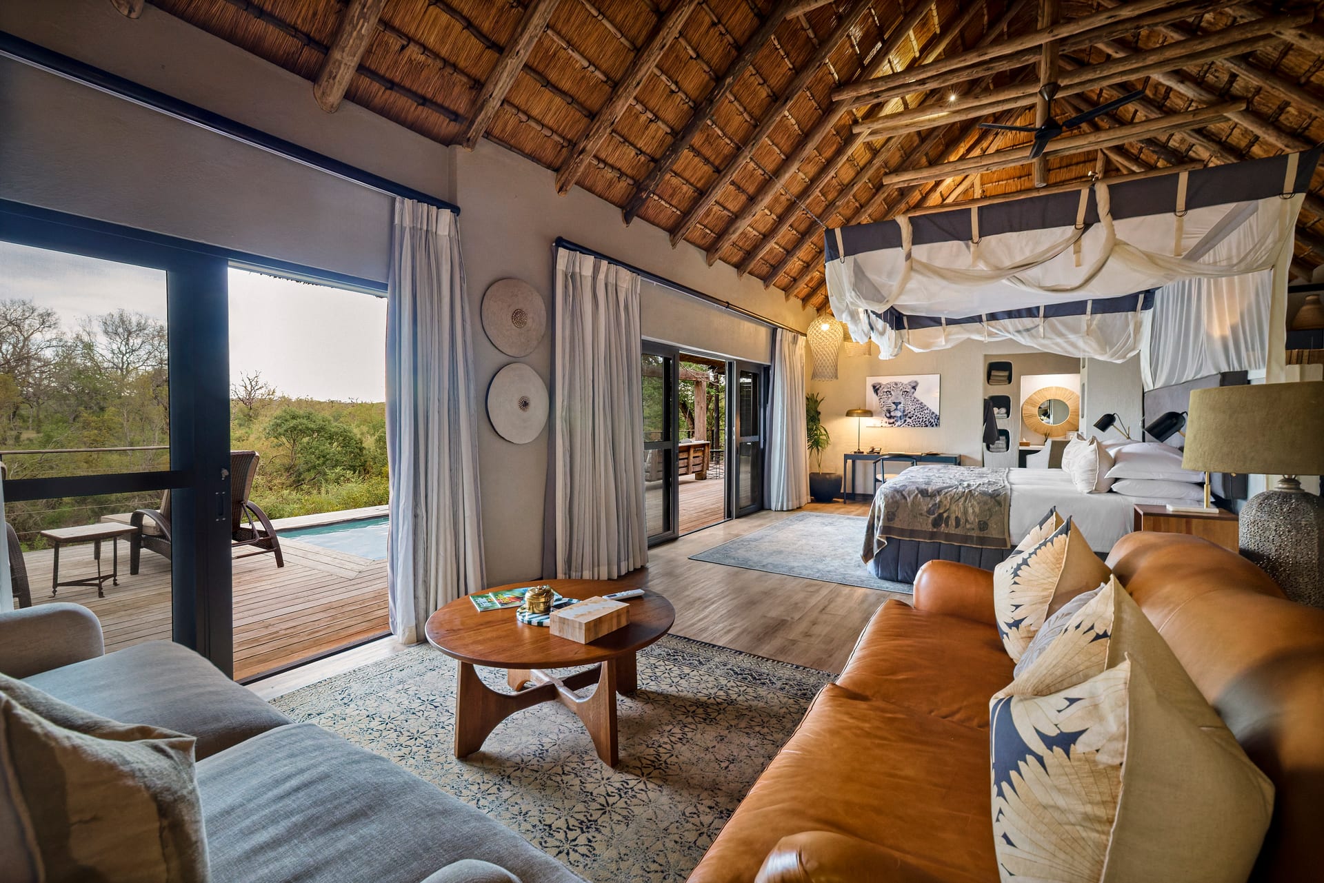
Where the frame falls has a direct bearing on how large a space feels. Crop tightly and a modest room can read as expansive, because the viewer has no ceiling line or opposite wall to measure against. Include the full perimeter and the same room may feel honest but smaller. For realtors and builders, this is a matter of integrity as much as aesthetics. A photograph should flatter without deceiving, and the edge is precisely where that balance is negotiated.
In architectural photography of exteriors, the border carries the additional weight of context. Cut a building off at its property line and it stands as an object. Extend the frame to include the street, the neighboring rooflines, or the approach, and the building becomes part of a place. The decision depends on whether the story is about the object or the setting.
Breathing Room and the Weight of Emptiness
Generous space around a subject is not wasted space. The margin between the subject and the edge gives an image its composure. A frame that crowds its subject against the border feels tense; a frame that grants a measured amount of air feels resolved. The trick is that this breathing room is not uniform. A well-balanced composition often carries more space on the side toward which the room opens, letting the image lean gently in the direction the eye already wants to travel.
A photograph should flatter without deceiving, and the edge is precisely where that balance is negotiated.
Composing With the Edge in Mind
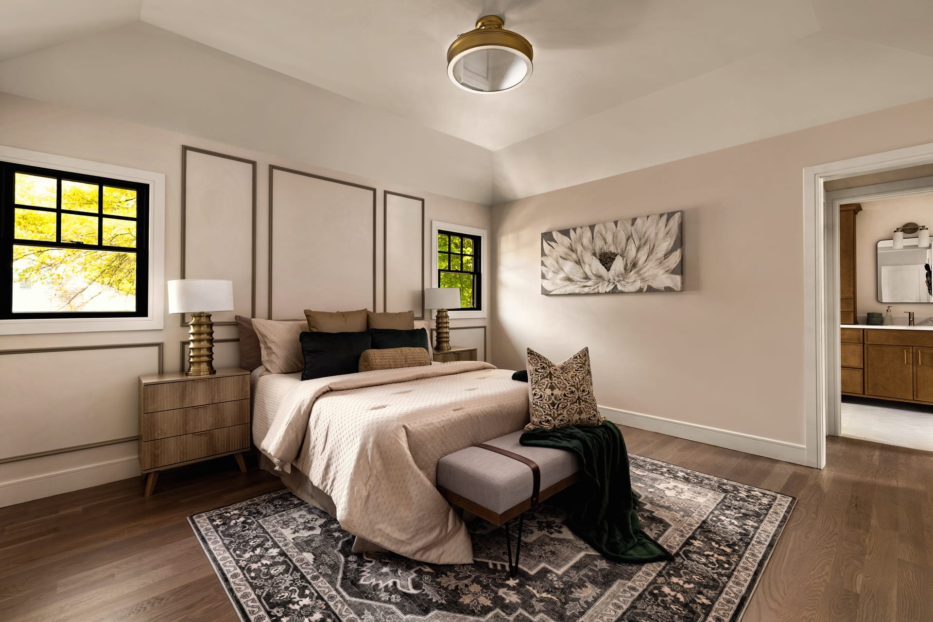
The discipline begins before the shutter. When setting up a frame, it helps to read the perimeter deliberately, corner by corner, rather than fixating on the center. Many otherwise strong compositions are undone by a single unresolved edge: a light switch bisected, a lamp partially in shadow at the border, a rug that ends abruptly a few centimeters inside the frame.
A useful habit is to ask, for each of the four edges, a simple question: does this border land on something intentional? If the answer is no, the fix is often small, a slight shift of the camera, a modest change in focal length, a repositioning of an object just enough to bring it fully in or send it fully out.
Practical Considerations for a Shoot
- Decide early whether an image is a self-contained hero or part of a sequence, since this governs how the edges should behave.
- Watch for half-elements at the border. As a rule, include an object fully or exclude it clearly rather than cropping it by half.
- Leave slightly more room than feels necessary when capturing, so there is latitude to refine the crop later without compromising resolution.
- Mind vertical edges especially. A wall that leans or a doorframe that slips off true at the border undermines the calm a good interior photograph should convey.
Why This Matters for Design Professionals
For the people who make spaces, the edge of an image is not a technical footnote. It is the mechanism by which a room’s story is told or lost. A hotel suite framed to imply a corridor of further rooms suggests a property of depth and generosity. A designer’s careful corner detail, framed to sit cleanly within its border, reads as an intentional decision rather than a happy accident. An architect’s facade, framed to include or exclude its neighbors, argues either for the building’s autonomy or its belonging.
The edge, in short, is where the photographer’s judgment meets the designer’s intent. When the two align, the resulting image feels inevitable, as though the room could only have been seen this way. That sense of inevitability is the quiet signature of considered work, and it begins at the border most viewers never consciously notice.
If you would like your spaces photographed with this kind of intention, we would be glad to hear from you at Matthew Lekker Photography.
Add us as a preferred source on Google
Add as preferred source