The Problem We Rarely Name
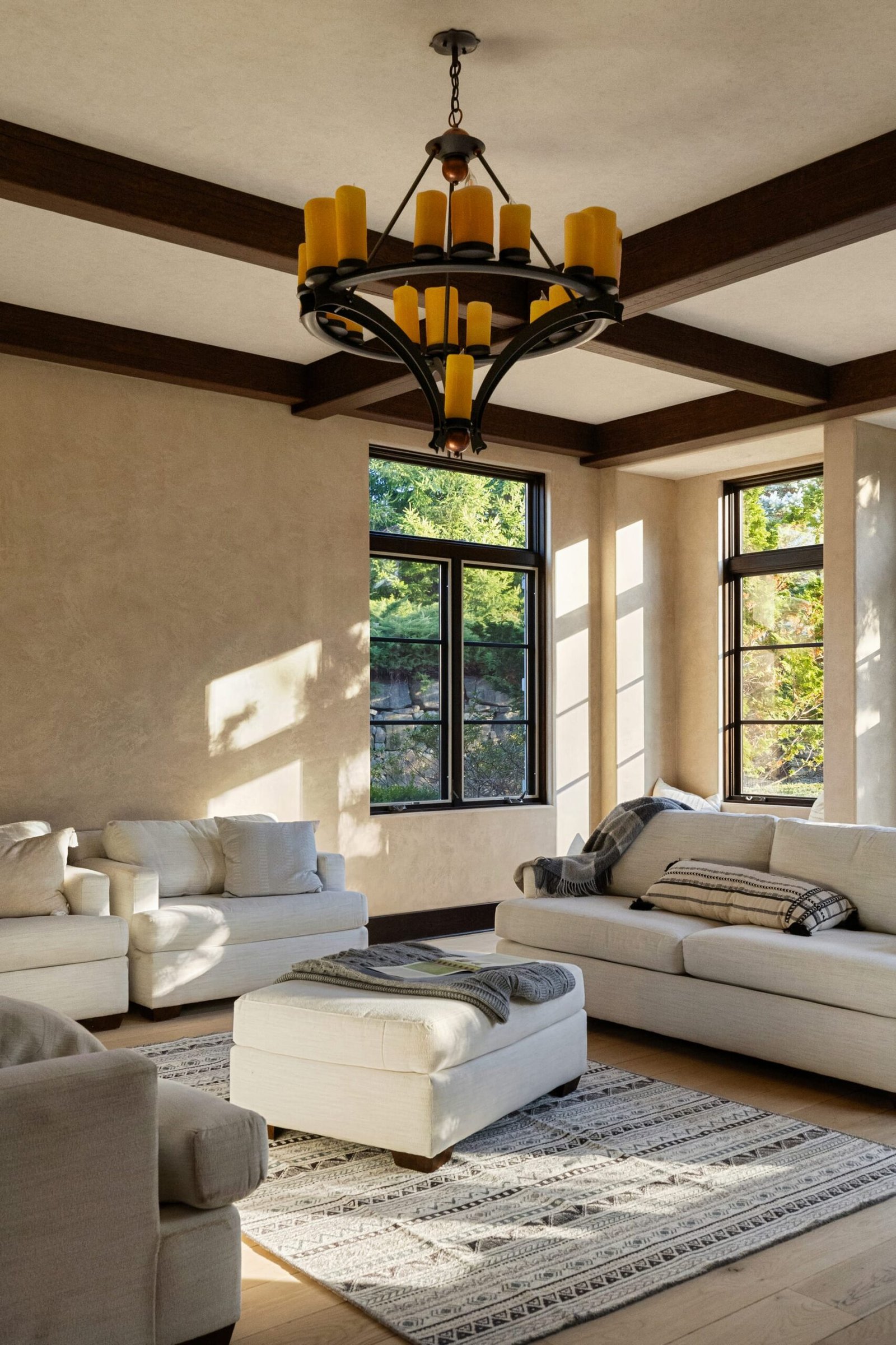
A space can be perfectly composed, cleanly styled, and sharply focused, and still feel wrong. The lines stand true, the light is generous, the furniture sits where it should. Yet something in the image unsettles the eye. More often than not, the culprit is color. A warm oak reads orange. A cool grey tilts blue. A carefully chosen greige drifts toward green. In architectural photography and interior photography alike, color is the quietest failure, because it rarely announces itself. It simply makes the room look like a version of itself that no one actually chose.
For design professionals, this matters more than almost any other technical concern. You did not spend weeks sampling paint, comparing stone slabs, and approving fabric memos so that a photograph could reinterpret them. The finishes are the work. If the color cast lies, the photograph lies about the design.
Where Color Cast Comes From
Every light source carries a temperature, measured in Kelvin. Daylight is cool. Incandescent and most warm LED lamps are warm. Fluorescent tubes, still common in older commercial spaces, lean green. The human eye adapts to these differences instantly and almost completely. We walk from a sunlit terrace into a lamplit lounge and perceive both as neutral. The camera does not. It records exactly what reaches the sensor, and the sensor does not forgive.
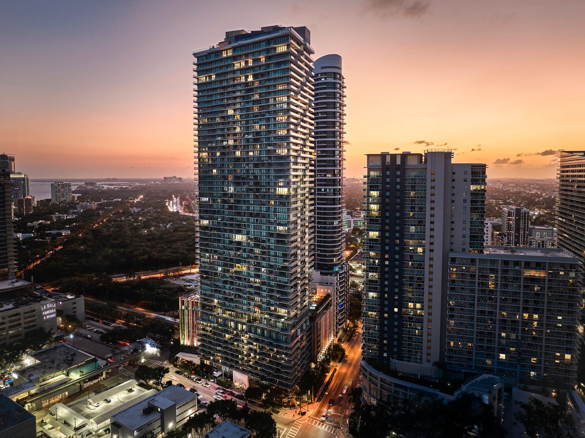
The real difficulty begins when sources mix. A living room photographed in late afternoon may receive cool daylight through the windows and warm light from table lamps in the same frame. The window wall reads blue while the far corner glows amber. No single white balance setting can correct both at once, because they are genuinely different colors of light occupying one room.
Color is the quietest failure, because it rarely announces itself.
Why the Eye Forgives and the Camera Does Not
This gap between perception and capture is the heart of the matter. When a client stands in the finished space, their vision continuously recalibrates. They experience the room as harmonious because their brain is correcting in real time. The photograph freezes a single moment of light with none of that adaptation. What felt seamless on site can look divided and artificial on screen.
Understanding this changes how a space should be approached before the shutter ever opens. The goal is not to fight the camera into submission afterward, but to give it light it can render honestly in the first place.
The Simplest Fix Is Often the Light Itself
Before any adjustment in post, the most effective correction happens at the source. Consider which lights belong in the frame and which should be turned off. Options worth weighing:
- Switching off warm interior lamps when daylight dominates, so the room reads under one consistent temperature.
- Matching the color temperature of any lamps left on to the ambient daylight, using bulbs rated near the same Kelvin value.
- Shooting at a time of day when the balance between window light and interior light is closest, rather than fighting a wide gap.
- Shading or diffusing a strong directional source that is throwing a colored wash across one surface.
These decisions are not merely technical. They are editorial. Turning a lamp off removes a cozy glow that may be essential to the mood of a hospitality interior. The right answer depends on what the image is meant to communicate, which is why these choices belong to the shoot, not to the edit.
The Materials Most at Risk
Some finishes are far more vulnerable to color cast than others, and they tend to be the ones designers care about most.
Whites and Neutrals
A white wall is never simply white. It carries an undertone, and that undertone is what distinguishes a sophisticated palette from a generic one. A warm cast turns a cool white creamy. A cool cast turns a warm white clinical. The subtle temperature of a neutral scheme is precisely what color cast destroys first.
Wood and Stone
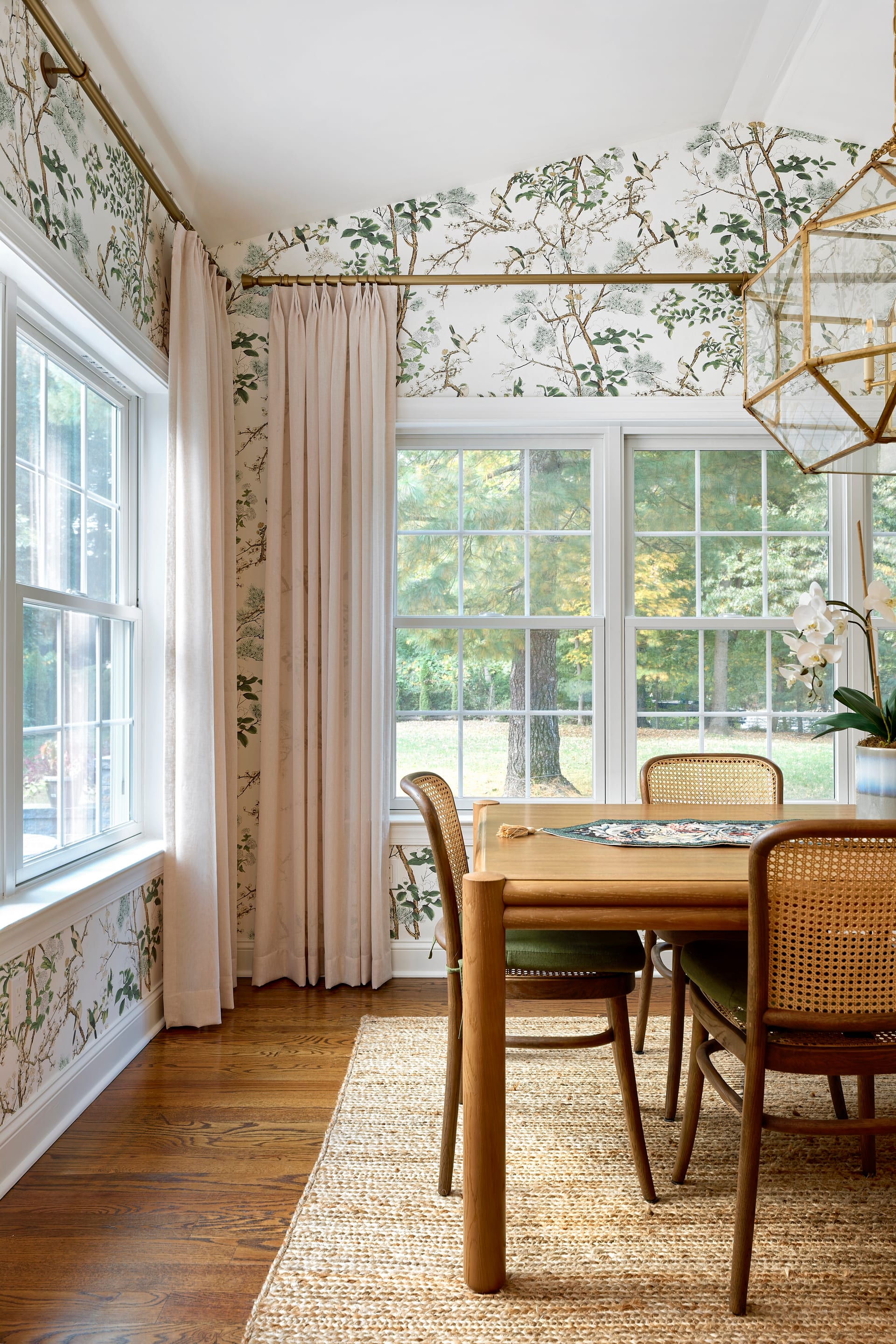
Natural materials have a color range built into them, which makes errors harder to spot and easier to accept by mistake. Oak can be pushed toward yellow, walnut toward red, pale marble toward blue. Because these shifts look plausible, they slip through unnoticed and quietly misrepresent the specification.
Greens and Muted Tones
Sage, olive, and the whole family of muted greens are notoriously unstable under mixed light. Fluorescent contamination exaggerates them; warm light mutes them into brown. A designer who chose a precise green deserves to see that green returned to them faithfully.
The finishes are the work, and if the color cast lies, the photograph lies about the design.
The Role of a Reference
Professional practice includes capturing a color reference on site, often a neutral grey card photographed within the lighting conditions of each setup. This gives a reliable anchor during editing, a known neutral against which every other tone can be measured. It is a small discipline that removes guesswork later. When a client questions whether a tone is accurate, the reference is the honest answer rather than an opinion.
For builders and realtors, this accuracy carries a practical weight. A kitchen marketed with a countertop that photographs the wrong shade invites disappointment at the viewing. For hoteliers, a guest room that reads colder online than it feels in person undermines the warmth the brand is selling. Color fidelity is not vanity. It is a form of accountability to the people looking at the image.
Restraint in Correction
Correcting color well is a matter of restraint. The aim is neutrality that feels natural, not a clinically perfect grey that strips the room of its character. A space lit by late sun should still feel warm; the warmth simply needs to read as sunlight rather than as an error. Overcorrection is its own kind of distortion, flattening the atmosphere that made the room worth photographing.
The skilled approach distinguishes between cast and mood. A color cast is an accident of mixed sources. Mood is an intention. Good interior photography removes the former while protecting the latter, so the image feels both accurate and alive.
Why This Deserves Attention
Color is the element most easily overlooked and most quietly consequential. It does not draw attention to itself the way a crooked vertical or a blown highlight does. It works beneath the surface, shaping how trustworthy an image feels. When color is true, viewers rarely notice. They simply believe the space. That quiet credibility is the whole point of the photograph.
If you would like your finishes represented with the color accuracy they deserve, Matthew Lekker Photography would be glad to hear about your project.
Add us as a preferred source on Google
Add as preferred source