The Quiet Power of What Is Left Out
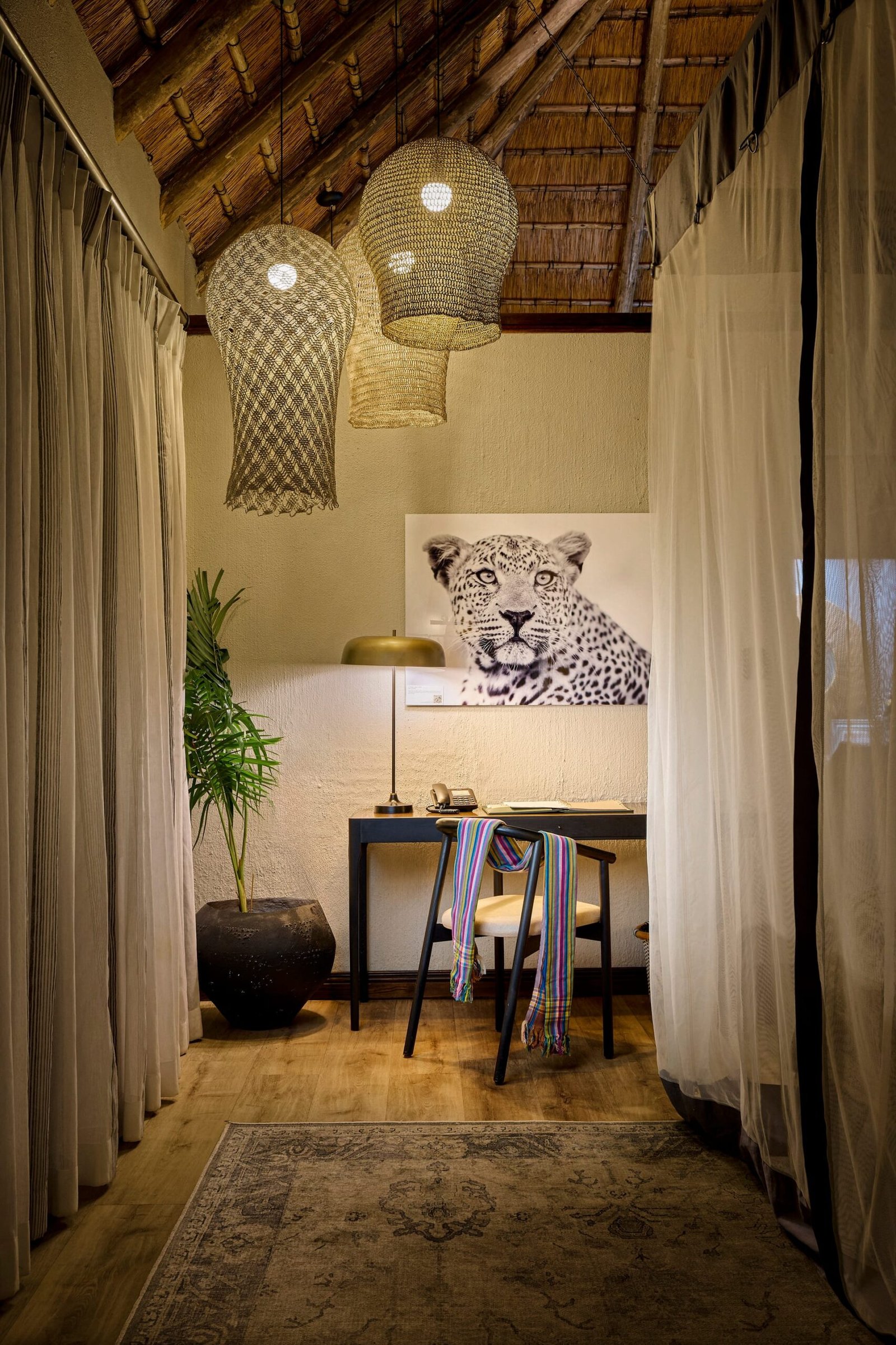
In architectural and interior photography, there is a persistent temptation to fill the frame. A styled corner, a layered vignette, a considered arrangement of objects. These have their place. But some of the most enduring images of designed spaces derive their strength not from what they contain, but from what they deliberately withhold. Empty space, handled with intention, becomes a subject in its own right.
For architects, interior designers, and hoteliers, understanding how photographers use emptiness can change how you evaluate images and how you brief the people who make them. A photograph that respects negative space communicates confidence. It says that the work does not need decoration to be understood.
Empty space, handled with intention, becomes a subject in its own right.
Why Emptiness Reads as Luxury
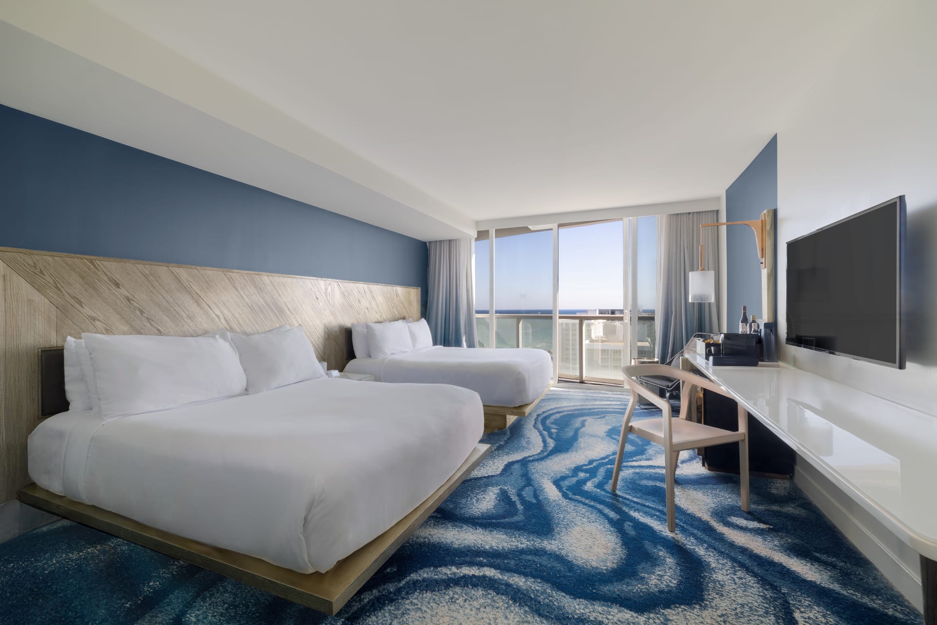
There is a reason that the most refined hospitality and residential imagery tends toward restraint. Clutter reads as anxiety. It suggests a space unsure of itself, compensating with props and busyness. A generous expanse of unadorned floor, a wall left to hold its own proportion, a ceiling given room to rise, all signal a different message entirely: this is a place that can afford to be still.
Emptiness is also how the eye rests. When every surface competes for attention, the viewer never settles. Negative space gives the composition a place to breathe, and in that pause the design reveals its true intent. The line of a staircase becomes legible. The join between materials becomes visible. The quality of light across a plain surface becomes the story.
What Negative Space Actually Does in a Frame
In practical terms, empty areas of a photograph perform several tasks at once:
- They isolate the subject, so a single chair or a window detail carries weight without distraction.
- They describe scale, allowing the viewer to sense the true dimensions of a room.
- They create rhythm, balancing dense areas of detail against calm, uninterrupted planes.
- They direct movement, guiding the eye along a path the photographer has chosen.
None of this happens by accident. The decision to leave part of a frame quiet is as deliberate as the decision to fill it. It requires trust in the architecture and discipline behind the camera.
Reading a Space Before You Photograph It
Every well-designed room contains areas meant to be occupied and areas meant to be open. A good architectural photographer learns to recognise the difference. The circulation path through a lobby, the threshold of a doorway, the sweep of floor before a fireplace, these voids are not incidental. They are part of how the designer choreographed the experience of being there.
Photographing these voids honestly means resisting the urge to correct them. A hotelier might feel that an empty corner looks unfinished and ask for a plant or a console to fill it. Often the opposite is true. That emptiness may be the very thing that makes the space feel generous and calm. The photographer’s role is to protect the intention, not to overwrite it.
The Role of Light in Empty Areas
Nowhere does negative space matter more than in the interplay with light. A blank wall is never truly blank. It is a canvas for the shifting tone of daylight, for the soft gradient from a window, for the shadow cast by a mullion. In interior photography, these subtle transitions across empty surfaces often carry the emotional temperature of the entire image.
This is why timing and patience are essential. The same empty wall can look flat and lifeless at one hour and luminous at another. Waiting for the light to model that surface, to give it depth and warmth, is part of the craft. The emptiness is what allows the light to be seen.
Composition Through Subtraction
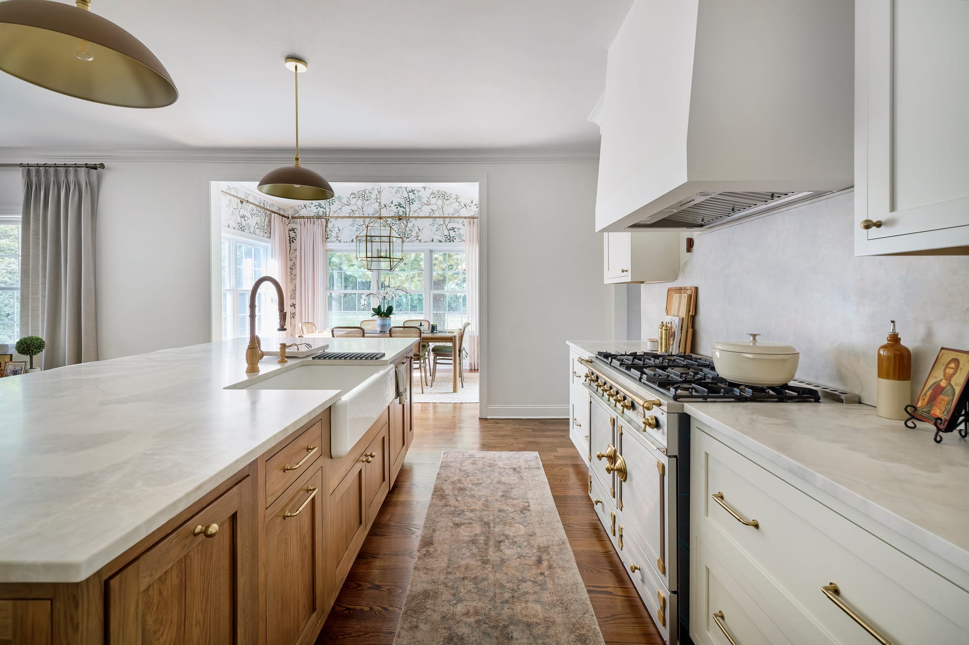
Designers are trained to add with purpose. Photographers, at their best, work in the opposite direction. They compose by subtraction, removing everything that does not serve the image until only the essential remains. This discipline is closely related to the architectural principles many designers already hold dear: proportion, hierarchy, and the confident use of void.
They compose by subtraction, removing everything that does not serve the image until only the essential remains.
Consider how a wide, uncluttered foreground can make a distant architectural feature feel monumental. Or how leaving the upper third of a frame open can convey the height and ambition of a space more effectively than any object could. These are compositional choices rooted in restraint, and they reward the viewer who lingers.
When Fullness Serves and When It Fails
None of this is an argument against styling or richly layered interiors. A densely detailed library or a warmly dressed dining table can be entirely appropriate. The point is that fullness should be a choice, not a reflex. Ask what the image is trying to say. If the answer is warmth, intimacy, and life, then layering supports it. If the answer is clarity, scale, and architectural intent, then emptiness may serve far better.
The most versatile portfolios move fluently between the two. They know when to fill and when to leave alone, and they trust the audience to appreciate the difference.
Practical Guidance for Design Professionals
If you are commissioning architectural or interior photography and want the strength of negative space to work in your favour, a few habits help:
- Resist filling every corner before the shoot. Let the photographer see the space as it was designed.
- Discuss intent early. Explain which voids are deliberate and which are simply unfinished.
- Trust silence in the frame. An image with breathing room often outperforms a busy one in a portfolio or a listing.
- Select for restraint. When reviewing final images, favour the ones that let the design speak clearly over those that feel crowded.
Realtors and builders benefit here too. A property photographed with generous, calm space feels larger, more considered, and more valuable. The eye is not distracted by staging; it is invited to imagine.
Emptiness as Confidence
Ultimately, the ability to photograph empty space well is a mark of maturity, both in the photographer and in the work being photographed. It reflects a shared confidence that the architecture and the interior design are strong enough to stand on their own. That confidence translates directly to the viewer, who senses, even without naming it, that they are looking at something considered and complete.
The next time you review a set of images, notice where your eye chooses to rest. Often it will settle not on the busiest detail, but in the quiet, in the deliberate void that gives the whole composition its poise.
If you are planning a project and want photography that treats space with this kind of intention, Matthew Lekker Photography would be glad to hear from you.