The Surface We Reach Out to Touch
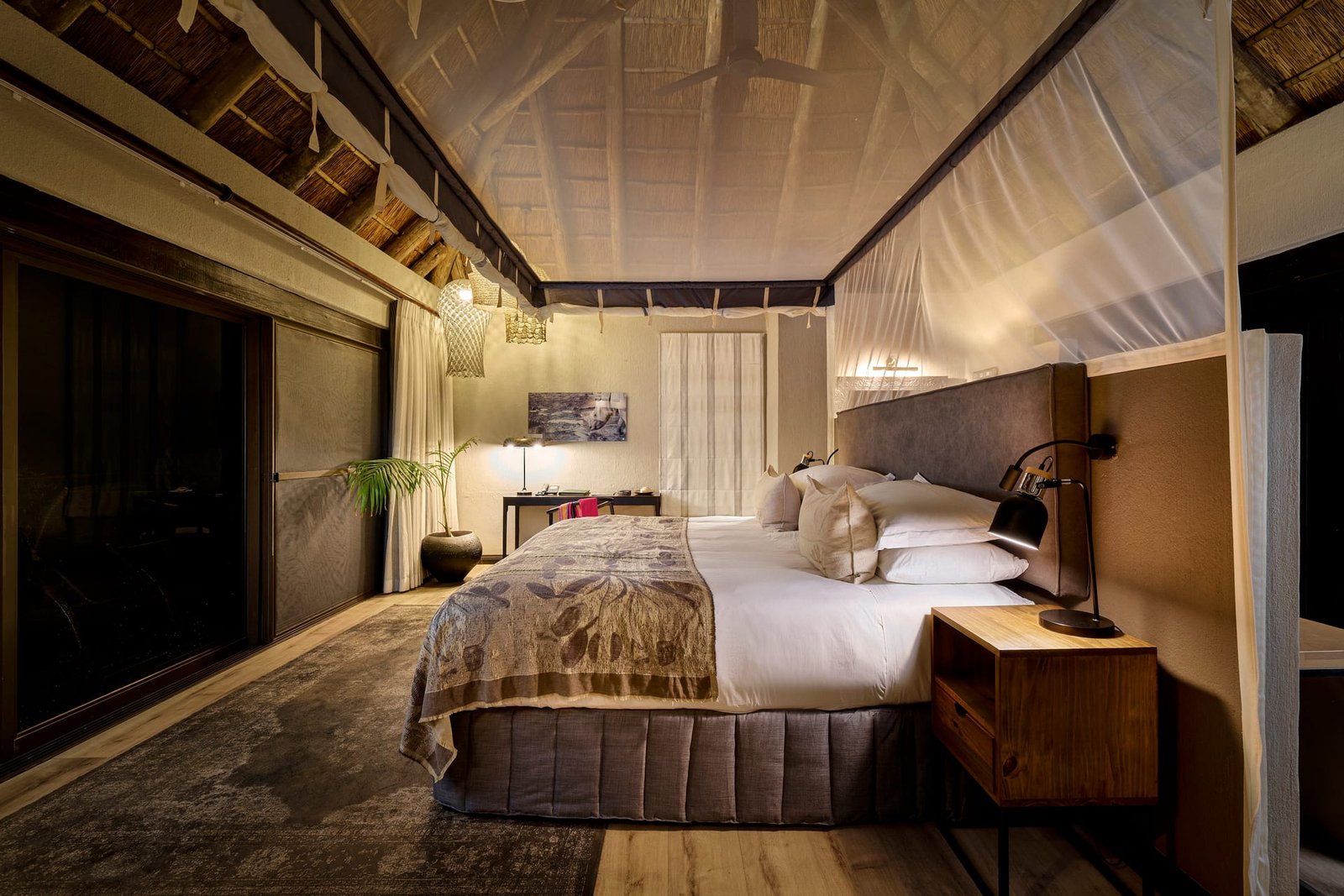
Before we understand a room intellectually, we often understand it with our hands. The cool of honed marble, the grain of oiled walnut, the slight roughness of lime plaster catching the morning. Material is the part of a space that invites contact, and it is also the part most easily lost in a photograph. A surface that feels alive in person can flatten into something generic on screen, stripped of the very quality that made a designer specify it in the first place.
For architects, interior designers, and builders, material is rarely an afterthought. It is where budget, intention, and craft converge. A joiner spent weeks matching veneers. A mason chose a particular limestone for the way it ages. When architectural photography fails to register these decisions, it quietly erases the labor and judgment behind them. Photographing material well is, in part, an act of respect for the people who chose it.
Why Texture Lives or Dies in the Light
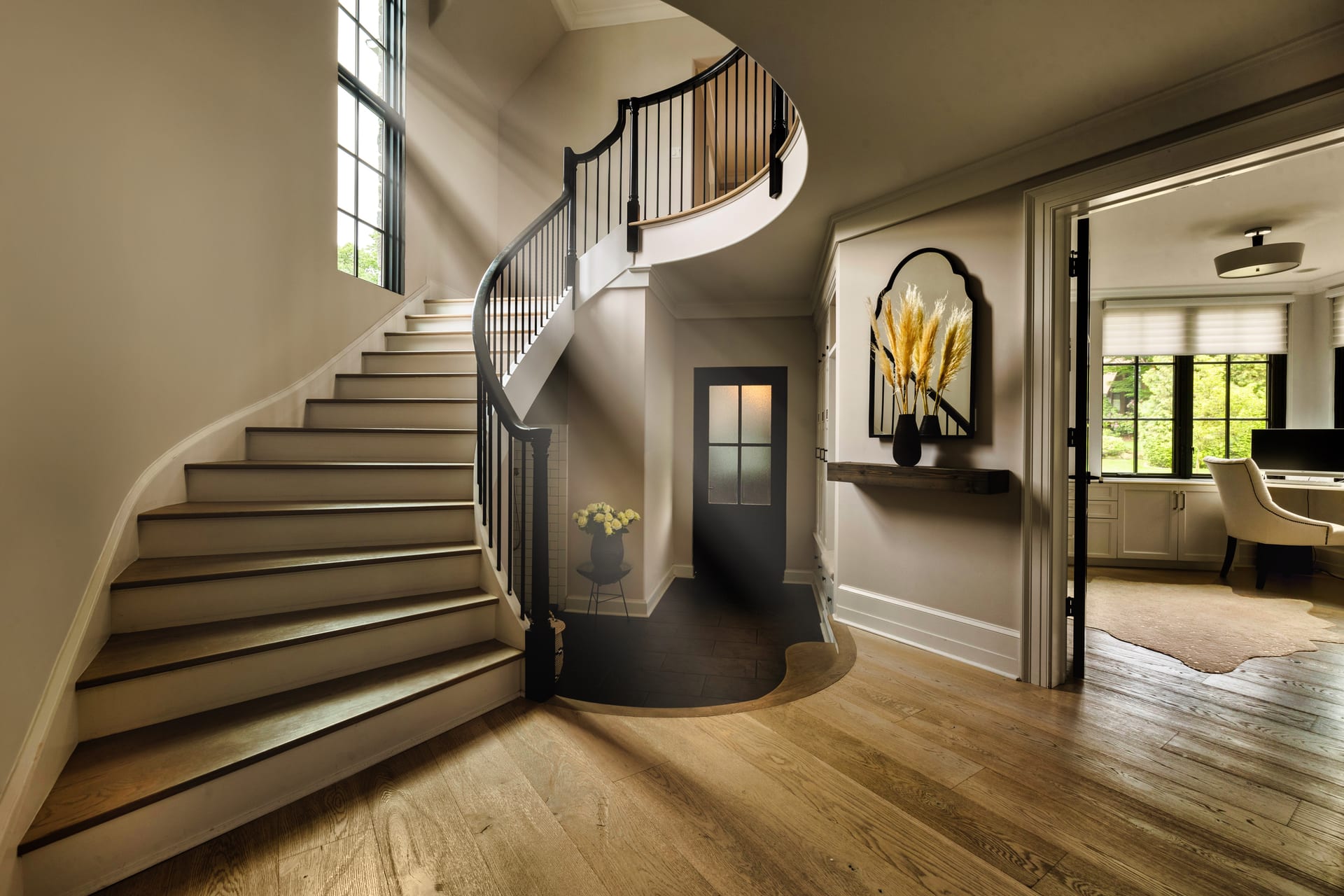
Texture is not a property of a surface alone. It is a conversation between a surface and the light that falls across it. The same oak floor can read as flat and lifeless under flat overhead light, or as deep and tactile when a low raking light travels along the grain. The angle of illumination is everything.
This is why interior photography of material asks for a different kind of attention than a wide establishing shot. A broad room view wants even, generous light that holds detail in shadow and highlight alike. A material study often wants the opposite. It wants light that grazes, that skims, that reveals the small topography of a surface.
Texture is not a property of a surface alone; it is a conversation between a surface and the light that falls across it.
When scouting a space, I pay attention to where directional light arrives and when. A wall of textured plaster may only come alive for forty minutes in the afternoon, when the sun angles across it rather than striking it head on. A stone floor may reveal its depth best in the softer, lower light near the end of the day. These windows are worth waiting for, because they cannot be convincingly faked after the fact.
Raking Light and Its Limits
Raking light, where illumination arrives nearly parallel to a surface, is the most powerful tool for revealing texture. It casts tiny shadows in every recess and lifts every ridge into relief. Used on a rough-sawn timber beam or a hand-troweled wall, it can be revelatory.
But raking light is a tool, not a reflex. Pushed too far, it exaggerates. A gentle surface can begin to look aggressive, and a minor imperfection can swell into a flaw that distracts from the whole. The goal is to honor how a material feels to the hand, not to manufacture drama it does not possess. Restraint here is a form of accuracy.
Reading the Material Honestly
Every material has a truth it wants to tell, and the photographer’s task is to listen before deciding how to show it.
- Stone rewards patience. Its veining, its matte or polished finish, and the subtle variation across a slab all respond to controlled, directional light. Harsh reflections on polished stone can obscure the pattern beneath, so the angle of the camera and the light must work together.
- Timber is about grain and tone. The direction of the grain should guide the direction of the light, so the pattern reads as movement rather than noise. Oiled and matte finishes are forgiving; high-gloss lacquers demand careful management of reflections.
- Plaster and lime render carry the fingerprints of their making. Slight undulations and tonal shifts are the point, not the problem. Flat light erases them entirely.
- Metal is defined almost entirely by what it reflects. Brushed brass, blackened steel, and polished chrome each need a considered environment around them, because the camera is really photographing the room in the metal’s surface.
- Textile depends on nap and weave. Linen, boucle, and velvet each shift dramatically with the direction of light, and a gentle rake brings out the depth that makes them feel soft.
The Role of the Lens
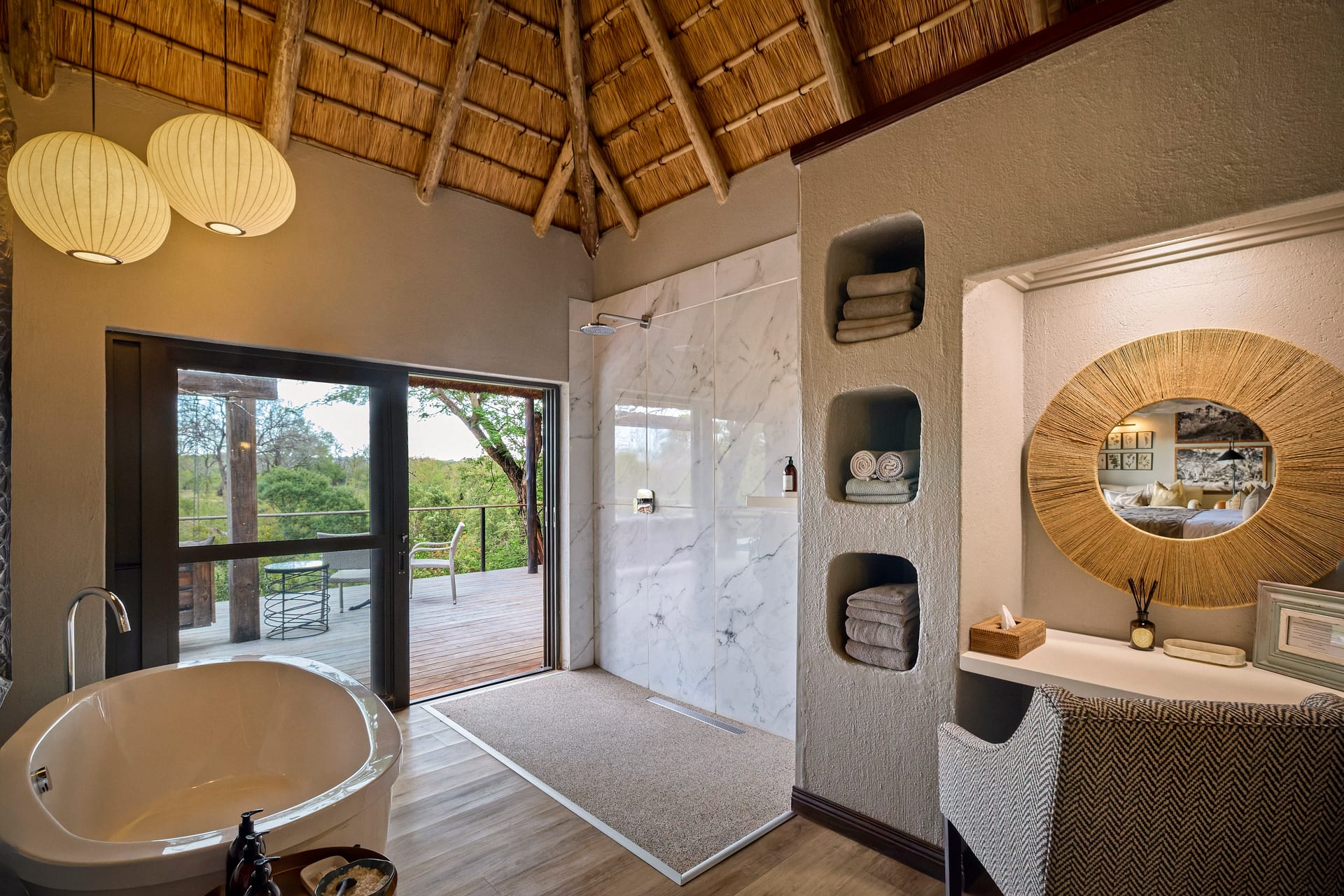
Focal length and distance shape how material reads. A detail captured with a longer lens, from a respectful distance, tends to feel calm and composed, with proportions left undistorted. Moving in very close with a wider lens can heighten presence but risks bending the surface in ways that misrepresent it.
Depth of field is its own decision. A shallow focus can isolate a single beautiful join or the edge where two materials meet, drawing the eye to a specific craft decision. A deeper focus keeps a textured surface coherent across its full extent, which often suits stone, brick, and anything where the overall pattern matters more than a single point.
The Material Transition
Some of the most telling photographs in architectural and interior photography are not of a single material but of the moment two materials meet. The line where timber flooring gives way to stone, where plaster meets steel, where a stair tread joins its carriage. These transitions reveal the quality of the detailing and the discipline of the hands that executed it.
The seam where two materials meet often says more about a project’s craft than any single surface alone.
Photographing these junctions well means giving them enough space to be understood, and enough light to show how cleanly, or how deliberately, the two surfaces resolve against one another. For builders and architects, these frames often become the most persuasive evidence of quality in a portfolio.
Restraint in Post-Production
It is tempting to sharpen texture aggressively or to push contrast until every surface shouts. This almost always betrays the material. Oversharpening introduces a brittle, artificial edge that no real surface possesses. Excessive clarity turns warm timber into something hard and metallic.
The more faithful approach treats post-production as a quiet correction rather than an amplification. Color must stay true, because a material’s tone is part of its identity. Contrast should be guided by how the surface actually behaves in light. The aim is a photograph that a designer can hand to a client and say, with confidence, that is exactly how it feels in the room.
Why This Matters to Design Professionals
Material is where specification becomes experience. For hoteliers, the tactile richness of a lobby or guest room is part of what guests remember and what sets a property apart. For realtors, honest material rendering builds trust and signals quality. For architects and interior designers, it is the proof of judgment, the visible record of every considered choice.
When material is photographed with care, a portfolio stops being a catalogue of rooms and becomes a demonstration of sensibility. It shows not only what was built, but how deeply it was understood.
If you would like your materials photographed with this kind of attention, I would be glad to hear about your project at Matthew Lekker Photography.
Add us as a preferred source on Google
Add as preferred source