The Quiet Authority of a True Line
There is a particular discomfort that a viewer feels before they can name it. A room looks competent, the finishes are handsome, the light is agreeable, and yet something sits slightly wrong. More often than not, the culprit is a line that should be vertical but is not. In architectural photography, the straightness of a line is not a technical nicety. It is the foundation of whether an image reads as deliberate or accidental.
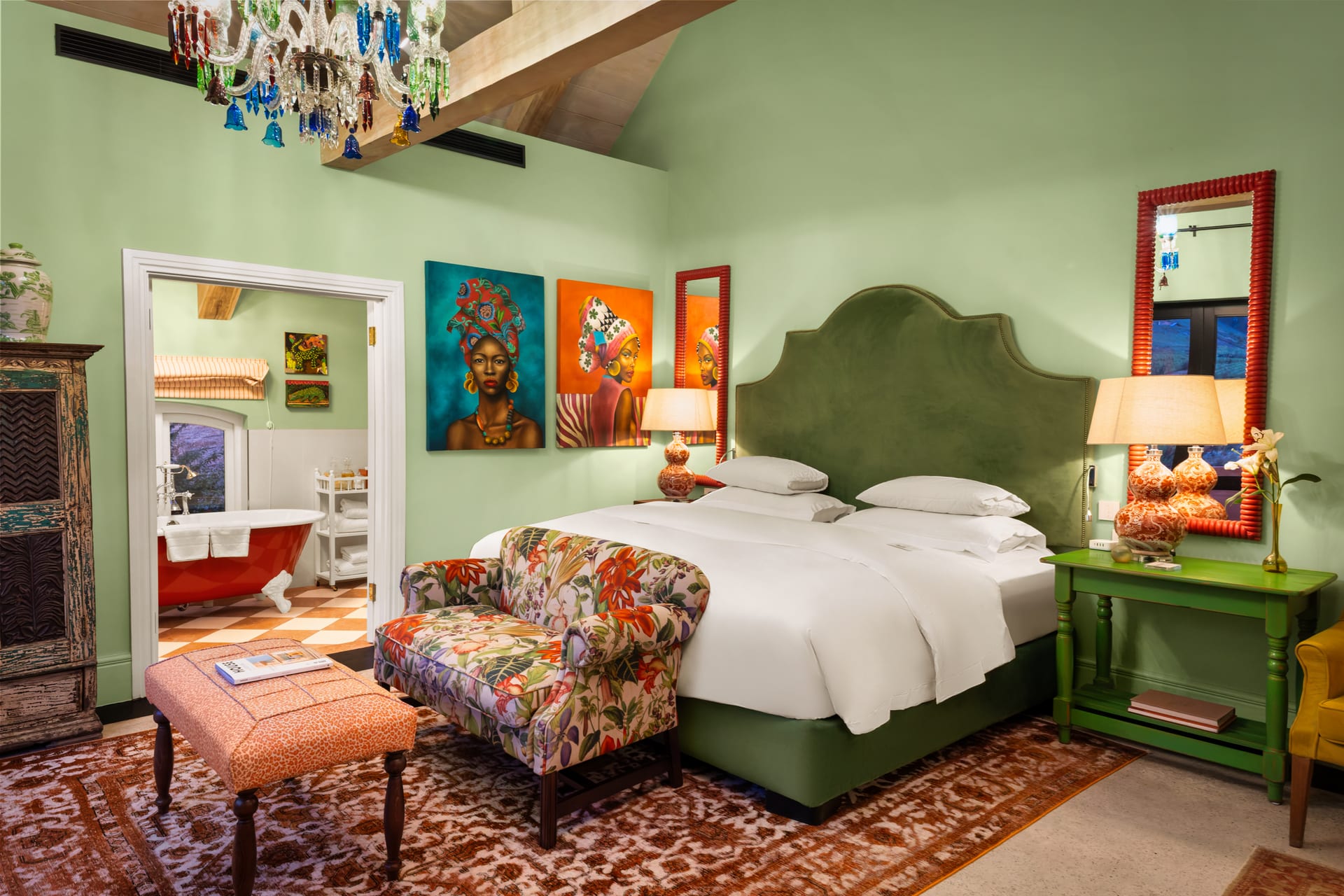
Walls, door frames, window mullions, cabinetry, structural columns: these are the elements that give a space its order. When they lean toward one another at the top of the frame, the building appears to be falling away from the viewer. When they lean outward, it seems to loom forward. Either way, the architecture is misrepresented, and the discipline that went into designing it is quietly betrayed by the photograph meant to celebrate it.
A leaning vertical tells the viewer that the camera was careless, even when every other decision was considered.
Why Verticals Converge in the First Place
The phenomenon is not a flaw in the photographer so much as a property of lenses and geometry. When a camera is tilted upward or downward to fit more of a space into the frame, the plane of the sensor is no longer parallel to the plane of the wall. Parallel lines in the world then appear to converge in the image, exactly as railway tracks seem to meet at the horizon.
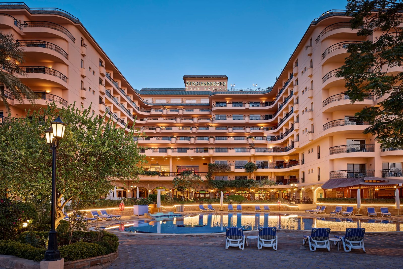
This matters most in tall rooms, narrow spaces, and exterior architectural work, where the temptation to tilt the camera is greatest. A hotel lobby with a double-height ceiling, a stairwell, a townhouse facade, a kitchen with cabinetry running to the ceiling: these are precisely the situations where convergence creeps in and does the most damage.
The Three Axes to Watch
- Vertical convergence: the most noticeable, caused by tilting the camera up or down. Walls fan inward or outward.
- Horizontal convergence: caused by shooting a wall at an angle rather than square to it. Useful at times, distracting when unintended.
- Roll: the simple tilt of the horizon left or right. Subtle, but a few degrees of roll will make an entire interior feel unsettled.
Each axis has its own correction, and each carries consequences. Keeping all three honest at once is what separates a photograph that reads as architecture from one that reads as a snapshot.
How True Verticals Are Kept
There are two established approaches, and both have a place in considered interior photography.
Keeping the Camera Level
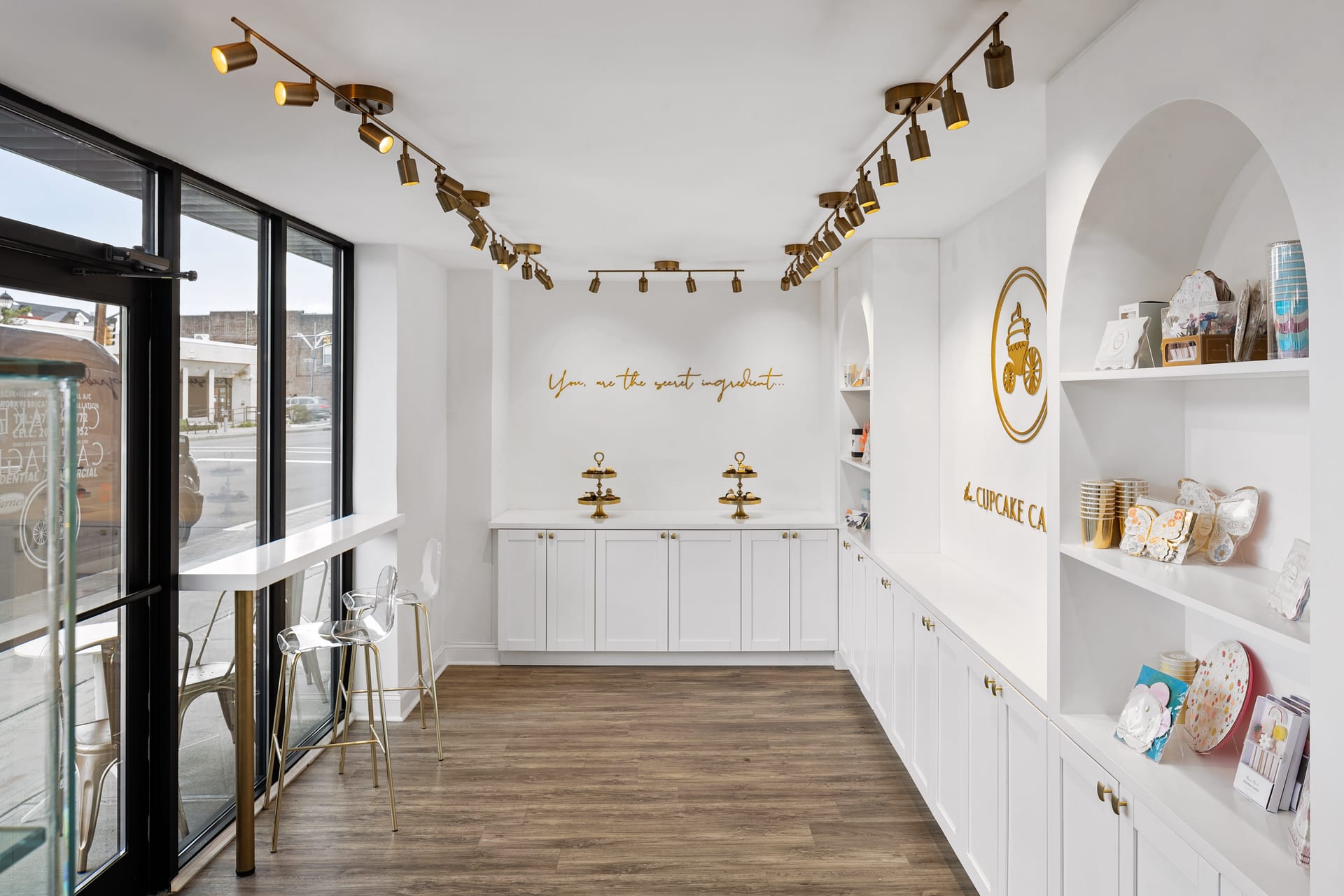
The most reliable method is to keep the sensor plane parallel to the walls, which means holding the camera level rather than tilting it. When this is done, verticals remain vertical because the geometry demands it. The cost is composition: a level camera placed at standing height often captures too much floor and too little ceiling. The solution is thoughtful camera placement, sometimes lowering the tripod, sometimes raising it, so that the frame is balanced before any correction is applied.
The Shift Lens and Its Logic
A tilt-shift lens, or a technical camera with movements, allows the lens to shift relative to the sensor. This lets the photographer capture more of a tall space while keeping the camera perfectly level, preserving true verticals without sacrificing the ceiling. It is the most elegant solution, and it is why much of the finest architectural photography is made with these tools. The discipline they impose, of composing with a level camera from the outset, tends to improve the work even beyond the correction itself.
True verticals are not a style choice; they are a promise that the photograph is telling the truth about the space.
Correction in Post-Production
Lines can also be straightened after the fact. Modern software can rotate and stretch an image to bring verticals upright. This is a legitimate tool, but it is not free. Every correction crops into the frame and stretches pixels, softening detail and narrowing the field of view. A photograph composed loosely with the intention of fixing it later will often lose the very corners that made the composition work. The better practice is to get as close to true as possible in camera, and to reserve post-production for refinement rather than rescue.
When to Let a Line Lean
Rules in photography earn their keep by knowing their own exceptions. There are moments when perfectly corrected verticals are not the goal. A dramatic upward view of a soaring atrium, a deliberate study of a staircase spiralling overhead, an exterior shot that embraces the scale of a tower: these may call for honest, uncorrected convergence, used as a conscious expression rather than an oversight.
The distinction is intention. A line that leans because the photographer chose it to, and controlled it, reads as confidence. A line that leans because no one noticed reads as a mistake. The viewer can usually tell the difference, even if they could not explain why.
What This Means for Design Professionals
For architects, interior designers, builders, and hoteliers reviewing a set of images, the straightness of verticals is one of the clearest signals of craft. It is worth training your eye to notice, because it affects how your work is perceived by every client, editor, and prospective guest who encounters the photographs.
- Scan the edges of the frame first. Do the window frames and door jambs stand upright, or do they tip inward at the top?
- Check the ceiling line and the floor line. A space feels grounded when these run true.
- Notice whether vertical correction has cost detail in the corners, a sign the image was composed too loosely.
- Look for consistency across the set. Verticals that are true in one frame and leaning in the next betray an inconsistent hand.
When verticals are honest, the architecture is free to speak for itself. Proportions read correctly, materials sit where they belong, and the viewer’s attention goes to the design rather than to a nagging sense that something is amiss. In interior photography, this quiet correctness is what makes a space feel inhabitable and real on the page.
The straight line is among the least glamorous considerations in the craft, and among the most consequential. It is the discipline that lets everything else, the light, the styling, the material palette, do its work without distraction. A space built with precision deserves to be photographed with the same.
If you would like your architecture or interiors photographed with lines that stand true and craft that honours the work, Matthew Lekker Photography would be glad to hear from you.
Add us as a preferred source on Google
Add as preferred source