
What Rhythm Does in a Space
Every considered interior carries a cadence. A run of columns, a sequence of pendant lights, the regular interval of a batten ceiling, the repetition of chairs along a long table. These repeating elements are rarely the first thing a client points to when describing their work, yet they are often the quiet structure holding the whole composition together. Rhythm is how the eye knows where to go, how a room settles into order, and how a space feels resolved rather than arbitrary.
In architectural photography and interior photography alike, learning to read rhythm is a way of seeing what the designer intended at the level of pattern. A photograph that respects the cadence of a space tends to feel calm and inevitable. A photograph that ignores it often feels restless, even when nothing is technically wrong.
Rhythm is how the eye knows where to go, how a room settles into order, and how a space feels resolved rather than arbitrary.
Learning to See the Interval
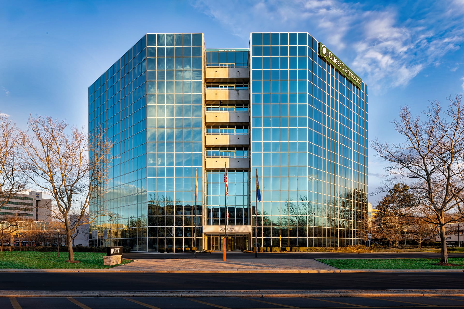
Rhythm in design is built from intervals, the measured gaps between repeated elements. Before the camera comes out, it is worth walking a room and naming them. The spacing of mullions across a glazed facade. The repeat of a tile pattern underfoot. The regular punctuation of artwork along a corridor. The stagger of a staircase. Once you begin to notice intervals, you start to see which ones are the backbone of the space and which are incidental.
Not all rhythm is even. Some of the most compelling interiors use syncopation, a regular beat interrupted by a deliberate pause or an oversized gesture. A long bank of identical cabinetry broken by a single tall window. A row of matching stools anchored by one sculptural pendant. The photographer’s task is to recognize both the pattern and the exception, because the exception is frequently the point.
Questions to Ask on Site
- What element repeats most clearly, and at what interval?
- Is the rhythm even, or does it build and release?
- Where does the pattern break, and is that break intentional?
- Does the rhythm run across the frame, into depth, or both?
Framing to Honor the Beat
Once the rhythm is identified, the camera position becomes a decision about how to present it. A repeating element reads very differently depending on the angle you choose.
The Frontal View
Standing square to a repeating feature flattens it into a clean, graphic pattern. A straight-on frame of a colonnade or a louvered screen turns rhythm into something almost abstract, emphasizing the interval itself. This works well when the repetition is the story and you want the viewer to register the discipline of the design. It also demands precision: when you shoot frontally, any misalignment of verticals or uneven spacing becomes immediately visible.
The Oblique View
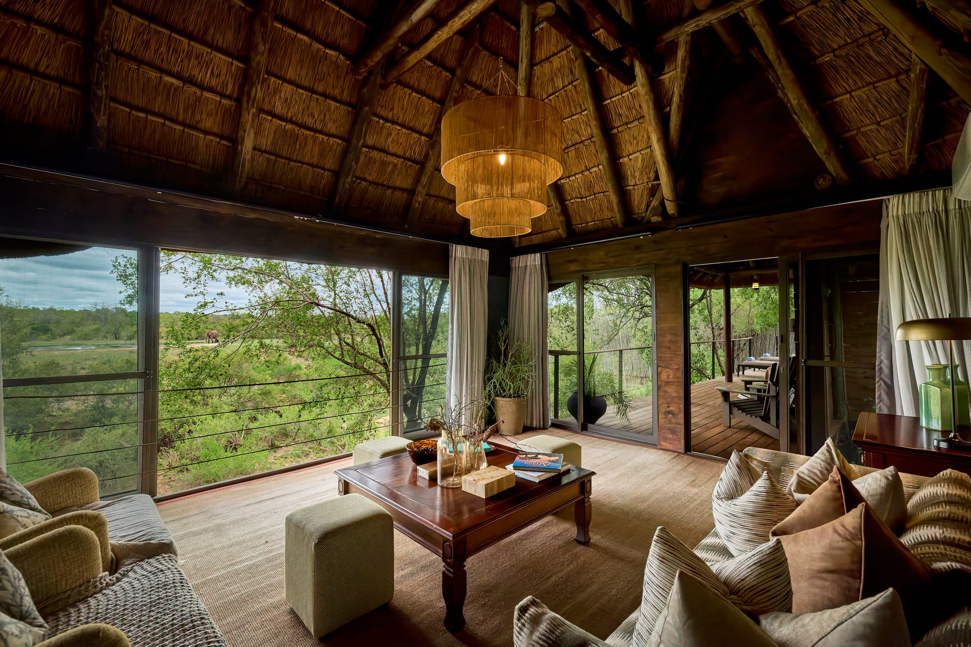
Shifting to an angle lets the same repeating elements recede into perspective. Columns that were evenly spaced now compress as they move away, creating a sense of acceleration and depth. This is the more dynamic treatment, useful when you want rhythm to pull the eye through the space rather than hold it on the surface. The oblique view also reveals how a pattern behaves in three dimensions, which often matters more to an architect than the flat graphic alone.
The oblique view lets a repeating element recede into perspective, turning an even interval into a sense of acceleration and depth.
Where to End the Pattern
A repeating element raises an immediate framing question: how many repetitions should the image contain? Too few, and the rhythm fails to establish itself. Too many, and the pattern can feel mechanical or overwhelm the subject. A useful instinct is to include enough of the repeat that the eye can predict its continuation beyond the frame edge. Letting a colonnade or a run of lighting fade off at the margin suggests the rhythm continues indefinitely, which is often truer to the experience of the space than a tidy, contained count.
Rhythm Across a Set of Images
Repetition is not only something to capture within a single frame. It can also organize a sequence. A set of images that returns to a recurring motif, a material, a color, a shape, gains its own cadence. For a boutique hotel, the repeated detail of a brass handle or a particular stone threshold can become a connective thread that carries the viewer from the lobby to the room. For an architect’s portfolio, a consistent structural element photographed in several contexts tells a story about a coherent design language.
This is where interior photography moves from documentation toward authorship. Choosing which repeating element to follow through a project is an editorial act. It tells the audience what the work is really about.
Common Pitfalls
Rhythm rewards precision, which also means it punishes carelessness. A few recurring problems are worth naming.
- Convergence errors. When verticals lean, repeating elements appear to march unevenly. Keeping the camera level, or correcting carefully, protects the integrity of the pattern.
- Uneven spacing from the wrong distance. Stand too close and the nearest repeat dominates while the rest crowd together. Backing up and using a longer focal length often restores a more honest rhythm.
- Ignoring the break. Cropping out the one element that interrupts the pattern can strip a space of its most considered moment.
- Overstyling the repeat. When chairs or place settings are meant to read as a rhythm, small inconsistencies in their placement become glaringly obvious. Repetition demands that styling be exact.
Rhythm and the Feeling of a Room
What makes rhythm worth this attention is that it is deeply tied to how a space feels. A steady, even cadence conveys calm, order, and formality. An irregular or syncopated rhythm feels more relaxed, more human, sometimes more surprising. A dense repetition can feel rich and enveloping, while a sparse one feels quiet and deliberate. By choosing how to frame the repeating elements of a room, the photographer is choosing which of these moods to bring forward.
For design professionals, this is the value of working with someone who reads rhythm fluently. The cadence you designed into a space, whether you named it or simply felt it, deserves to survive the translation into a photograph. When it does, the image carries the same quiet logic as the room itself, and the viewer senses the care without needing to explain it.
If you would like your next project photographed with this kind of attention to the rhythm and order of a space, I would welcome the conversation at Matthew Lekker Photography.
Add us as a preferred source on Google
Add as preferred source