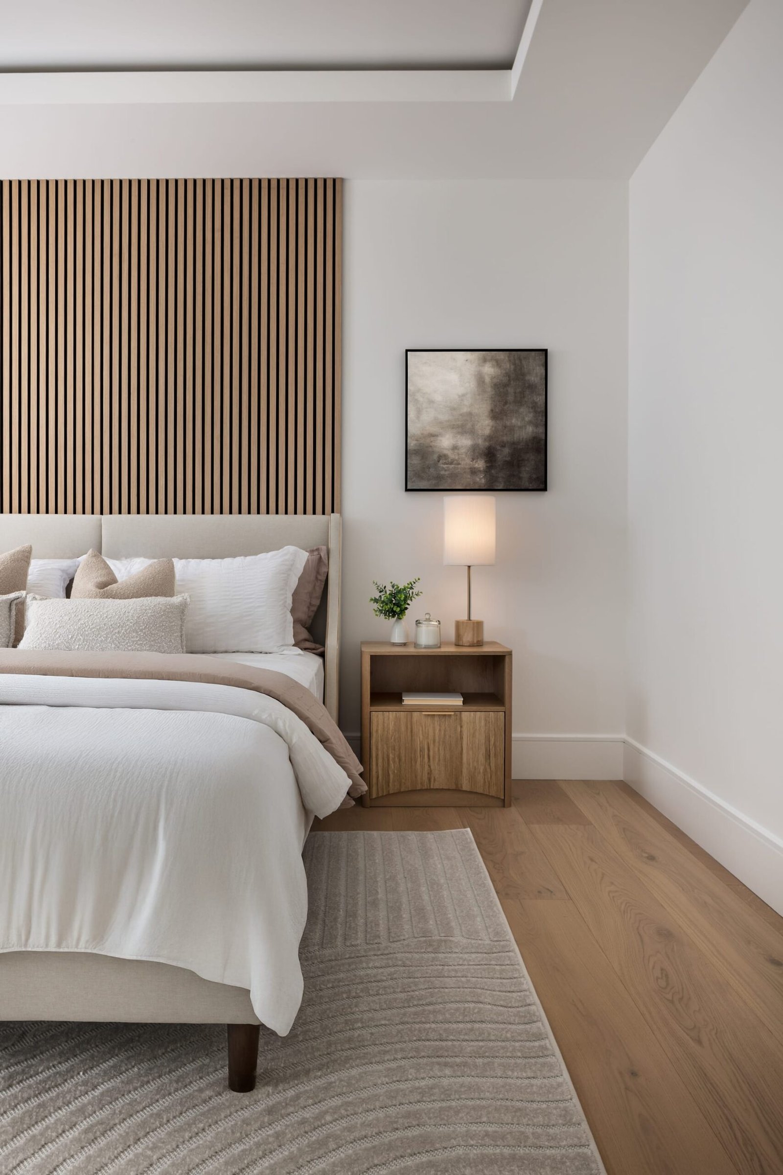
The Image That Speaks First
Every project deserves a full set of images, but only one of them arrives first. It is the frame that leads a portfolio page, anchors a submission to a publication, fills the thumbnail on a listing, or opens a pitch deck. Long before anyone studies the plan or reads the description, this single photograph has already made a case. In architectural photography, the cover image is not simply the best picture in the group. It is the one that carries the argument for the entire project.
Design professionals often think of a shoot as a collection of equally weighted assets. That view is understandable, but it underestimates how images actually travel. A set does not reach an audience all at once. It reaches them in sequence, and the first frame sets the terms for everything that follows. Choose it well and the viewer leans in. Choose it carelessly and the rest of the work has to fight to be seen.
The cover image is not simply the best picture in the group; it is the one that carries the argument for the entire project.
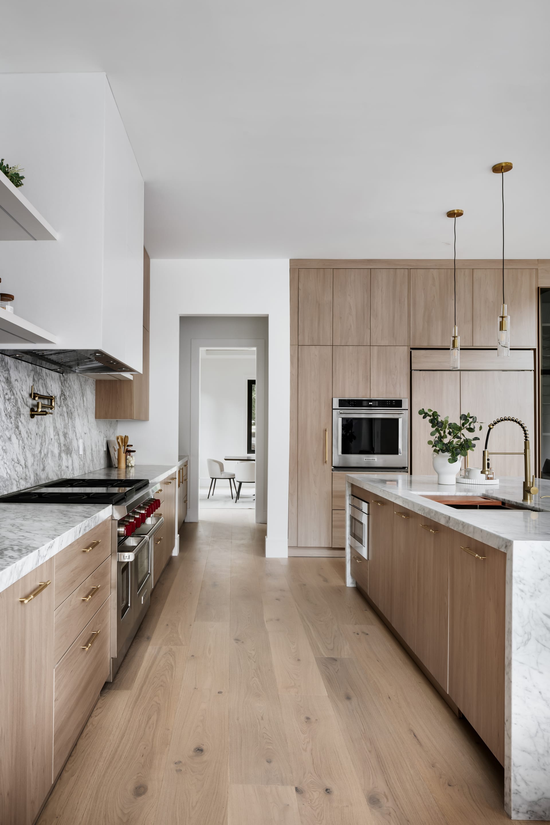
What a Cover Image Has to Do
A leading image works harder than any other frame in the set because it performs several jobs at once. Understanding those jobs helps clarify what to look for when you select one.
- It communicates the idea. The best cover image expresses the central concept of the space in a single glance, whether that is a play of light, a bold gesture of form, or a quiet material honesty.
- It establishes tone. Warm or cool, restrained or dramatic, intimate or expansive. The first frame tells the viewer what kind of place they are about to enter.
- It rewards a small format. Cover images are frequently seen as thumbnails on a phone. If the composition falls apart at that scale, it fails at the exact moment it matters most.
- It invites the next image. A good opening frame creates curiosity rather than closing the story. It should feel like a beginning.
These demands are why the cover image is rarely a detail shot or a tightly cropped vignette. Those frames earn their place deeper in a sequence, once the viewer already understands the space. The opener usually needs to give context, orientation, and a clear sense of place.
Choosing the Frame
When we review a shoot with a client, selecting the lead image is one of the most valuable conversations we have. It forces a question that clarifies the whole project: what is this space really about? For a boutique hotel, the answer might be arrival and atmosphere. For a residential interior, it might be the way morning light settles across a room. For an architect presenting a new building, it might be the confident line of the facade against the sky.
Look for the image that needs no caption
The strongest cover images explain themselves. They do not rely on a paragraph of text to reveal their meaning. In interior photography, this often means an establishing view that shows how a room is composed, how light enters, and how the materials relate to one another. The viewer should feel oriented within a second or two, not confused about what they are looking at.
Favor clarity over cleverness
An unusual angle can be striking, but the cover is not the place to test the audience’s patience. Save the more experimental perspectives for the interior of the sequence, where the viewer has already found their footing. The opening frame benefits from a composition that is legible and calm, with clean vertical lines and a considered sense of order.
The strongest cover images explain themselves and never rely on a paragraph of text to reveal their meaning.
Consider where the image will live
A frame destined for a magazine cover has different requirements than one leading a real estate listing or a design awards submission. Many publications need room at the top for a masthead, or a strong vertical orientation. A listing thumbnail crops aggressively and rewards a single, uncluttered focal point. Knowing the destination in advance lets us shoot with the right proportions and breathing room built in, rather than cropping a compromise later.
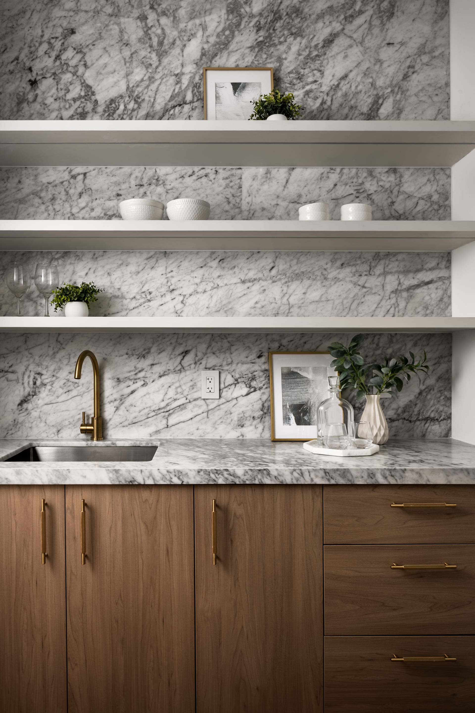
Crafting It During the Shoot
The most useful shift for design professionals is to stop thinking of the cover image as something chosen after the fact and start thinking of it as something planned. When we build a shot list, we identify likely hero frames early. That does not lock us into them, since the light or the space often reveals something better on the day, but it ensures the leading image receives the attention it deserves rather than being an afterthought among dozens of files.
On location, a cover-worthy frame usually asks for patience. It is the shot we return to as the light changes, refining the styling, adjusting a chair by an inch, waiting for a cloud to soften a harsh window. Because so much rests on this one image, it earns the extra fifteen minutes. A frame that will be seen ten thousand times deserves more care than one that appears once, deep in a gallery.
Practical considerations that pay off later
- Shoot with margin. Leaving generous space around the subject gives room to crop for different platforms without losing the composition.
- Capture a vertical and a horizontal. The same view in two orientations doubles the ways the image can be used.
- Mind the small distractions. A stray cable or crooked cushion is forgivable in a supporting frame but distracting in the one image everyone sees.
The Cover as a Statement of Intent
For architects and interior designers building a body of work, the cover images across a portfolio do something collective. Seen together, they signal the sensibility of the practice. A consistent quality of light, a shared sense of restraint, a recurring attention to proportion. Clients scanning a website form an impression from these opening frames long before they read a single project description. The lead image, repeated across many projects, becomes a kind of visual signature.
This is why the choice is never purely aesthetic. It is strategic. The cover image is the handshake, the first sentence, the note that sets the key. When it is chosen with intention, everything that follows is heard more clearly.
If you are planning a project and want the leading image to carry its full weight, we would be glad to talk with you at Matthew Lekker Photography.