The Quiet Power of What Is Left Out
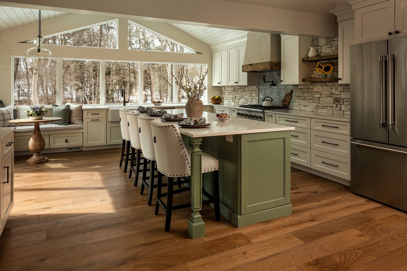
In architectural photography, we often speak about what fills a frame: the furniture, the finishes, the play of light across a wall. Yet some of the most considered images owe their strength to the parts of the frame that hold nothing at all. Negative space, the deliberate inclusion of emptiness, is not a void to be eliminated. It is a compositional material in its own right, as deliberate as a chosen angle or a carefully placed chair.
Designers understand this instinctively. A well-resolved room is not crowded with incident. It allows the eye to rest, to register proportion, to appreciate a single gesture against a calm backdrop. Interior photography that honours this principle does more than document a space. It carries forward the same intentionality the designer brought to the room.
Emptiness in a photograph is not an absence of content but a presence of intention.
What Negative Space Actually Does
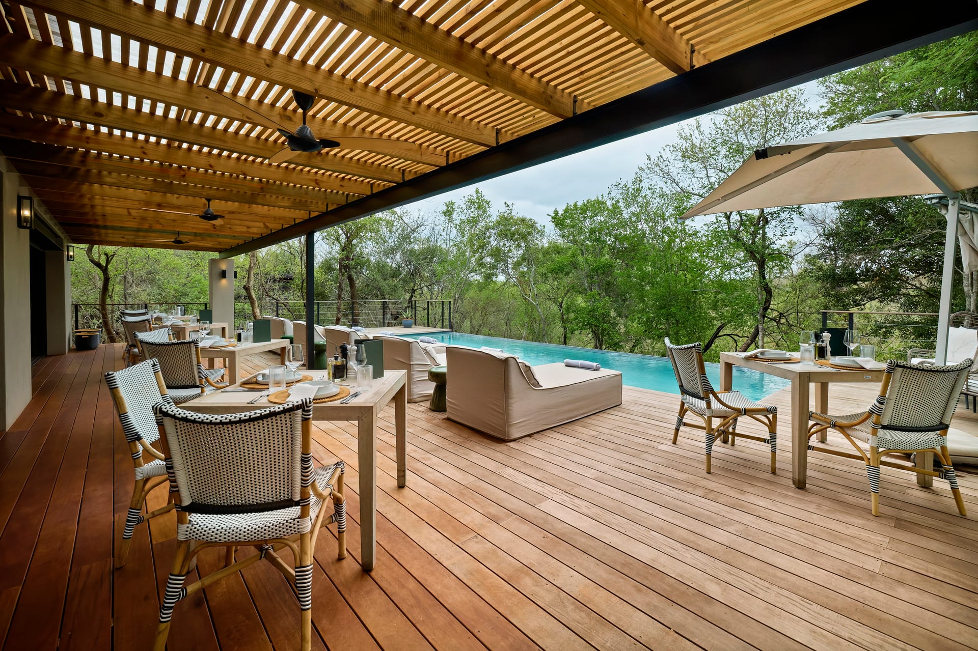
Negative space earns its place in a frame because it performs several tasks at once. It establishes breathing room, it isolates a subject, and it communicates a sensibility. When used with care, it tells the viewer that the photographer trusts the architecture enough to let it stand alone.
It Gives the Subject Somewhere to Rest
A chair positioned against a broad plane of unbroken wall reads with far more clarity than the same chair surrounded by competing objects. The emptiness around it becomes a frame within the frame. The viewer’s attention is directed, not through force, but through the absence of distraction.
It Conveys Scale and Volume
Generous negative space above a dining table or beside a staircase communicates ceiling height and spatial generosity in a way that a tightly cropped image never could. For architects and builders presenting volume as a core value of a project, this restraint is often more persuasive than filling every corner with proof of occupancy.
It Signals a Point of View
A composition that leaves room is a composition that has made a choice. It reads as editorial rather than inventory. For boutique hotels and design-led brands, this quality separates imagery that feels like a catalogue from imagery that feels like a magazine spread.
Reading a Space for Its Emptiness
Before setting the camera, it helps to walk a room looking specifically for its quiet areas. Where does the space already offer a clean plane? Which walls carry no clutter? Where does the floor extend uninterrupted toward a window?
These areas are not problems to be solved by adding props. They are opportunities. A broad expanse of plaster, a bare stretch of polished concrete, a stretch of calm sky visible through glazing: each can anchor a composition and give the designed elements their proper weight.
In interior photography, the temptation is often to introduce styling to fill perceived gaps. Yet the most refined images frequently do the opposite. They protect the emptiness that the designer worked to achieve.
Balancing Full and Empty
Negative space works through relationship. A frame that is entirely empty says little. A frame that is entirely full overwhelms. The craft lies in the proportion between the two.
- The rule of thirds as a starting point. Placing a subject off-centre leaves a natural field of emptiness that feels composed rather than accidental.
- Weight and counterweight. A dense cluster of objects on one side of the frame can be balanced by an open plane on the other, creating tension that holds the eye.
- Directional breathing room. Leaving space in the direction a subject faces, or the direction light travels, gives the image a sense of movement and ease.
These are guides, not rules. The aim is always to serve the architecture, and sometimes a centred, symmetrical composition surrounded by emptiness is exactly right. A long corridor photographed head on, with nothing but light and shadow drawing the eye forward, relies entirely on negative space for its effect.
A frame that leaves room is a frame that trusts its subject to be enough.
Light and the Empty Plane
Negative space becomes most compelling when light does the work within it. An unadorned wall is rarely truly empty. It holds the soft gradient of daylight falling from a window, the faint trace of a shadow, the subtle shift of tone from top to bottom.
Photographing these quiet gradients requires patience and attention to the time of day. Morning light raking across a plain surface can turn emptiness into one of the most expressive elements in the composition. The plane is bare, yet it is alive with information about the quality of light the space receives.
For hoteliers and designers, this matters because atmosphere sells as much as detail. A guest remembers how a room felt, and feeling is carried by light moving through open space far more than by any single object within it.
When Negative Space Goes Wrong
Empty space is not automatically elegant. It can read as careless, unresolved, or simply dull. The difference between intentional restraint and accidental emptiness usually comes down to edges and tension.
- Watch the edges. Emptiness that bleeds off the frame without purpose can feel like a mistake. Emptiness that is contained and composed feels deliberate.
- Keep the plane clean. A scuff, an unfilled nail hole, or an errant cable undermines the calm that negative space promises. Quiet areas are the most unforgiving of small flaws.
- Give the emptiness a reason. There should be a relationship between the open area and the occupied area. Without that dialogue, the image loses its structure.
Negative Space as a Brand Language
For design professionals building a visual identity, consistency in the use of negative space becomes a signature. A portfolio that consistently allows its images room to breathe communicates confidence and discipline. It tells prospective clients that the work does not need to shout.
Realtors presenting high-end properties, architects assembling a monograph, and interior designers curating a website all benefit from this discipline. The restraint of the imagery mirrors the restraint of the work, and the two reinforce one another.
Negative space, in the end, is a form of respect. It respects the viewer’s attention, the designer’s intention, and the architecture’s capacity to speak for itself. To photograph a space well is often to know what to leave out.
If you are preparing to photograph a project where emptiness and intention matter as much as detail, we would welcome a conversation with Matthew Lekker Photography.
Add us as a preferred source on Google
Add as preferred source