Why Colour Deserves More Attention
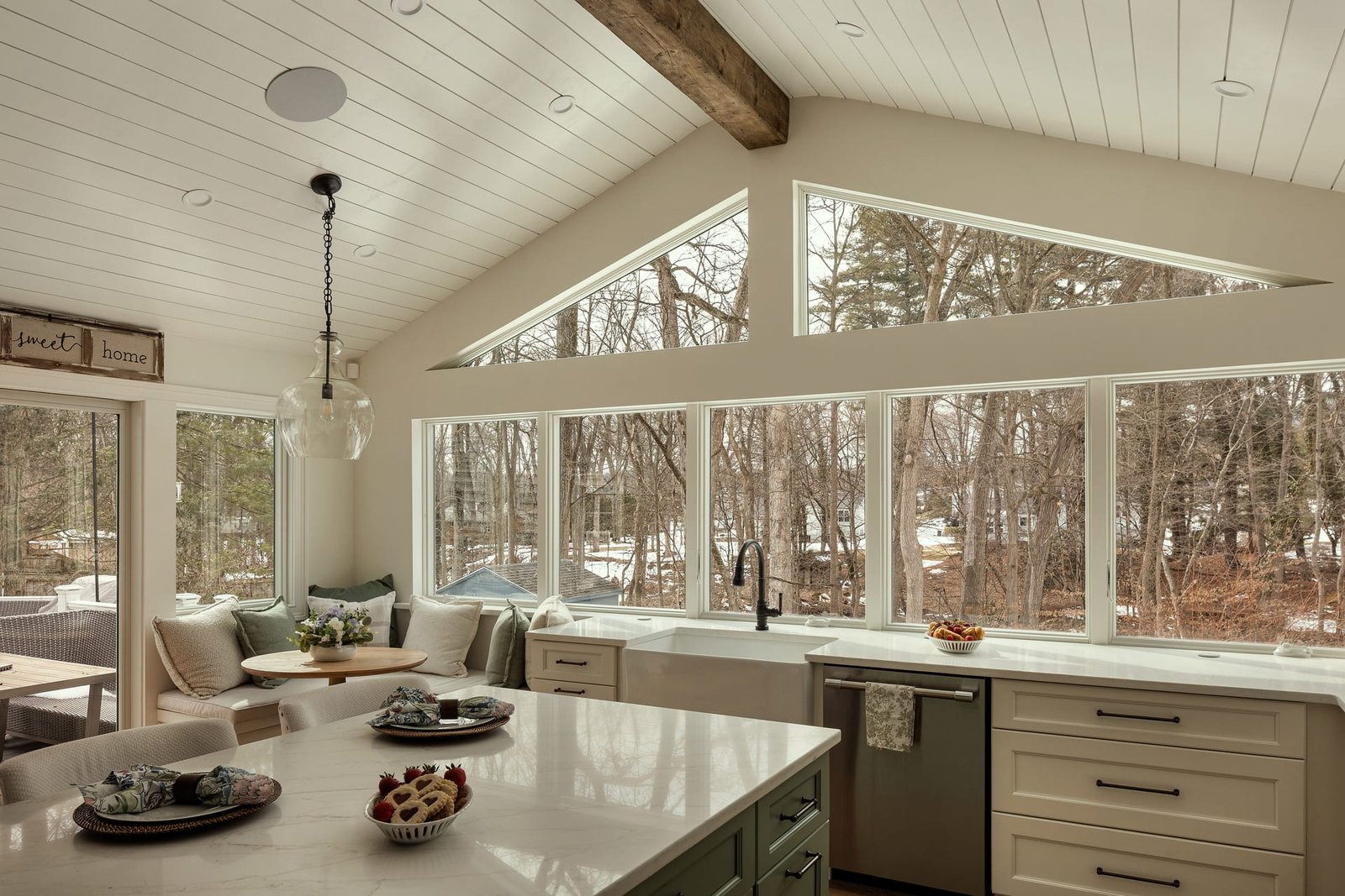
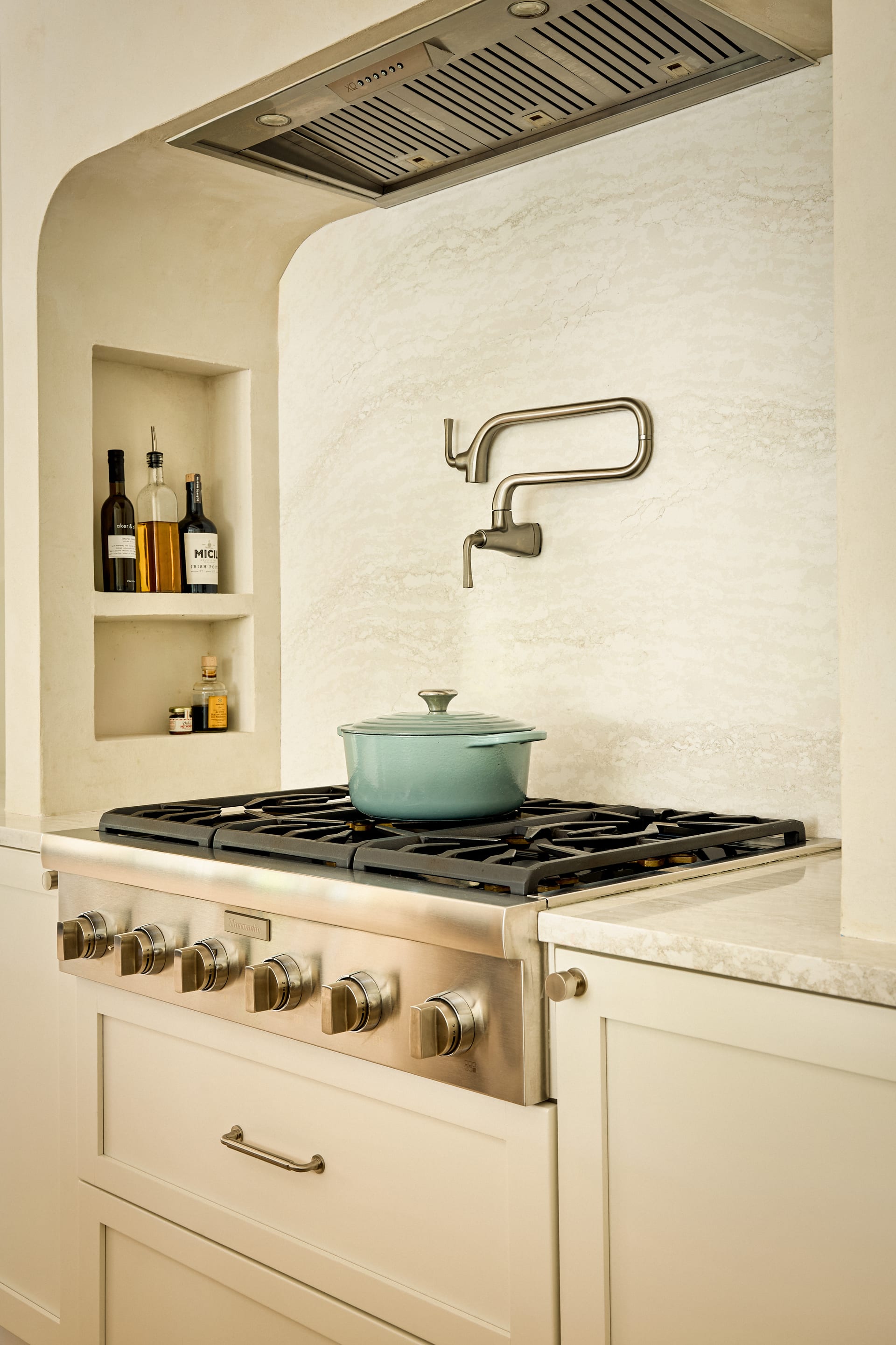
Of all the qualities a photograph carries, colour is the one most often assumed and least often controlled. A room can be composed with precision, lit with care, and framed to hold its lines perfectly straight, yet still misrepresent the space if the tones drift. For a design professional, this is not a minor concern. The palette is frequently the heart of the work. A warm plaster wall, a specific green on the joinery, the exact cool grey of a poured floor: these are decisions made over weeks, and a careless image can undo them in a single frame.
In architectural photography and interior photography alike, colour is where technical accuracy meets creative intent. The camera does not see colour the way the eye does. It records light as data, and that data must be interpreted. The question is who interprets it, and how faithfully they hold to the truth of the space.
The palette is frequently the heart of the work, and a careless image can undo it in a single frame.
How Colour Drifts
Understanding why tones shift helps clarify why they must be managed. Several forces pull an image away from accuracy, and most of them are invisible in the moment.
Mixed light sources
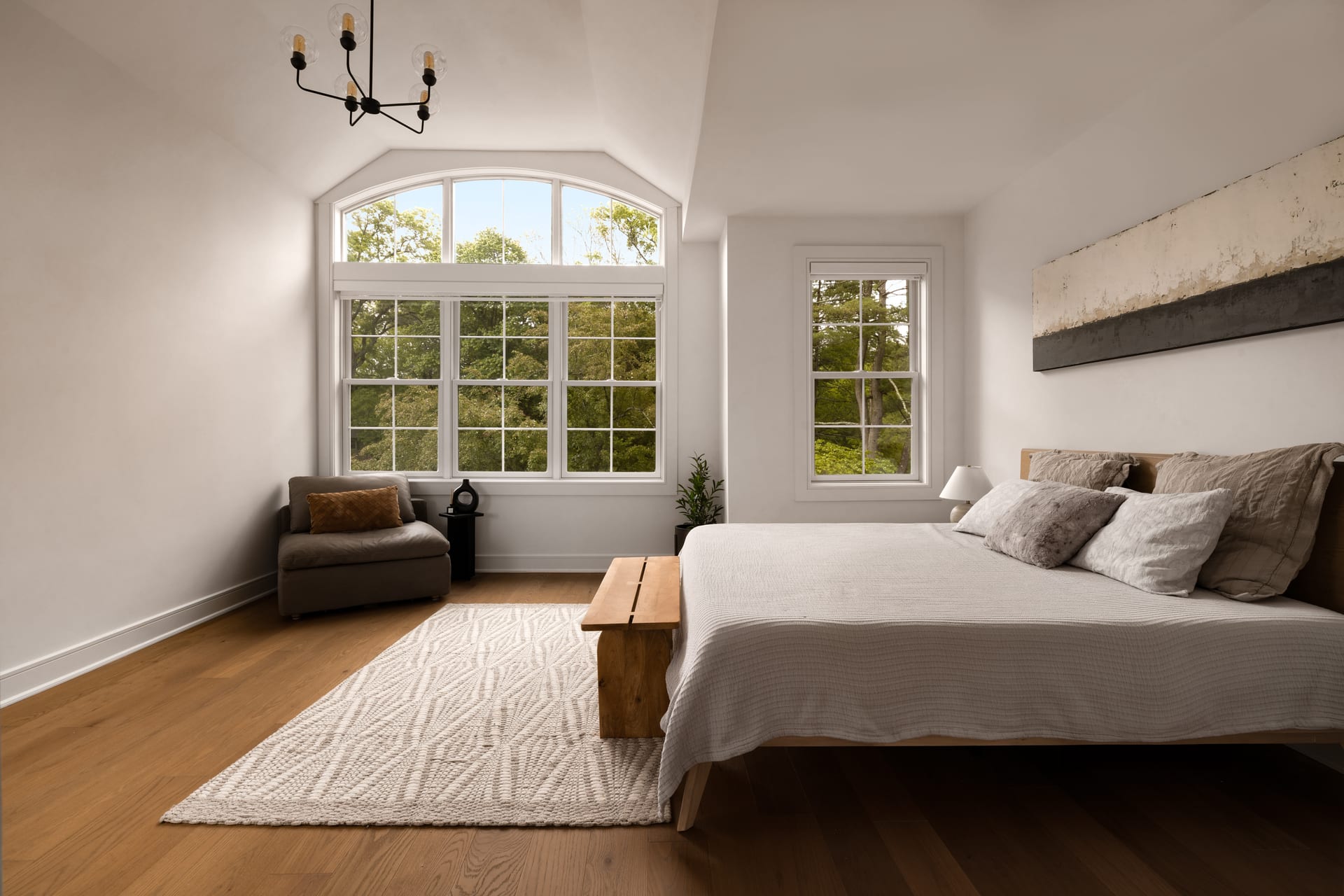
Few interiors are lit by a single kind of light. Daylight enters through windows while warm lamps glow indoors and cooler downlights wash the ceiling. Each of these has a different colour temperature. Daylight reads cool and blue, tungsten reads warm and amber, and many LEDs sit somewhere unpredictable in between. When they mix in one frame, the camera cannot satisfy all of them at once. A wall near the window may look neutral while the same wall further inside turns yellow.
Reflected colour
Surfaces borrow from one another. A green sofa casts a faint green tint onto a pale rug. A timber floor warms the walls above it. Strong exterior colour, such as a red brick courtyard, can push its hue into a room through the glass. These reflections are natural and often beautiful, but they can also distort a finish the designer intended to read as neutral.
White balance and interpretation
The camera’s white balance setting decides which point in the image should count as neutral white. Choose the wrong reference and the entire frame tilts warm or cool. Automatic settings guess, and they guess inconsistently from frame to frame, which is why a set of images can arrive looking mismatched even when the space never changed.
What Accurate Colour Actually Means
It is worth being precise about the goal. Accurate colour does not mean clinical or flat. It means faithful. The aim is for the photograph to represent the tones a person would perceive standing in the room, adjusted gently for the way a still image is read on a screen or in print.
This distinction matters because true perception and raw camera data are not the same thing. The human eye adapts constantly, correcting for warm evening light or cool overcast skies without our noticing. A camera does not adapt. Left alone, it will render a lamp-lit living room in an orange cast that no occupant would recognise, because their eyes had already compensated for the warmth. Good colour work restores what the eye would have felt, not what the sensor mechanically recorded.
Protecting the Palette on the Shoot
Much of the work happens before the edit. The choices made on location determine how much can be honoured later.
- Manage the light sources. Where possible, turning off mismatched lamps or gelling them to match the dominant light reduces conflicting casts. Some spaces photograph best with practical lights on for atmosphere and others with them off for cleaner colour. The decision depends on the story of the image.
- Shoot in raw. Raw files retain the full colour information the sensor captured, giving room to correct white balance later without degrading the image. A compressed file locks in early decisions that may prove wrong.
- Reference the true tones. Photographing a colour reference or noting the actual paint and material specifications gives the editor a fixed point of truth to work toward. Memory of a colour fades quickly. A record does not.
- Watch the mixed zones. Framing can avoid the worst colour conflicts, keeping a warm lamp out of an otherwise daylit composition, or waiting for the exterior light to balance with the interior at dusk.
The aim is for the photograph to represent the tones a person would perceive standing in the room.
Colour in the Edit
The edit is where accuracy is finalised, and it demands restraint. Correcting white balance to a neutral reference is the foundation. From there, the work is local and considered: warming a cool corner, cooling a hot spot near a window, easing a colour cast off a wall without stripping the warmth from the wood beside it.
The temptation in modern editing is to push saturation and contrast until an image looks vivid on a phone screen. For design professionals this is a trap. Oversaturated greens and exaggerated warmth read as marketing gloss and, worse, they misrepresent the materials. A client who specified a muted sage will not thank anyone for turning it into emerald. Faithful colour builds trust, because the finished space matches its photographs.
Consistency across a set
A single accurate image is not enough. The images in a series must agree with one another. When a portfolio moves from room to room, the neutral tones should stay neutral throughout, so the viewer reads one coherent building rather than a collection of separately treated pictures. This consistency is quiet work, but its absence is immediately felt.
Why This Matters for Your Work
For architects and interior designers, colour fidelity is a matter of professional record. These images become the archive of the project, the version future clients will see. For builders and developers, accurate tones show craftsmanship honestly. For hoteliers, colour sets the emotional temperature of a space and shapes the expectation a guest arrives with. For realtors, tones that match reality prevent the quiet disappointment of a viewing that does not resemble the listing.
Colour is not decoration applied to a photograph. It is information, mood, and integrity at once. Treating it with the same rigour given to line and composition is what separates a competent image from one that genuinely represents the work.
If you are preparing to photograph a space where colour and material are central to the design, we would welcome a conversation at Matthew Lekker Photography.