The Space Around the Subject
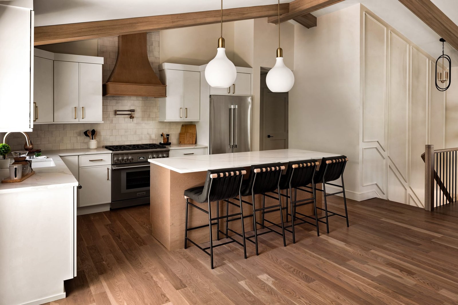
Every photograph is a set of decisions about inclusion, but the more revealing choices are often about exclusion. What sits outside the frame, and what remains empty within it, shapes how a space is understood. In architectural photography and interior photography alike, the areas of a composition that hold nothing in particular are doing quiet, essential work. They give the eye somewhere to rest, they establish proportion, and they lend an image the composure that separates a considered photograph from a merely informative one.
Negative space is the term borrowed from the visual arts for the parts of a frame not occupied by the principal subject. In a portrait it might be the wall behind a face. In architecture and interiors it is the stretch of floor, the expanse of ceiling, the quiet reach of a wall, or the sky against which a building is read. Design professionals tend to think carefully about the objects in a room. Far fewer think about the intervals between them, yet those intervals are precisely what make a space feel resolved.
Why Absence Reads as Confidence
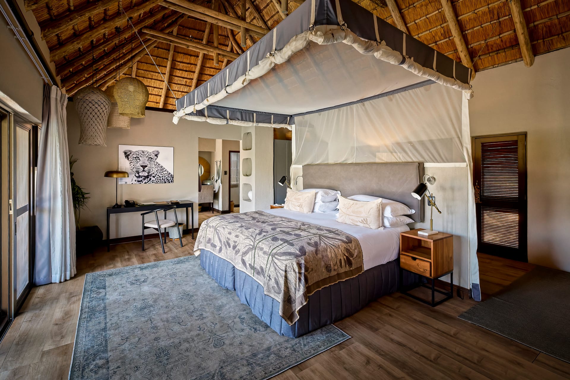
There is a temptation, especially when a project has been laboured over, to show everything at once. The instinct is understandable. A room may hold a joinery detail, a striking light fitting, a bespoke rug, and a view worth the whole commission. Crowding all of it into a single frame, however, tends to flatten each element into competition with the others. The photograph becomes an inventory rather than an image.
Generous negative space does the opposite. By granting a subject room to breathe, it signals that the space does not need to prove itself. A single chair set against a broad, uninterrupted wall reads as intentional. The same chair jostling among five other pieces reads as clutter. The emptiness is not a failure to fill the frame; it is the very thing that gives the occupied portion its authority.
Emptiness is not a failure to fill the frame; it is the very thing that gives the occupied portion its authority.
This principle matters most in the disciplines that trade on restraint. A minimalist interior loses its meaning when photographed densely. A hotel lobby designed around a sense of calm cannot communicate that calm if every surface competes for attention. The photograph must embody the same discipline the design already practises.
How the Eye Moves
Negative space also governs the path a viewer’s attention takes through an image. The eye is drawn first to contrast and detail, then it seeks somewhere to settle. When a composition offers no rest, the viewer feels a low, unnamed tension and moves on quickly. When it provides open passages, the eye lingers, and the space is absorbed rather than glanced at. For a realtor, this can be the difference between a listing that holds a buyer’s attention and one they scroll past. For an architect building a portfolio, it is the difference between images that are studied and images that are skimmed.
Working With Negative Space in Practice
Understanding the idea is straightforward. Applying it during a shoot, when a beautifully appointed room seems to demand that everything be shown, takes discipline. A few practical considerations help.
- Let the floor and ceiling participate. In interior photography, a sweep of unadorned floor in the foreground or a clean plane of ceiling above can anchor a room far more effectively than tightening in on the furniture.
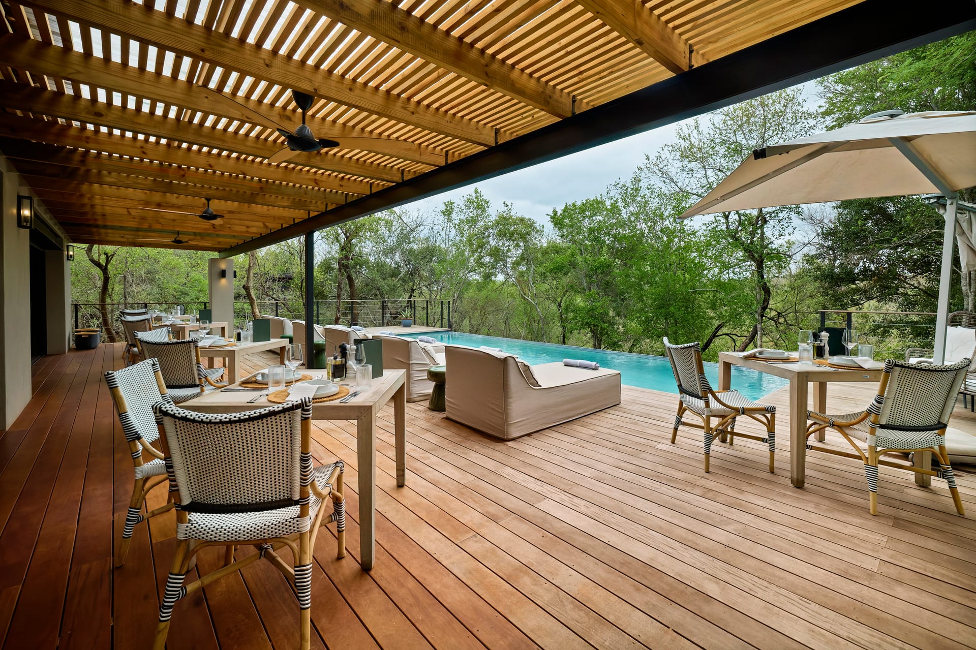
- Give the exterior room to sit. When photographing a building, resist the urge to fill the frame edge to edge. Sky, landscape, and open ground around the structure allow its form to register clearly.
- Simplify before adding. If a frame feels busy, the answer is rarely to reposition the camera to include more. It is usually to remove an object or shift the vantage so that fewer elements carry more weight.
- Watch the corners. The edges and corners of a frame are where clutter accumulates unnoticed. Keeping them quiet preserves the sense of order at the centre.
There is also a compositional discipline sometimes described as leaving room for the subject to look into, or for the space to open toward. A corridor photographed with empty space ahead of it invites the viewer forward. A staircase given air above it feels lifted rather than cramped. These are subtle adjustments, but they accumulate into images that feel deliberate.
Negative Space Is Not Emptiness
It is worth drawing a distinction. Negative space is active, not dead. A blank wall that carries a soft gradient of light is negative space. A blown-out window with no information in it is a hole. The goal is not to leave portions of the frame vacant, but to leave them uncluttered while still full of tone, texture, and light. A concrete floor catching a low rake of daylight is empty of objects yet rich with atmosphere. That richness is what keeps the space from feeling barren.
A blank wall carrying a soft gradient of light is negative space; a blown-out window with no information in it is merely a hole.
This is where the collaboration between designer and photographer becomes valuable. A hotelier knows which corner of a suite was meant to feel expansive. A builder knows which run of a facade shows the craft most clearly. Sharing those intentions before the shoot allows the negative space to be shaped around them, so that the emptiness serves the design rather than accidentally undermining it.
The Longer View
Images built on generous negative space age well. Trends in styling shift, but a photograph organised around calm proportion and clear intervals retains its poise for years. This matters for design professionals whose portfolios are meant to represent them over the long term. An image crammed with the fashions of a single season dates quickly. An image that honours the quiet architecture of a room stays relevant as long as the space itself does.
Restraint, in the end, is a form of respect. It trusts the viewer to appreciate a space without being told everything at once. It trusts the design to hold its own without decoration piled upon decoration. And it produces photographs that feel, above all, considered, which is precisely the quality that architects, interior designers, builders, and hoteliers most want their work to convey.
If you would like your spaces photographed with this kind of considered restraint, Matthew Lekker Photography would be glad to hear from you.
Add us as a preferred source on Google
Add as preferred source