The Discipline of the Straight Line
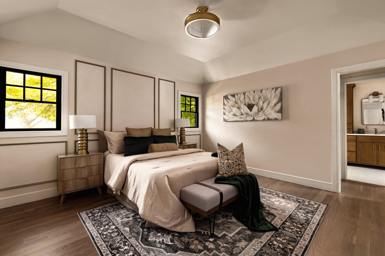
There is a particular quality that separates a considered architectural photograph from an ordinary one, and it is rarely the first thing a viewer names. It is not the light, though light matters. It is not the composition alone. It is the quiet fact that the vertical lines stand true. Door frames rise without leaning. Columns hold their posture. Walls meet the edges of the frame as they meet the floor: at a clean, honest right angle. This correctness is easy to overlook when it is present and impossible to ignore when it is missing.
For design professionals, this matters more than it might first appear. A building or interior is, at its core, a study in geometry and proportion. When a photograph distorts those relationships, it distorts the work itself. A room that was designed with careful symmetry can look unbalanced. A facade conceived with restraint can appear to topple. The photograph stops describing the architecture and begins describing the camera’s mistakes.
When the verticals stand true, the eye relaxes and the architecture is finally free to speak for itself.
Why Verticals Fall
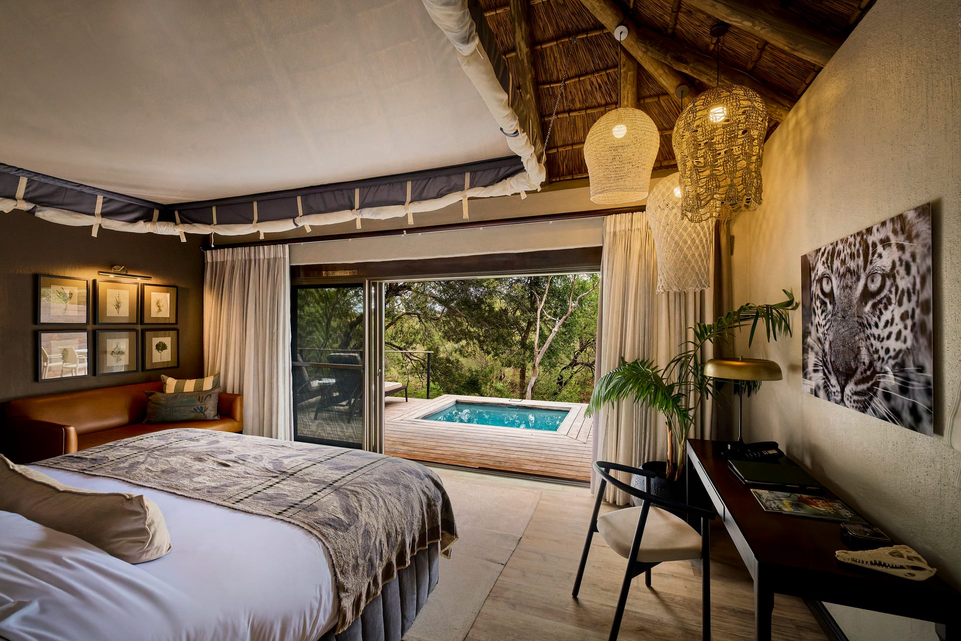
The problem originates in a simple physical act. When a photographer tilts the camera upward to capture the top of a tall building, or downward to include a foreground, the sensor is no longer parallel to the subject. Lines that are genuinely vertical in the world begin to converge, leaning inward toward the top of the frame or splaying outward at the base. This is often called keystoning, and it is the most common flaw in casual architectural photography.
A modest amount of convergence can pass unnoticed. A pronounced amount reads instantly as amateur, even to viewers who could not explain why. The human eye is remarkably attuned to the vertical. We stand upright, we build upright, and we register a leaning wall as a small wrongness long before we consciously identify it.
The Difference Between Correction and Intention
It is worth saying that converging lines are not always an error. There is a long tradition of deliberately exaggerated perspective, where a photographer looks straight up a tower to dramatize its height, allowing the lines to rush toward a single point. When this is chosen consciously and executed cleanly, it becomes a statement rather than a slip. The distinction lies in intention. A photograph that leans by accident looks careless. A photograph that leans by design looks composed.
For most interior photography and exterior work commissioned by architects and designers, however, the goal is fidelity. The client wants the space rendered as it feels to stand within it, with its proportions intact and its lines behaving.
How Truthful Verticals Are Achieved
There are several established approaches, and understanding them helps design professionals appreciate what goes into a properly made image.
- Keeping the camera level. The most fundamental technique is to hold the camera’s sensor parallel to the vertical plane of the subject. When the camera stays level, verticals remain vertical. This often means the horizon sits in the center of the frame, which can leave more foreground than desired.
- Using a tilt-shift lens. A shift lens allows the photographer to raise the lens element relative to the sensor, capturing the top of a building or the height of a room without tilting the camera at all. The lines stay parallel while the framing shifts upward. This is the traditional tool of the architectural specialist.
- Correcting in the edit. Perspective can be adjusted after capture, straightening converging lines through software. This is a valuable tool, though it comes at a cost: correcting steep convergence stretches and crops the image, sacrificing resolution and sometimes introducing subtle distortion of its own. The cleaner the capture, the gentler the correction needed.
In practice, the finest results usually come from getting as close to correct as possible in the camera, then refining with restraint afterward. Relying entirely on post-production tends to show.
What This Means for the Spaces You Commission
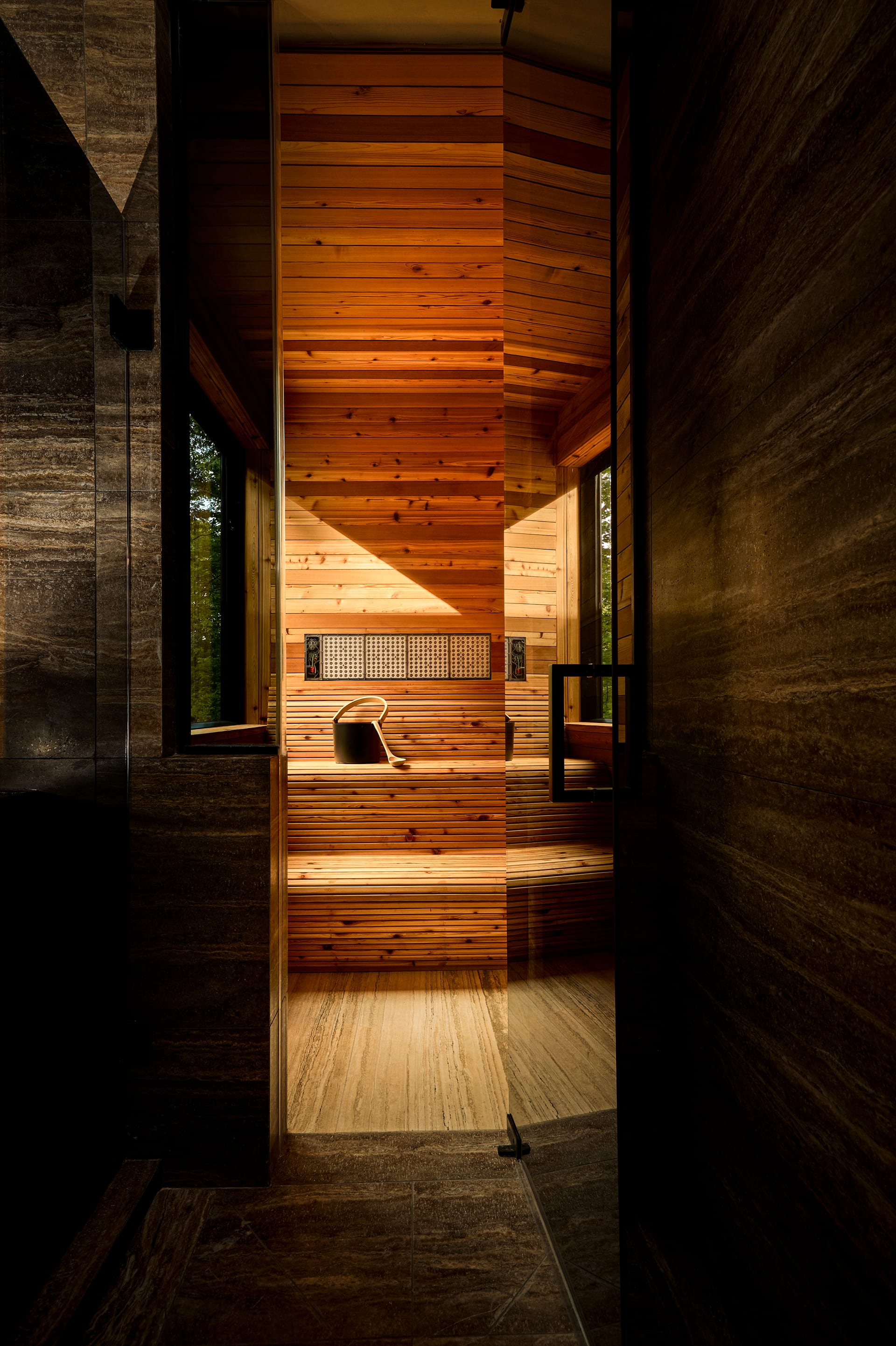
When you engage a photographer for architectural photography, the treatment of vertical lines is one of the clearest indicators of craft. It reveals whether the work was made carefully or quickly. In interior photography especially, where a viewer is invited to imagine themselves standing in the room, straight verticals create a sense of stability and calm. A tilted frame subtly unsettles the viewer, even when the room itself is serene.
Consider the practical settings where these images will live. A hotel presenting its suites wants prospective guests to feel the poise of the design, not a vague uneasiness. An architect submitting a project for publication knows that editors expect technical precision. A realtor marketing a property benefits from rooms that look composed and generous rather than skewed. A builder documenting finished work wants the craftsmanship, not the camera, to be the subject.
A leaning wall in a photograph quietly undermines the confidence of everything the design was meant to convey.
The Exception of the Interior Detail
Within a space, not every element demands perfectly parallel verticals. A tightly framed detail shot of a stair balustrade or a run of joinery may find its strength in a diagonal energy. The rule of true verticals applies most strictly to the establishing views, the frames that describe the whole room or the entire elevation. These are the images that carry proportion, and proportion is where honesty matters most.
Reading the Line Yourself
You do not need technical training to assess this in your own commissioned work. Look at any wide shot of a room or building and let your eye travel up the edges of a doorway, a window, or a corner where two walls meet. Ask whether those lines run parallel to the sides of the frame. If they lean inward or bow outward noticeably, the geometry has been compromised.
This small habit of observation will sharpen how you evaluate photography and how you brief the professionals you work with. It signals that you understand the difference between a picture of a space and a faithful representation of a design.
The straight vertical is not a flourish. It is the foundation on which everything else in the image rests, the invisible discipline that lets light, material, and proportion do their work without interference. When it is handled well, no one notices it. That is precisely the point.
If you would like your architecture or interiors photographed with this level of care, I would be glad to hear from you at Matthew Lekker Photography.