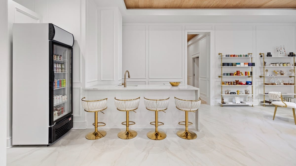
Great interior photography rarely fails on a grand scale. The architecture is sound, the light is generous, the composition is considered. What separates a competent image from a genuinely compelling one usually lives in the margins: the fold of a throw, the angle of a chair, the single stem placed with intention. Styling is the quiet craft that gives a photograph its atmosphere, and for design professionals it is often the difference between a room that reads as a showroom and one that feels genuinely lived in.
This is not about adding more. It is about editing, refining, and directing the eye. Below are the details that consistently elevate an interior photograph, drawn from the practice of preparing spaces for the camera rather than for daily life.
Styling Begins With Subtraction
The most common styling mistake is generosity. A room that feels warm and full in person can appear cluttered and restless through a lens. The camera flattens depth and heightens every object, so what the eye forgives, the frame amplifies. Before adding a single accessory, the first act of styling is removal.
Clear the surfaces that carry the residue of daily life: remotes, chargers, stray paperwork, the extra cushion that has migrated to the wrong chair. Reduce a coffee table to two or three deliberate elements. The goal is not sterility but breathing room, a sense that every object earned its place.
The camera flattens depth and heightens every object, so what the eye forgives, the frame amplifies.
For architects and builders documenting new work, this discipline is especially valuable. A minimally styled space allows the architecture itself to lead, letting proportion, material, and detailing speak without competition.
The Details That Do the Heavy Lifting
Textiles and the Art of the Soft Edge
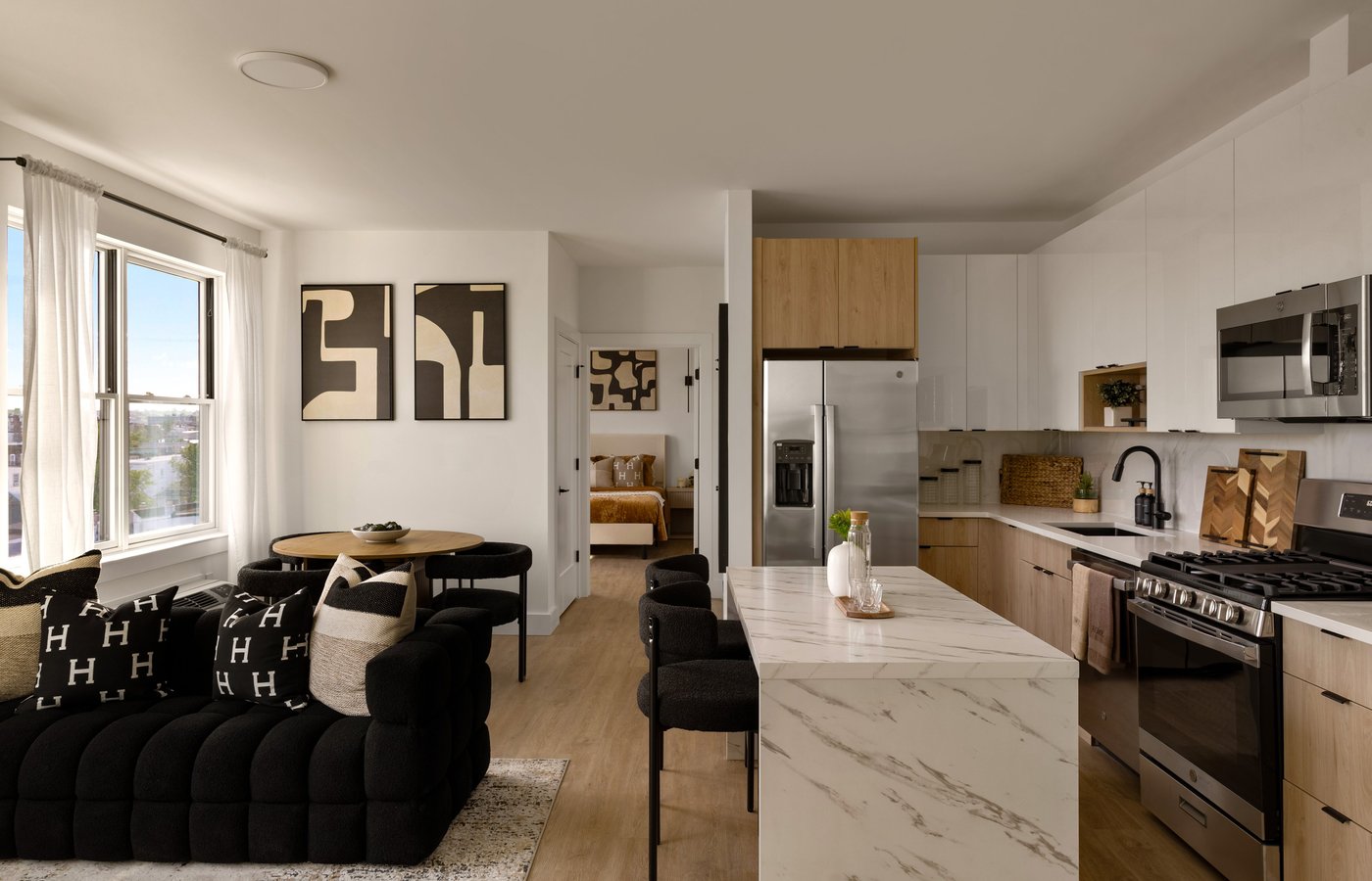
Fabric introduces the human element into a photograph. A crisply made bed can look convincing in a hotel brochure, but in editorial interior photography a gentle imperfection often reads as more inviting. A throw draped with a single relaxed fold, a linen pillow given a soft karate chop and then eased back, a rug straightened so its edge runs parallel to the frame. These are small gestures with outsized results.
Watch for creases that catch the light unkindly. Steam upholstery and bedding before the shoot. A wrinkle that is invisible in ambient light can become a hard shadow under directional daylight, drawing the eye to exactly the wrong place.
The Considered Vignette
A vignette is a small, arranged grouping that gives the eye a place to settle. On a console, a nightstand, or a kitchen counter, a well-composed vignette adds narrative without noise. The reliable principles are odd numbers, varied heights, and a mix of textures. A stack of books, a ceramic vessel, and a low object create a triangle the eye can travel comfortably.
- Group in threes rather than pairs or crowds
- Vary height to create a sense of movement and depth
- Combine a matte surface with something reflective for contrast
- Leave negative space so the grouping does not feel crammed
Greenery With Restraint
Nothing enlivens a room quite like something living, but plants are easily overdone. A single sculptural branch in a tall vessel can carry more presence than a dense arrangement. Choose stems with strong lines that photograph well, and be wary of anything wilting or artificial-looking. Fresh greenery signals care, and care is precisely what design professionals want the image to communicate.
Directing the Eye Through the Frame
Styling is inseparable from composition. Once the objects are chosen, their placement determines how a viewer moves through the photograph. A chair angled slightly toward the light invites the eye inward. A book left open on a table suggests presence. A cup positioned off-center adds a note of authenticity that a perfectly centered arrangement would lose.
Consider the foreground, middle ground, and background as three layers to be styled in relationship to one another. A blurred branch in the foreground, a styled sofa in the middle, and a glimpse of a room beyond creates the layered depth that makes architectural photography feel immersive rather than flat.
Styling is inseparable from composition, because the objects you choose determine how the eye moves through the frame.
Reflections and Distractions
Mirrors, glass, and polished metal are honest to a fault. They will reveal the tripod, the stylist, the ceiling fixture you forgot about. Before the shutter releases, check every reflective surface for unwanted intrusions. Turn off televisions, or style them with a considered still image rather than a black void, which tends to read as a hole in the composition.
Light Is a Styling Tool
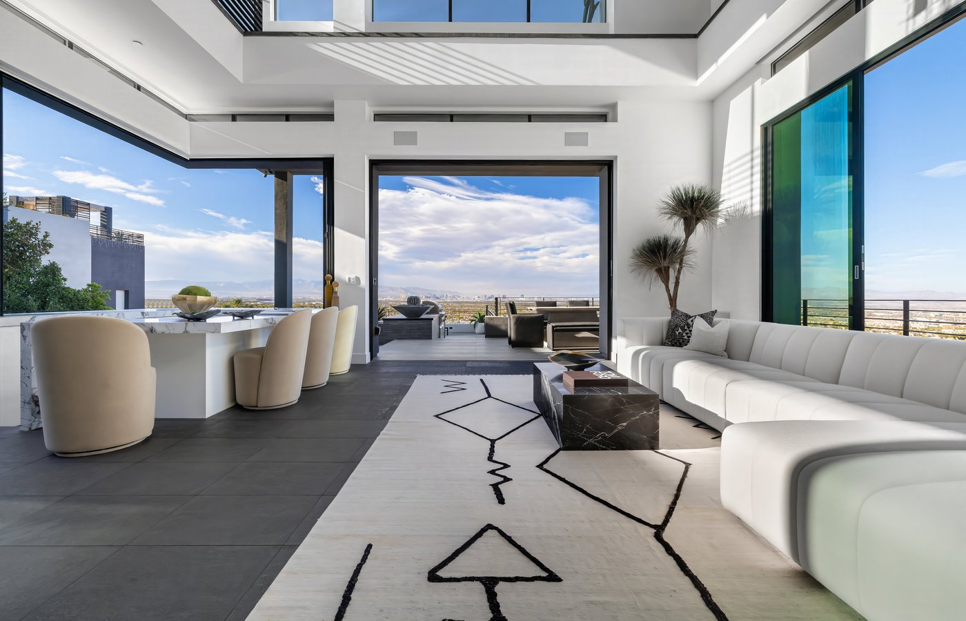
The finest styling can be undone by careless light, and the most modest room can be transformed by attentive light. Observe how daylight moves through a space across the day and schedule the shoot for the hour that flatters each room. Soft, directional light reveals texture: the grain of timber, the weave of a rug, the ridges of hand-thrown ceramics. Flat, overhead light erases exactly those qualities.
Style with the light in mind. Position a textured object where a raking beam will graze it. Pull a sheer curtain to diffuse a harsh window. The interplay of light and material is where interior photography earns its sense of atmosphere.
Consistency Across the Set
For hoteliers, realtors, and designers presenting a full portfolio, individual images matter less than the coherence of the whole. A consistent styling language, a restrained palette, a recurring quality of light, ties a set together and signals professionalism. Decide on a mood before the shoot and let it govern every decision, from the flowers on the table to the color of the folded towels.
- Keep a consistent color temperature and palette across rooms
- Repeat a small motif, such as a single flower type, for visual continuity
- Maintain the same level of styling density from image to image
The Value of a Practiced Eye
Much of styling can be learned, but the instinct for when a room is finished develops with time. The discipline lies in knowing when to stop, in resisting the urge to add one more object, in trusting that emptiness can be as expressive as abundance. For design professionals, this is where a collaborative relationship with a photographer pays dividends. The best images emerge when the person behind the camera understands the intent behind the space and styles in service of it.
The small details are never small in effect. They are the vocabulary through which a photograph speaks, the quiet decisions that make a room feel inevitable rather than arranged.
If you are preparing a space for the camera and would like a considered, collaborative approach to styling and interior photography, Matthew Lekker Photography would be glad to hear from you.